 Design System
| Month | Bill value |
|---|---|
| 999€ | |
| 999€ | |
| 999€ | |
| 999€ | |
| 999€ | |
| 750€ | |
Important information:
Using the Design System implies following some rules: the code should be valid and same as the Design System. Meaning custom HTML & CSS override are forbidden.
Please don't forget to read Usage part of each element.
Please don't forget to read Usage part of each element.
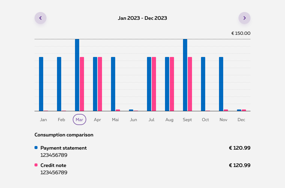
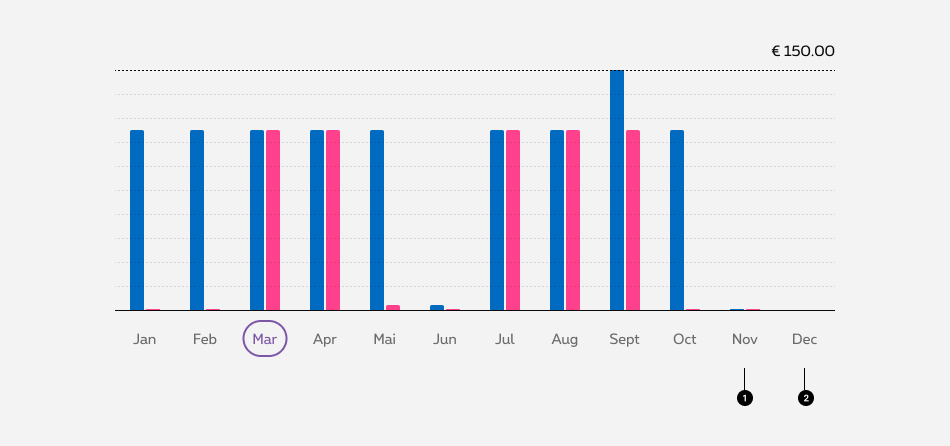
Bar chart
Compares different values that are hierarchically equivalent. Each bar is mapped to a dimension value with a length determined by a metric.
last modified: 06/12/2023 10:55:05
Overview
Bar chart is used to compare values and show trends over time. In a billing context for example, a bar chart allows the user to grab quickly his billing information, make comparisons and track his billing trends.
Comparative bar chart is used to compare values across multiple categories. It makes easy to identify patterns, trends, and differences in the data. To maintain clarity and simplicity in the comparative bar chart, a maximum of two bars per axis label is permitted.
Anatomy
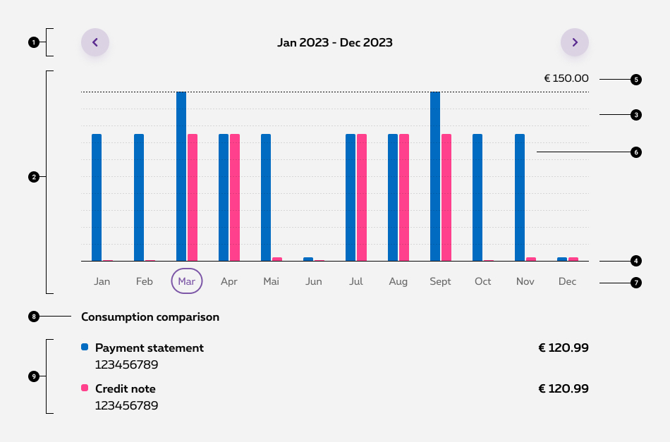
- Chart navigation
-
Chart frame
The chart frame is the area where the data will be visualized -
Ticks
Help the reader understand the proportions and scale of the data, the indicators involved, and their unit of measure - Axe Start at zero
-
Max value
-
Bars
-
Axis label
-
Legend heading
-
Legends
The Legends explain the chart’s meaning by defining the association of each color property to the corresponding data.
Behavior
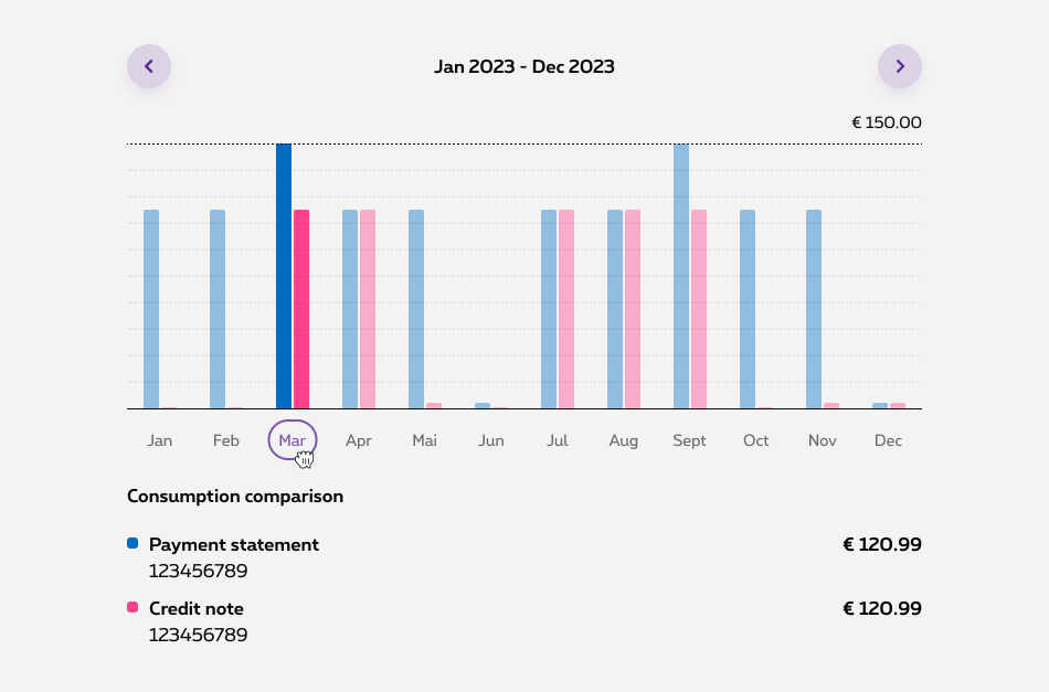
Pressed state
In desktop, when you click on one column in the bar chart, the other columns become slightly faded or less prominent. This effect is designed to draw attention to the pressed column, making it easier to see and analyze.
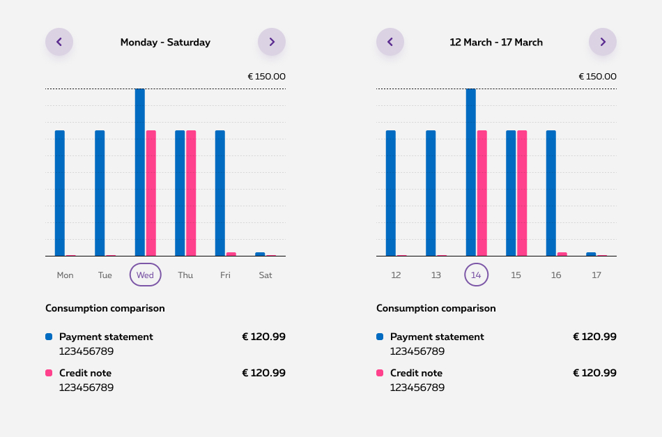
X-axis
Axis labels can be configured to display various time-related categories, such as weekdays, specific days of the month, or entire months. The chart can be set to show 6 labels on mobile devices and 12 labels on desktop screens for better readability.
Value 0 vs No data
In certain scenarios, it's important to distinguish between a data value of 0 and the absence of data. In such specific cases, we assign a minimum height to the bar representing the value 0 to ensure clear visual differentiation from the absence of data
- Value 0
- No data
Chart colors
Predefined colors are established for the Chart Bar component, carefully chosen to ensure suitable levels of contrast and visual clarity. Our status colors continue to hold semantic significance within the chart while the others are versatile and can be employed for various purposes.
last modified: 06/12/2023 10:55:05
Sizes and colors
last modified: 26/08/2024 15:30:07
Accessibility of Table
Bar chart is a table element. Please check documentation of Table about accessibility.
You have to link <table>
to a descriptive title via aria-labelledby="ac-chartID-title"
attribute.
Depending on the number of bars per column, you have to put colspan
attribute on certain th
and td
tags. Be careful!
Bars are <td> tag. Their values are inside <span class="show-for-sr"> tag.
th
may be truncated (copy or automatic design that add "..." when space missing), that's why title
attribute is needed with complete value.
Accessibility of selection
Labels below bars are buttons and must control show/hide state of content below the bar chart. Links them with:
-
aria-controls="ac-ID"on button - same ID on element to show and hide
Add the aria-expanded="false"
attribute to the button
tag. The value depends on the state of the element linked to the button (shown: true / hidden: false).
Accessibility of Spinner
Please check documentation of Spinner about accessibility.
Be careful with colspan
attribute on td
around Spinner. Its value depends on the number of bars per column: 2 for 1 bar, 3 for 2 bars.
Razor
Bar chart is composed by multiple Razor objects.
Parameter
Check example to see complete structure.
Here is the list of all the parameters for
| Name | Purpose | Default value |
|---|---|---|
| sDisabled | String, choice arrow to disabled: "both", "next", "prev" | "" |
| sTitle | Copy of title | "Descriptive Chart Title" |
| sID | ID on title, must be the same as for <table aria-labelledby="ac-chartID-title"> | "ac-chartID-title" |
| bNavSO | Boolean to show on small only the navigation (true) or normal behaviour (false) | false |
Here is the list of all the parameters for
| Name | Purpose | Default value |
|---|---|---|
| sValue | Maximum value | "123€" |
Here is the list of all the parameters for
| Name | Purpose | Default value |
|---|---|---|
| sLabel1 | Copy of label's title | "Month" |
| sLabel2 | Copy of bar's title | "Bill value" |
| iNbrCol | Give number of columns inside the <table> , could be 2 or 3 depend of bars quantity (1 bar: 2 | 2 bars: 3) | 2 |
Here is the list of all the parameters for
| Name | Purpose | Default value |
|---|---|---|
| bBusy | Boolean to show (true) or hide (false) the spinner | false |
| iNbrCol | Give number of columns inside the <table> , could be 2 or 3 depend of bars quantity (1 bar: 2 | 2 bars: 3) | 2 |
Here is the list of all the parameters for
| Name | Purpose | Default value |
|---|---|---|
| sHideClass | Set a class to hidden column <tr> follow your need: "hide", "hide-for-small-only" or "show-for-medium-up" | "" |
| iNbrCol | Give number of columns inside the <table> , could be 2 or 3 depend of bars quantity (1 bar: 2 | 2 bars: 3) | 2 |
| bSelected | Boolean to select this column <tr> | false |
| sLabel | Label below bars | "Label" |
| sLabelTitle | Title of label below bars | sLabel |
| sIDControl | Set ID of linked <div> below the <table> , it must be same value | "ac-panel-1" |
|
sBar1Value sBar2Value |
Copy for screen reader, if nothing set "" | "999€" |
|
iBar1Size iBar2Size |
Height of the bar, it's a pourcent: minimum 0, max 100 | 100 |
|
bBar1Neg bBar2Neg |
Boolean to move the bar bellow zero | false |
|
sBar1Colour sBar2Colour |
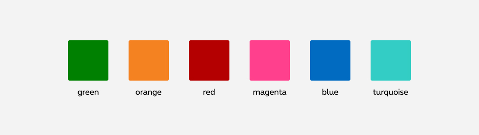
Choose bar colour, 6 are possible: "orange", "turquoise", "green", "magenta", "blue" or "red" |
"blue" "magenta" |
Here is the list of all the parameters for
| Name | Purpose | Default value |
|---|---|---|
| sColour | Choose legend colour, 6 are possible: "orange", "turquoise", "green", "magenta", "blue" or "red" | "blue" |
| sLegend | Change default legend label by what you want | "" |
| sCopy | Descriptive copy below legend label | "123456789" |
| sValue | Value on the right | "€120.99" |
How does it work
Barchart use CSS loaded on demand. You need to add data-rslib-css-load="rslib.css.barchart" attribute to load it. Inception library will load all necessary CSS.
Default graph
Bar height
Height is set via inline style: style="height:100%"
. Height is a pourcent of full table height.
No bar for a column? Just put style="height:0%"
.
Show/Hide bars column for navigation and per breakpoint
On mobile, show maximum 6 columns tr (1 or 2 bars + label). On desktop, maximum 12.
You can show/hide bars column tr
with hide
, hide-for-small-only
and show-for-medium-up
classes.
Gridding
Please, always use small gridding 12, not less. For medium-up, you can use little gridding and change bars column quantity.
Coloured bars are <td>
tag with a colour class like rs-barchart-color-blue
. Check colours list.
2 bars by column
Add one more <td> to each <tr> with its own parameters.
Bar colours
6 colours are possible: "orange", "turquoise", "green", "magenta", "blue" and "red". Just add colour class rs-barchart-color-XXX
to td
and legend, replace XXX by colour name.
Consumption comparison
Legend label orange
123456789
€120.99
Legend label turquoise
123456789
€120.99
Legend label green
123456789
€120.99
Legend label magenta
123456789
€120.99
Legend label blue
123456789
€120.99
Legend label red
123456789
€120.99
Column selected
Accessibility of selection
Labels below bars are buttons and must control show/hide state of content below the bar chart. Links them with:
-
aria-controls="ac-ID"on button - same ID on element to show and hide
Add the aria-expanded="false"
attribute to the button
tag. The value depends on the state of the element linked to the button (shown: true / hidden: false).
What to do when a column is selected
Switch button
attribute aria-expanded
between true and false depending if content below is shown or hidden.
Add rs-barchart-selected
class to tr
selected.
Add/Remove class hide
of element hidden/shown below.
Navigation
Show/Hide bars column for navigation and per breakpoint
On mobile, show maximum 6 columns tr (1 or 2 bars + label). On desktop, maximum 12.
You can show/hide bars column tr
with hide
, hide-for-small-only
and show-for-medium-up
classes.
Navigation arrows
You have to use Navigation arrows, more info inside the Design System.
Descriptive Chart Title
Disabled
Accessibility
For Screen Reader add disabled
to <button>
.
Descriptive Chart Title
Descriptive Chart Title
Descriptive Chart Title
On mobile only
Descriptive Chart Title
Below Zero
Negative value
Add rs-barchart-valneg
to <td>
tag with negative value.
By default, line of 0 is at the end of the table. You could move it by adding a class position on table container class: <div class="rs-barchart-content rs-barchart-zero-posX">
, X correspond to line of 0 position. rs-barchart-zero-pos0
is the highest, the top. rs-barchart-zero-pos10
is the lowest, the bottom.
Loading state
Accessibility of Spinner
Please check documentation of Spinner about accessibility.
Be careful with colspan
attribute on td
around Spinner. Its value depends on the number of bars per column: 2 for 1 bar, 3 for 2 bars.
After loading state
When the content is loaded:
- set the
aria-busyto false onrs-spinnerelement - add
hideclass to <tr> aroundrs-spinnerelement
Skeleton
Some content after... You can use Skeleton.
If you don't know the maximum value by default, put 0 and change the value after data are loaded.
Tag for line 0 <div class="rs-barchart-zero"></div> is not in this HTML. We don't need it before data loading.
Empty/Error state
No data or error, you can use Empty state template or Error message box.
JavaScript
The dynamization has to be added by each team according to its own needs. Please pay attention to all accessibility needs.
How to trigger the js
Barchart use CSS loaded on demand. Your HTML must contain data-rslib-css-load="rslib.css.barchart"
attribute. If HTML is added after page load, use function
CONTEXT refers to document or html element parent to the component.
After loading state
When the content is loaded:
- set the
aria-busyto false onrs-spinnerelement - add
hideclass to <tr> aroundrs-spinnerelement
Bar height
Height is set via inline style: style="height:100%"
. Height is a pourcent of full table height.
No bar for a column? Just put style="height:0%"
.
Negative value
Add rs-barchart-valneg
to <td>
tag with negative value.
Show/Hide bars column for navigation and per breakpoint
On mobile, show maximum 6 columns tr (1 or 2 bars + label). On desktop, maximum 12.
You can show/hide bars column tr
with hide
, hide-for-small-only
and show-for-medium-up
classes.
What to do when a column is selected
Switch button
attribute aria-expanded
between true and false depending if content below is shown or hidden.
Add rs-barchart-selected
class to tr
selected.
Add/Remove class hide
of element hidden/shown below.