 Design System
Please don't forget to read Usage part of each element.
Carousel
A carousel is a UI component displaying content slides horizontally, allowing users to navigate through multiple items or stories.
Overview
You can choose between 2 types of carousels, each offering a different functionality:

-
Default carousel
Multiple slides are displayed at the same time to offer the user a view on different content. -
Slider
A single slide is displayed to offer to user a focus on one specific content.
For each type of carousel, you can choose the default navigation with the navigation arrows, which we recommend, or the navigation with the bullets :

More information about the navigation between sldies
States
Slides
The carousel itself has no state. Each slide can contain different components of the Design System and each of them will have its own states (buttons, links,...). If a slide contains a unique link, then it must be completely clickable with the hand visible at the hover.
Navigation arrows
The different color versions of navigation arrows can be used, please refer to the navigation arrows article for more information about the variants and states. To ensure the button affordance, a shadow is applied on all navigation arrows except for the disabled state.
Bullet list
Bullet list navigation is only available in the positive version of the default theme.
Anatomy
-
Slide container
-
Headings area (optional)
This part contain the title and/or the subtitle of the slide. -
Content area (optional)
It contains the main content of your slide. You are free to compose your own content with the elements of the Design System. -
Navigation arrows
It allows the user to go to the previous and next slide. Anatomy details available in navigation arrows article.
Navigation between slides
You are able to navigate between slides by interacting with the navigation arrows, the bullets or by a swipe gesture.
With a auto-play carousel, users can't stop and start slide rotation, which is an essential aspect of accessibility of the carousel for a variety of people with disabilities. So it's not allowed to auto-play slides.
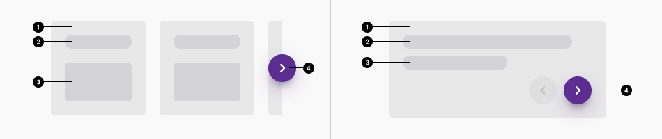
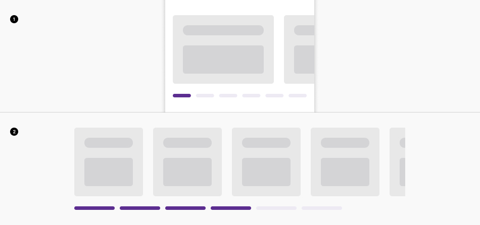
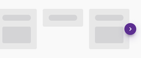
Default carousel
In the default carousel, slides don't slide one by one but by visible block of slides. If four slides are visible and three are hidden, a click on the navigation arrow will shift the four slides in order to show the next three (1, 2, 3, 4 -> 4, 5, 6, 7).
Navigation arrows can be used together or separated at your choice. The choice you make is then active in all breakpoints, it's not possible to choose one option on mobile and another on desktop.
Together
Navigation arrows are always placed together below the carousel's slides:
-
Mobile
Below the carousel's slides centered on mobile. -
Desktop
Below the carousel's slides at the right on desktop.
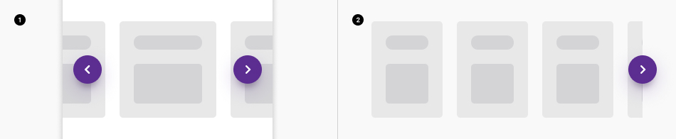
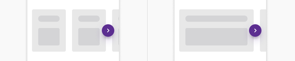
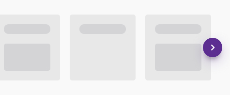
Separated
Navigation arrows are always placed separately on each side of the carousel and in overlap with the slides. They are centered on the height of the slides.
-
Mobile
-
Desktop
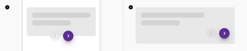
Slider
-
Mobile
Connected arrows navigations are placed overlapping on the slides and centered on mobile. -
Desktop
Navigation arrows are together by default on the slider at the bottom right on desktop..
To ensure visibility and accessibility, a safe area is defined next to the navigation arrows displayed together.
So no content may be displayed in this zone.
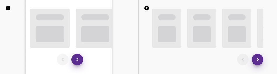
Bullet list
Another way to navigate between slides is to use the navigation indicator. These are small lines just below the carousel. Each line represent a slide and you can click on a line to navigate to a slide.
All the bullets showing the active content: Mobile view (1) and desktop view (2).
Composition options
The composition options are based on our default grid. Please refer to these articles for more information on the gridding and background out of grid.
Default carousel
Default composition
Composition of carousel is set to the grid. By default, you can have a maximum of 4 slides fully visible at a time per row in desktop, the 5th is cut as preview.

And a maximum of 2 slides per row on mobile:
Fullwidth
The fullwidth option allows for up to 4 slides to be displayed simultaneously. It also provides a preview of the next slides by displaying them at a lower opacity outside of the grid. Users cannot interact with these slides even if they contain a link.

This option is only available for desktop, on mobile mode the composition goes back to default.
Slider
Default composition
The composition of the slider is set to the grid. On desktop, you can set the slider's width to the number of columns you need to follow your needs with a minimum of 3 columns.

On mobile, the slider always takes the full grid.
Outgrid
On desktop, the outgrid option allows you to set the slider's width to the number of columns you need. And have the background color or image extend out of the grid, to either bounds of the window.

On mobile, outgrid slider takes the fullwidth, like the fullwidth option here below.
Fullwidth
The fullwidth option allows you to set the slider's width to fullwidth on desktop and mobile.

The content inside the carousel is also set to the grid. This means you can define the width of the content depending on your needs. For example the content can be displayed on a part of the slide to allow the display of a background image.
Best practices
Height
The height of the slides is based on the highest slide of the row.
Do
Don't
Full clickable
If your slide contains a single link, then it must be completely clickable with a pointer visible on hover.
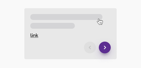
Do
The default cursor becomes a pointer on hover. There is no hover effect on the slide itself, but rather on the call to action (link or button) once it is hovered.
Consistency
Use the same kind of components in each slide:
Do
Use the same type of buttons.
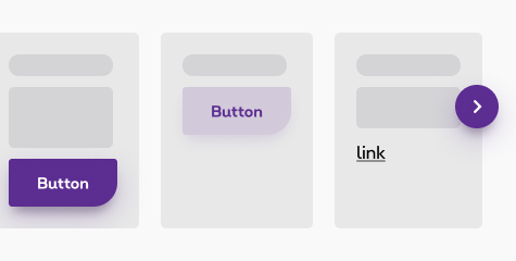
Don't
Avoid to use a mix of type of buttons
One slider or carousel at a time
Only one slider can be used in the same row.

Do

Don't
Sizes and colors
Default carousel
If the carousel/slider isn't informative, you must put an a
with id
of the section next to the carousel/slider and must be visible only on focus. The text of this link must be:
FR: "Contenu de carrousel, passer à la section suivante.";
EN: "Carousel content, skip to the next section.";
DE: "Carousel inhoud, ga naar de volgende sectie.".
The container of all slides, data-carousel-row
, must have an aria-live="polite"
attribute.
Every slide, data-carousel-column , must have:
-
role="group"attritube; -
aria-roledescription="slide"; -
aria-label="Slide x of y", x is the slide number and y the total. (added automatically in JavaScript in all langages)
Thanks to all this attributes the screen reader will be able to read the showed slide content by clicking on prev/next button. And then navigate in it if he wants to click on a link inside.
The carousel/slider with arrow can't take the attribute autoplay anymore for accessibility reason.
Informative carousel
Inside the columns of the carousel, you can organize the content however you want. Here is the basic example, if you need a background image or something else, feel free to check the panel article.
Lorem ipsum
Subtit
[content]
Lorem ipsum
Subtit
[content]
Lorem ipsum
Subtit
[content]
Lorem ipsum
Subtit
[content]
Lorem ipsum
Subtit
[content]
Lorem ipsum
Subtit
[content]
Carousel with arrow below
Different colors are available for the navigation arrow. To have these, add arrowColor
inside data-carousel-options
.
- purple (default): primary navigation arrow;
-
"arrowColor": "secondary": secondary navigation; -
"arrowColor": "neg": negative primary navigation.
Lorem ipsum
Subtit
[content]
Lorem ipsum
Subtit
[content]
Lorem ipsum
Subtit
[content]
Lorem ipsum
Subtit
[content]
Lorem ipsum
Subtit
[content]
Lorem ipsum
Subtit
[content]
Lorem ipsum
Subtit
[content]
Lorem ipsum
Subtit
[content]
Lorem ipsum
Subtit
[content]
Lorem ipsum
Subtit
[content]
Lorem ipsum
Subtit
[content]
Lorem ipsum
Subtit
[content]
Full width carousel
A carousel with items external to the gridding visible. Add rs-carousel-no-overflow
to rs-carousel
+ isFullWidth: true
in the data-carousel-options
Sliders
If you want to have a slider instead of a carousel, just add slider: true
in the data-carousel-options
.
Lorem ipsum
Subtit
[content]
More infosLorem ipsum
Subtit
[content]
More infosLorem ipsum
Subtit
[content]
More infosNegative Slider
Lorem ipsum
Subtit
[content]
More infosLorem ipsum
Subtit
[content]
More infosLorem ipsum
Subtit
[content]
More infosFull width slider
Slider who takes full screen width.
The gridding where the arrow are injected can be adapt to the content gridding. If you have a slide where the content takes only a medium-6
, set arrowGridding
to small-12 medium-6
in the data-carousel-options
.
Negative
Outgrid slider
Sliders also exist in outgrid layout.
If the outgrid slider isn't informative, you must put an a
with id
of the section next to the slider and must be visible only on focus. The text of this link must be:
FR: "Contenu de carrousel, passer à la section suivante.";
EN: "Carousel content, skip to the next section.";
DE: "Carousel inhoud, ga naar de volgende sectie.".
The container of all slides, rs-outgrid-panel
, must have an aria-live="polite"
attribute.
Every slide, data-outgrid-slide , must have:
-
role="group"attritube; -
aria-roledescription="slide"; -
aria-label="Slide x of y", x is the slide number and y the total.
Thanks to all this attributes the screen reader will be able to read the showed slide content by clicking on prev/next button. And then navigate in it if he wants to click on a link inside.
Slider without arrow
This slider don't generate arrow and work without JavaScript. You can see all examples on one page.
It exists for breakpoints.
-
rs-slider-s: for small only -
rs-slider-m: for medium only -
rs-slider-l: for large up
Small only devices
Obviously it appears only on mobile. Small only slider - example
Medium only devices
Obviously it appears only on medium devices. Medium only slider - example
Large up devices
Obviously it appears only on large devices. Large up slider - example
Slider without arrow - autoplay
You can see all examples on one page:
- Small only slider - autoplay example
- Medium only slider - autoplay example
- Large up slider - autoplay example
This slider is the only one who accepts automatic slide because it has a play/pause button.
The button pause must have an aria-label="Pause slideshow"
translated in each language. Once the button is clicked, it automatically change the aria-label according to the status of the slider.
- fr: Mettre le diaporama en pause;
- nl: Pauzeer de diavoorstelling;
- de: Diashow anhalten.
Carousel with bullet
Add rs-carousel-hasbullet
to carousel div
parent. Add this options "dots": true
to have dot. This option could be used together with "navigation": {}
to remove arrow.
Lorem ipsum
Subtit
[content]
Lorem ipsum
Subtit
[content]
Lorem ipsum
Subtit
[content]
Lorem ipsum
Subtit
[content]
Lorem ipsum
Subtit
[content]
Lorem ipsum
Subtit
[content]
JavaScript
Carousels/sliders
Each time you add Carousel to the page, you have to use this JS function
ELS refers to all elements carousel, for exemple
BREAKPOINTS refers to breakpoints. It's not mandatory to be set.
SETTINGS refers to options. It's not mandatory to be set.
You can have different carousel/slider regarding the attributes you put inside the following data-attribute:
To have a different gridding, you can modify data-carousel-breakpoints="[0, 1], [641, 3],[1025, 4]"
.
- small screen: [0, ...]
- medium screen: [641, ...]
- large screen: [1025, ...]
Carousel has js property you can put in an data-carousel-options
attribute inside the <div class="rs-carousel">
. Be careful that this attribute is an object!
| Parameter | Default value if nothing is set |
|---|---|
| "isTable" -> allow to see the beginning of the next slide | true |
| "jump" -> goes 3 per 3 slides when arrow is clicked | true |
| "slider" | false |
| "arrowColor" | "white" |
| "isFullWidth" | false |
| "isArrowTogether" | false (true if slider is true) |
| "arrowGridding" -> adapt the gridding of the injected arrows | "small-12" |
Slider without arrow - autoplay
Each time you add Slider without arrow autoplay to the page, you have to use this JS function
EL refers to element slider, for exemple
CONTEXT refers to document or html element parent.
If the slider is automatic, add data-options='{"autoplay": ...}'
attribute to .rs-slider
with the number (in milliseconds) you need.