 Design System
Please don't forget to read Usage part of each element.
Gridding
Create powerful multi-device layouts quickly and easily with the default 12-column, nest-able Zurb Foundation (5.1.0) grid. If you're familiar with grid systems, you'll feel right at home. If not, you'll learn quickly.
Responsive layout grid
Proximus responsive layout grid adapts to screen size and orientation, ensuring consistency across layouts.
The grid is mobile-first and fundamental to everything we design. The gridding is the geometric foundation of all the visual elements of Proximus UI, from typography to columns, boxes, icons, and illustrations. It provides structure and guidance for all creative decision-making.
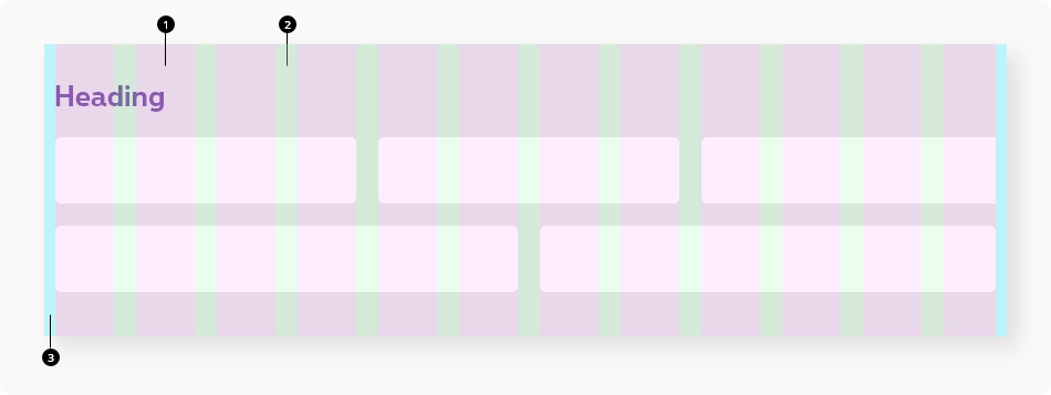
Anatomy
The layout grid is made up of three elements: columns, gutters, and margins.
-
Columns
Content is placed in the areas of the screen that contain columns. -
Default gutters
Gutters are the spaces between columns. They help separate content. Gutters are present by default and identical amongst all breakpoints. For closely related content, the grid gutters can be collapsed. -
Margins
Margins are the space between content and the left and right edges of the screen. Margin widths are defined as a fixed value for all the breakpoint.
Expanded grid
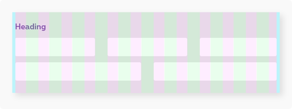
In some specific cases, we can used bigger gutters. With the expanded grid, gutters and columns have different values than the default one for medium up, margins remain the same.
Style
| Mobile | Tablet | Desktop | |
|---|---|---|---|
| Columns width | Depending of the width of the screen | ||
| Default gutters | 2rem | ||
| Margins left & right | 1rem | ||
| Expanded grid gutters | 2rem | 4rem | |
Basic
Start by adding an element with a class of row. This will create a horizontal block to contain vertical columns.
Then add divs with a columns class within that row. You can use column or columns -
the only difference is grammar. Specify the widths of each column with the small-#, medium-#, and large-#
classes.
Foundation is mobile-first. Code for small screens first, and larger devices will inherit those styles. Customize for larger screens as necessary (Show-for-medium is better than hide-for-small).
To avoid misunderstandings, we decided to make mandatory the definition of small sizes even for small-12.
Nesting
You can nest the grids indefinitely, though at a certain point it will get absurd.
Incomplete Rows
In order to work around browsers' different rounding behaviors, Foundation will float the last
column in a row to the right so the edge aligns (yes, it means the last column is not perfectly the same 1/12th). If your row doesn't have a count that adds up to
12 columns, you can tag the last column with a class of end in order to override that behavior.
Offsets
Move blocks up to 11 columns to the right by using classes like .large-offset-1 and .small-offset-3
Collapse rows
The Zurb Foundation collapse
class lets you remove column gutters (padding).
To collapse row columns gutters per breakpoint, you can use following rslib classes classes:
-
rs-collapse-for-small-only -
rs-collapse-for-medium-only -
rs-collapse-for-medium-up -
rs-collapse-for-large-up
Centered columns
Center your columns by adding a class of small-centered to your column.
Large will inherit small centering by default, but you can also center only on large by applying a
large-centered class. To uncenter on large screens use large-uncentered.
Centered/uncentered classes are off course available for all device sizes.
Push/pulls
Using these source ordering classes, you can shift columns around between our breakpoints.
This means if you place sub-navigation below main content on small displays, you have the option
to position the sub-navigation on either the left or right of the page for large displays.
Prefix push/pull with the size of the device you want to apply the styles to.
medium-push-#, large-push-# is the syntax you'll use.
Use large-reset-order to reset pushed or pulled columns to their
original position on large screens.
Expanded gridding (larger gutters)
To allow bigger gutters between columns in a row, you can add rs-xpandgrid
to <div class="row">
Lorem ipsum
Lorem ipsum
Auto/Last
Using the classes rs-auto and rs-last, you can collapse the first column to the content
and use the remaining space to the second column.
Auto/Last (flex shrink code)
Using the classes rs-flex-row, rs-flex-column and rs-flex-shrink, you can collapse one column to the content
and use the remaining space to the other column.
Flex column class for auto/last gridding is rs-flex-column
without "s".
rs-flex-columns with "s" is used for classic flex gridding with small-12, medium-6,... sizes classes.
Flex shrink/grow per breakpoint
You may also need a flex shrink or grow (to force an element to fill up the remaining space) for a specific device, you can use following classes per breakpoint:
| Small only | Small up | Medium only | Medium up | Large only | Large up | |
|---|---|---|---|---|---|---|
| Shrink | rs-flex-shrink-small-only
|
rs-flex-shrink
|
rs-flex-shrink-medium-only
|
rs-flex-shrink-medium
|
rs-flex-shrink-large-only
|
rs-flex-shrink-large
|
| Grow | rs-flex-grow-small-only
|
rs-flex-grow
|
rs-flex-grow-medium-only
|
rs-flex-grow-medium
|
rs-flex-grow-large-only
|
rs-flex-grow-large
|
Flex gridding
Flex gridding is a variant of traditional gridding. The difference is the usage of css flex properties instead of left or right float position.
-
rs-flex-rowinstead of row -
rs-flex-columnsinstead of columns - All sizes classes (
small-12, medium-12, large-12,...remain unchanged
Flex column class is rs-flex-columns
with "s".
rs-flex-column without "s" is used for auto/last flex gridding .
Basic flex gridding
Nesting
You can nest the flex grids indefinitely, though at a certain point it will get absurd.
Collapse flex rows
rs-flex-collapse
class lets you remove flex column gutters (padding).
To collapse flex row columns gutters per breakpoint, you can use following rslib classes classes:
-
rs-flex-collapse-for-small-only -
rs-flex-collapse-for-medium-only -
rs-flex-collapse-for-medium-up -
rs-flex-collapse-for-large-up
Expanded flex gridding (larger gutters)
To allow bigger gutters between flex columns in a flex row, you can add rs-xpandgrid
to <div class="rs-flex-row">
.
An expanded flex grid should be nested in a grid to work properly.
Lorem ipsum
Lorem ipsum
Flex order (push/pull)
You can change the order of flex columns per breakpoint with following classes:
-
rs-order-sX -
rs-order-mX -
rs-order-lX
(X is a number between 1 and 10 included.)
Columns will be sorted by ascending number. If you put no order class, it means the position is 0 so this content will be displayed first.
I'm first on mobile, second on medium up
I'm second on mobile, first on medium up
Horizontal alignment for flex elements
To align along the main axis, you can use following classes:
| Breakpoint | Align Left | Align Right | Align center | Space between |
|---|---|---|---|---|
| Small up | rs-justify-left
|
rs-justify-right
|
rs-justify-center
|
rs-justify-between
|
| Small only | rs-justify-left-small-only
|
rs-justify-right-small-only
|
rs-justify-center-small-only
|
rs-justify-between-small-only
|
| Medium up | rs-justify-left-medium
|
rs-justify-right-medium
|
rs-justify-center-medium
|
rs-justify-between-medium
|
| Medium only | rs-justify-between-medium-only
|
|||
| Large up | rs-justify-left-large
|
rs-justify-right-large
|
rs-justify-center-large
|
rs-justify-between-large
|
| Large only | rs-justify-between-large-only
|
Vertical alignment for flex elements
To align along the cross axis, you can use following classes:
| Breakpoint | Align Top | Align Bottom | Align middle |
|---|---|---|---|
| Small up | rs-flex-top
|
rs-flex-bottom
|
rs-flex-middle
|
| Small only | rs-flex-top-small-only
|
rs-flex-bottom-small-only
|
rs-flex-middle-small-only
|
| Medium up | rs-flex-top-medium
|
rs-flex-bottom-medium
|
rs-flex-middle-medium
|
| Medium only | rs-flex-top-medium-only
|
rs-flex-bottom-medium-only
|
rs-flex-middle-medium-only
|
| Large up | rs-flex-top-large
|
rs-flex-bottom-large
|
rs-flex-middle-large
|
| Large only | rs-flex-top-large-only
|
rs-flex-bottom-large-only
|
rs-flex-middle-large-only
|
Flex direction
By default, content is aligned horizontally. You could change direction to vertical by using .rs-flex-dir-col
to your row or flex element.
It can also be done per breakpoint with following classes:
| Small up | rs-flex-dir-col
|
| Small only | rs-flex-dir-col-small-only
|
| Medium up | rs-flex-dir-col-medium
|
| Medium only | rs-flex-dir-col-medium-only
|
Flex no wrap
To force all flex items to be on one line per breapoint, you can use following classes:
| Small only | rs-flex-nowrap-small-only
|
| Medium up | rs-flex-nowrap-medium
|
| Medium only | rs-flex-nowrap-medium-only
|
| large up | rs-flex-nowrap-large
|
| large only | rs-flex-nowrap-large-only
|
Flex utility classes
rs-flex
|
To transform an element to a flex element (display: flex;). To avoid issue with IE, you need to combine rs-flex
with rs-maxw
|
rs-flex-row-wrap
|
To transform an element to a flex element (display: flex;) and make its children go one next to the other and wrap onto multiple lines (flex-flow: row wrap;) |
rs-flex-auto
|
To make a flex item grow or shrink to fit the space available in its flex container (flex: auto or flex: 1 1 auto;) |
rs-flex-inline
|
To make a flex container display inline (display: inline-flex;) |
rs-flex-dir-row-small-only
|
To make flex items be one next to to other in the flex container on mobile only (flex-direction: row;) |