 Design System
Please don't forget to read Usage part of each element.
Navigation arrows
Allow to navigate easily trough content. Whether it's through pages, slides or carousels.
Overview
It comes handy when you need to split content and offer a easy way to navigate through content. Use navigation arrows in your carousels or as pagination.
You can choose the type of navigation arrows according to the visual importance you wish to give them.
-
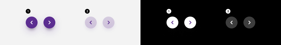
Primary navigation arrows
Use this one as the main call to action on of the components. -
Secondary
For secondary actions.
States
-
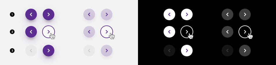
Default state
State visible before click. -
Hover/focused states
State visible when the cursor hovers the navigation arrow and triggered by keyboard navigation or click. Cursor becomes a pointer. -
Disabled state
State visible if the navigation arrow is not clickable.
Placement
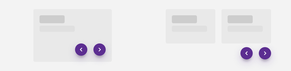
Navigation arrows can be used together or separated.
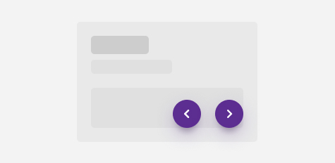
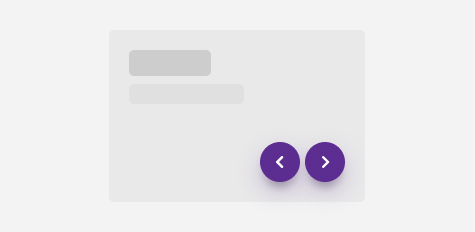
Together
Separated
Best practise
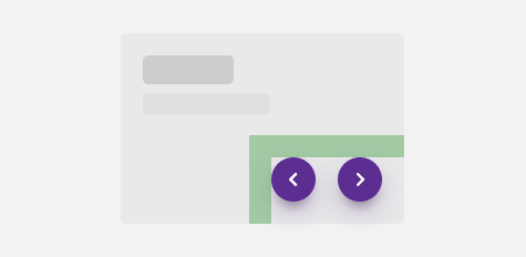
Safe area
Always keep a safe area around each navigation arrow to avoid the overlapping with content.
Do
Don't
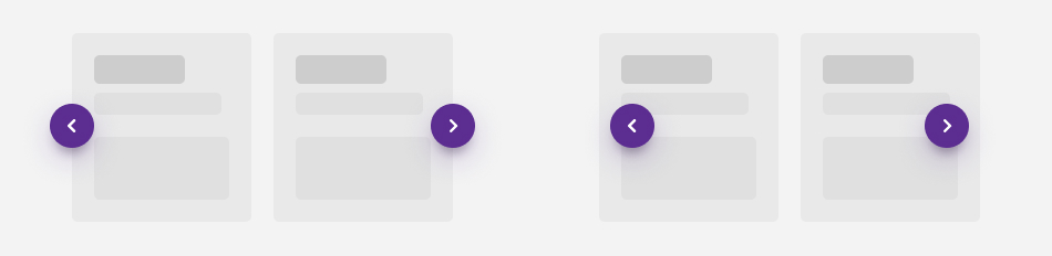
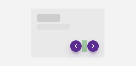
Distance
Navigation arrows placed together must be spaced far enough apart for the user to distinguish them .
Do
Don't
Sizes and colors
Label of each arrow is available for screen readers and must be translated in the aria-label
of the <i>
tag.
Navigation arrows can be generated with helpers called
Here is the list of all the parameters:
| Name | Type | Description | Default value |
|---|---|---|---|
| bBtn | boolean | Is it <button> instead of <a> | false |
| bDisabled | boolean | Is the arrow disabled | false |
| sXtraClass | string | Extra class to rs-navigation-arrow
container |
"" |
Default navigation arrows
Add rs-navigation-purple
class to navigation container.
Negative
Add rs-navigation-white
class to navigation container.
Secondary
Negative
Add rs-navigation-neg
class to navigation container.
Disabled arrow
For Screen Reader add:
-
aria-disabled="true" tabindex="-1"to <a> -
disabledto <button>
Add rs-disabled
class to disabled arrow container.