 Design System
Please don't forget to read Usage part of each element.
Fonts
Proximus needs to offer a clear way to display text.
Typesetting at Proximus digital
Typesetting controls the readability of a text with the size, style, and spacing of its type. It's a function of microtypography (how text is styled within a text block) and macrotypography (how content elements are arranged on the page). The more readable a text the more easily users can understand its content. Text with poor readability turns off readers and can make it challenging for them to stay focused.
Easy-to-read constitutes a great extra reading to write and produce content that is accessible for all.
Typeface: Proximus font
Proximus uses its own font: Proximus font. It has been designed with love to meet Proximus standards and reflects all the aspects of the brand and the products. It can be downloaded via our DAM: Proximus font.
Proximus Light
abcdefghijklmnopqrstuvw
ABCDFGHIJKLMNOPQRSTUVWXYZ
0123456789(.;:/?!+)...&*
Proximus Regular
abcdefghijklmnopqrstuvw
ABCDFGHIJKLMNOPQRSTUVWXYZ
0123456789(.;:/?!+)...&*
Proximus Bold
abcdefghijklmnopqrstuvw
ABCDFGHIJKLMNOPQRSTUVWXYZ
0123456789(.;:/?!+)...&*
Proximus ExtraBold
abcdefghijklmnopqrstuvw
ABCDFGHIJKLMNOPQRSTUVWXYZ
0123456789(.;:/?!+)...&*
Fallback font
If the font is not displayed in a browser, the fallback font is Verdana. Verdana is the default font used on the e-mails for technical reasons.
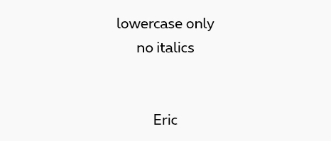
Rules
- No italics and condensed versions for web usage.
- No transformation and effect on the font.
- No accent on capital letters
Do
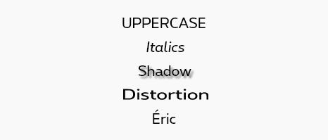
Don't
If you need add emphasis on one and some words, you can use the Proximus bold. Font weight is an important typographic variable that can add emphasis and differentiate content hierarchy.
Type scale
Proximus.be uses a common library with defined text sizes and line height. Refer to the Style tab to have all the details.
Body text
Body text normal is always Font Proximus Text Font Regular and its typically used for long-form writing
Lorem ipsum dolor sit amet, consectetur adipisicing elit, sed do eiusmod tempor incididunt ut labore et dolore magna aliqua. Ut enim ad minim veniam, quis nostrud exercitation ullamco.
Caption and footnotes
Caption and footnotes are the smallest font sizes. They are used sparingly to annotate a table or give more small information.
Lorem ipsum dolor sit amet, consectetur adipisicing elit, sed do eiusmod tempor incididunt ut labore et dolore magna aliqua. Ut enim ad minim veniam, quis nostrud exercitation ullamco.
Alignment
While right-aligned, centered, and justified text have their place, most websites benefit from a consistent use of left-aligned text. Justified text, common in print, does not yet display well enough in a web browser to be considered a best practice.
Type set flush left provides the eye a constant starting point for each line, making text easier to read.
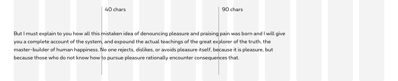
Line length
Controlling the length of lines of text helps readers attention flow easily from one line to the next, making reading more natural and comfortable. While a line between 40 and 90 characters can be considered as readable, we tend to suggest to have lines somewhere around 40 to 60 characters in body text and 20 to 40 characters for shorter text (such as headings).
Paragraph spacing
Information architecture is the key to a comprehensive and readable content. Relationship between text element is affected by spacing, more space will distinguish one element from the other while less space will group them together. Making sure to use spacing wisely will help your content to be more comprehensive.
Type scale
Our scale has been built to provide hierarchy and consistency for all cases throughout Proximus digital experience. Both mobile and desktop have their own factor in order to correspond to their specific needs.
Refer to the text sizes article to have all the detailed text sizes.
Type color
Refer to the text colors article to have all the detailed text colors.
Font family classes
Paragraph
To use a paragraph, place your text in a <p>
Lorem ipsum dolor sit amet...
Span
The <span> tag is inline. You can integrate it inside your paragraph in order to specify a typographical difference without affecting the layout.
Lorem ipsum dolor sit amet...
Strong
The <strong> tag is used to mark a text that you want to emphasize, it will be displayed in bold using the ProximusBold font.
Lorem ipsum dolor sit amet...
Body text sizes
It's possible to adapt the size of your content by adding a class to your elements. To do this, redirect you to the section Text sizes.
Font colors
It's possible to change the color of the typeface by simply adding a class starting with 'rs-txt-' followed by the desired color. For example rs-txt-blue
. You will find all references in section Text Colors.
Alignments
It's possible to play on the justification of the texts, for that redirect you to the section Alignment.