 Design System
Important information:
Using the Design System implies following some rules: the code should be valid and same as the Design System. Meaning custom HTML & CSS override are forbidden.
Please don't forget to read Usage part of each element.
Please don't forget to read Usage part of each element.
Themes
A theme is an intentional, systematic customization of Proximus. It has unique visual attributes.
last modified: 15/09/2023 15:40:07
Overview
Themes are used to customize and apply color, typography, and style that reflects a specific brand or style while maintaining consistency with underlying design structure.
-
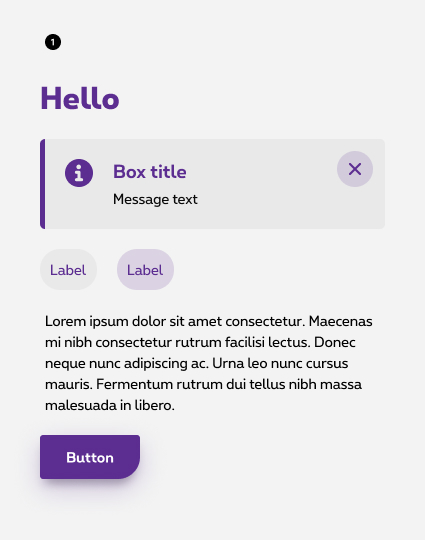
Proximus (default) theme
See all about Proximus theme -
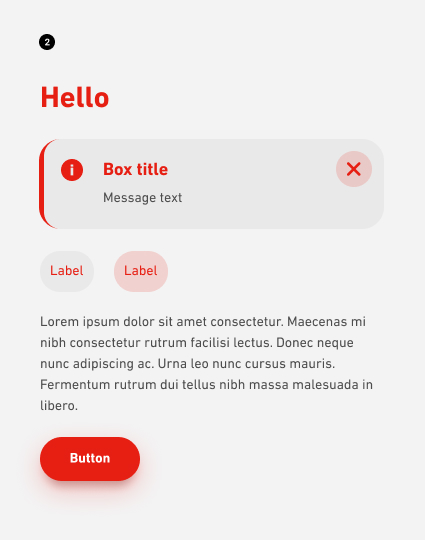
Scarlet theme
See all about Scarlet theme -
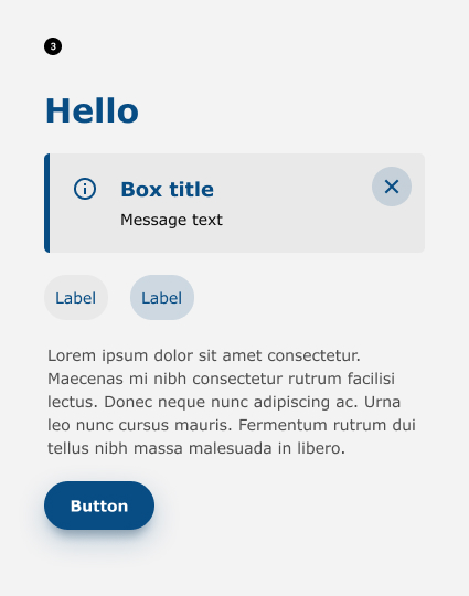
White label theme
See all about White label theme
How to look at themes through design system components
Proximus being the default theme, all usage documentation is writing with Proximus examples and can be apply to other themes. In the HTML tab, you can easily navigate into the different themes of the component via the right dropdown.