 Design System
Please don't forget to read Usage part of each element.
UI Designer
If you're just starting out designing with Proximus Design System, you're in the right place.
Install design kits
Our primary design kit is Figma. Head on over to the Design kit section and follow the install instructions to use it properly.
This kit comes with Proximus Design System components so you don’t have to build them. By using the kit you automatically get any updates made by the Proximus UI team so you don’t need to go back and change any designs to match the latest release. And when handing off to your developers there won’t be confusion about the component and its behaviors.
In Other resources, you’ll find links to the icon library and fonts.
Learn about foundational guidance
Learn what drives Proximus design philosophy and principles so that you can make informed decisions in your product work.
Guidelines | Photography guidances (.pdf - 202MB)
Make all design fully accessible
Accessibility means making digital products/content easy to use and understandable for users in general.
Discover accessibility guidelines
BOSA Accessibility Check bookmarklet
Check that the page conforms to accessibility standard.
Review our usage guidance
Our usage guidance is detailed and thorough, and you’ll learn a lot about the system by reading through the basic elements, components, templates and datavisualization documentation.
- Basic Elements: Discover our ground principles to build digital products.
- Components: Find all the available building blocks to compose your pages.
- Templates: Reusable combinations of components that address common user objectives with sequences and flows.
- Data Visualization: Graphical representation to present information/data and provide an accessible way to see and understand trends, outliers, and patterns in data.
UI Kit
The Proximus UI kit contains the basic elements and components you need to get started and rapidly build beautiful and accessible experiences. It's a shared library available on demand. Feel free to drop us an email to get latest version of it.
Request the UI Kit library access
What's included?
All the basic elements, components, templates and data visualization are available in the UI Kit in Figma. There are all available in positive and negative modes, for all themes and for mobile and desktop design.
Start designing
Open Figma
To design with Proximus UI Kit you must have access to Figma.Create a new project
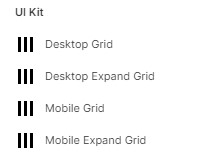
Choose one of the pre-defined Grid Styles in the UI Kit as Layout grid.
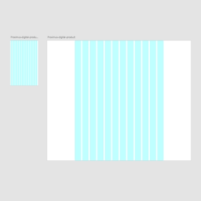
Frame width Column number Gutter width Margins* Mobile 375px 12 20px 15px Desktop 1920px 12 20px 370px *left & right distance between the layout grid and the edge of the artboard
Start designing!
From the moment we shared you the Ui Kit library, you can link the library to your working file and start designing mobile first! You will also be notified when an update is available.
We make small adjustments and updates to the kit on a regular basis. When we make a change, you will be notified via an "update" button. Updates are important, we recommend you keep your kit as up to date as possible.
Proximus Font

Proximus uses its own typeface, which is distinctive and contemporary yet simple and not too stylize. It expresses our personality and is key to the visual style in which we convey our messages. Icons are included in the Proximus UI Kit.
Explore the Fonts and the Headings guidelines to learn how to use it.
Request the Proximus font for all your digital products.
Icon font
Proximus has its own set of icons. For web projects, the best format is our easy-to-use icon web font.
Explore the Icons guidelines to learn how to use it.