 Design System
Please don't forget to read Usage part of each element.
Typography
Typography needs to offer a clear way to display text. It helps us create hierarchies, organize information, and guide our users through pages.
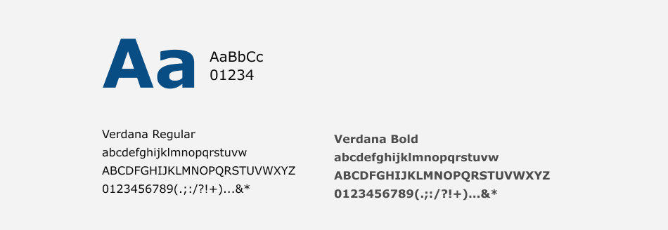
Typeface
White label, as neutral theme, uses the classic Verdana font.
Typography components
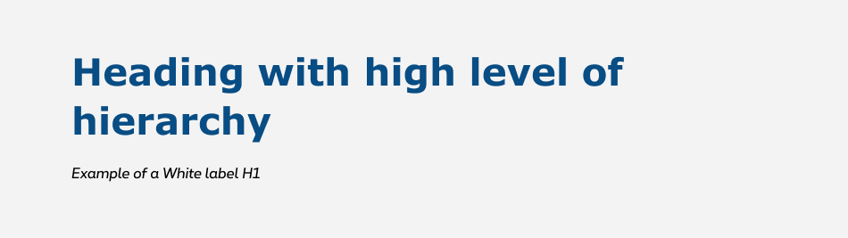
Headings
Heading is used to create various levels of typographic hierarchies.
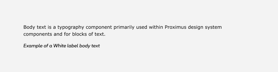
Body text
Body text normal is always DIN Next LT Pro Font Regular and its typically used for long-form writing
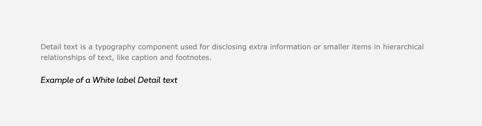
Detail text
Detail text is used for disclosing extra information or smaller items in hierarchical relationships of text. As caption and footnotes who are the smallest font sizes. They are used sparingly to annotate a table or give more small information.
Type scale
Each theme uses a common library with defined text sizes and line height. As Proximus being the default theme, all usage documentation is writing with Proximus examples and can be apply to other themes. Refer to Text sizes to have all the details.
Alignment
The standard alignment is left.
Typesetting
Typesetting controls the readability of a text with the size, style, and spacing of its type. It's a function of microtypography (how text is styled within a text block) and macrotypography (how content elements are arranged on the page). The more readable a text the more easily users can understand its content. Text with poor readability turns off readers and can make it challenging for them to stay focused.
Easy-to-read constitutes a great extra reading to write and produce content that is accessible for all.
Type scale
Scale has been built to provide hierarchy and consistency for all cases throughout Proximus digital experience. Both mobile and desktop have their own factor in order to correspond to their specific needs.
Each theme uses a common library with defined text sizes and line height. As Proximus being the default theme, all usage documentation is writing with Proximus examples and can be apply to other themes. Refer to Text sizes to have all the details.
Type color
Each theme follow the same color system. As Proximus being the default theme, all usage documentation is writing with Proximus examples and can be apply to other themes. Please refer to Text colors to have all the details.
Font family classes
Paragraph
To use a paragraph, place your text in a <p>
Lorem ipsum dolor sit amet...
Span
The <span> tag is inline. You can integrate it inside your paragraph in order to specify a typographical difference without affecting the layout.
Lorem ipsum dolor sit amet...
Strong
The <strong> tag is used to mark a text that you want to emphasize, it will be displayed in bold using the ProximusBold font.
Lorem ipsum dolor sit amet...
Body text sizes
It's possible to adapt the size of your content by adding a class to your elements. To do this, redirect you to the section Text sizes.
Font colors
It's possible to change the color of the typeface by simply adding a class starting with 'rs-txt-' followed by the desired color. For example rs-txt-blue
. You will find all references in section Text Colors.
Alignments
It's possible to play on the justification of the texts, for that redirect you to the section Alignment.