 Design System
Please don't forget to read Usage part of each element.
Search fields
expiry date: 30/04/2021
Search allows users to enter keywords or a phrase to find relevant result without the use of navigation.
Types
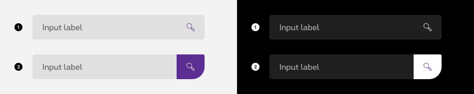
- Default search field - As-you-type suggestion search
If you wish to offer suggestions to the user (e.g. fuzzy, elactic or autocomplete searches), this option is very handy and enables dynamic results. - Search field with button
When a search is static, this option allows the users to type in its request and hit the search button in order to submit the search request.
Forms can be simple or complex, so we have prepared clear recommendations for you to use. These guidelines will help you build your forms and maintain consistency between all the forms of our digital platforms. Discover our recommandations to build a form.
States

For all the input field states info, please refer to the text field article.
- Default state
State visible before click. Field and label are displayed. No user input yet. - Active state
State visible when the field is focused. - Hover/Focus state
State visible when the cursor hovers the suggestion and triggered by keyboard navigation or click.
Autocomplete
If you wish to offer suggestions to the user (e.g. fuzzy, elactic or autocomplete searches), this option is very handy and enables dynamic results.
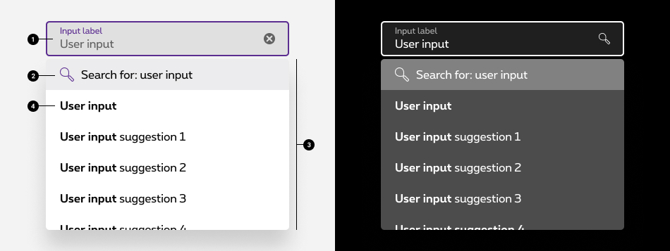
Default autocomplete
-
Text field state
Allows users to open the options panel. For more info about the field, check out the text field article. -
Search for the input
If the user wish to search for the specific string he entered, this first item of the list will act as the submit button. It differs from the rest of the elements in the list by its color and the magnifying glass icon. -
Suggestions panel
The suggestion panel open when the user start typing, this panel contains all the the items that the system found. -
Suggestion
Each suggestion item within the list is a clickable element that triggers the search with the specific element clicked.
Add a suggestion
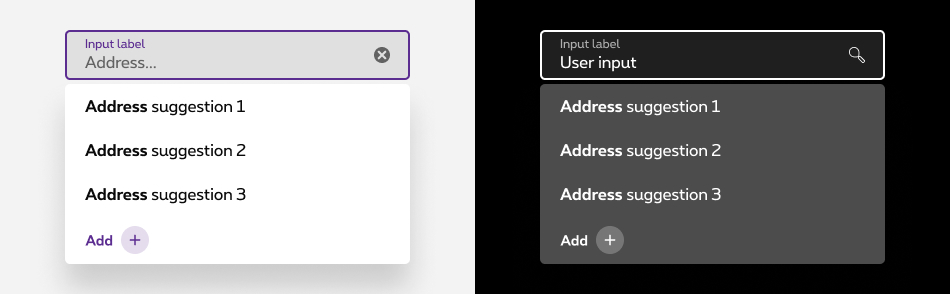
In some cases, you should prevent the users ending up with an empty result. Hence, you can offer them to add their input to the list of entries, they'll be able to move forward in the flow their currently in.
This is an optional element of the component. Before using this option, make sure that the data model allows this option.
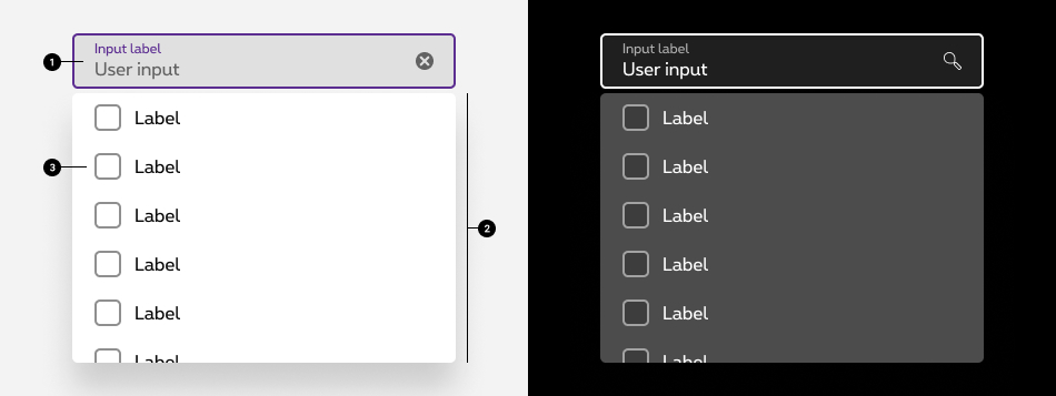
Complexe autocomplete with checkboxes
-
Text field state
Allows users to open the options panel. For more info about the field, check out the text field article. -
Suggestions panel
The suggestion panel open when the user start typing, this panel contains a list of options to select from that the system found. -
Suggestion
Each option item within the list is a checkbox element that triggers the search with the specific checkbox clicked. Multiple checkboxes can be selected at once.
Sizes and colors
All form fields have a 100% width so they need to be included in a gridding to have the wished size.
Each <input>
must be wrapped within <div class="rs-form-item">
container. This container must contain <input type="search">
and <label>
linked to the input thanks to for
attribute refering to the <input>
id
.
We put ac-
prefix (abbreviation for "accessibility") to know that this id
has been added for accessibility matter.
By default, all form fields are mandatory, except those mentionned with (optional) in the label.
Default search
Default negative search
rs-form-neg
class added on <form>
or a <div>
container (if <form>
is not needed in particular cases like with Angular) allows to switch all form fields to negative version.
Search with button
Search fields can be combined with a button as a standalone form.
Search loading
Error search
To use Zurb Foundation form check javascript, data-abide="ajax"
should be added to <form>
so error
class will be added/removed dynamically when needed, for example if <input>
is required.
The <span>
error message should have an id
which should be referenced in the <input aria-describedby="ac_error_id">
for screen readers when the error is displayed.
id
is prefixed with "ac-" (as accessibility abbreviation) to know this is added for accessibility matter.
Javascript will display the error automatically.
Search with helper text
The <span>
helper text should have an id
which should be referenced in the <input aria-describedby="ac_helper_id">
for screen readers.
id
is prefixed with "ac-" (as accessibility abbreviation) to know this is added for accessibility matter.
Disabled search
Just add disabled
attribute to both <input>
and <button>
.
Search autocomplete
Following attributes have to be added to <input> for screenreaders to understand the list related to the search field:
-
role="combobox": a combo box is an edit control with an associated list box that provides a set of predefined choices -
autocomplete="off"stops browsers from showing their own suggestions, which would interfere with those offered by our component -
aria-autocomplete-
aria-autocomplete="list": indicates that the autocomplete behavior of the text input is to suggest a list of possible values in a popup related to the string present in the textbox -
aria-autocomplete="both": indicates that the autocomplete behavior of the text input is to both show suggest a list of possible values in a popup related to the string present in the textbox and a predicted/preselected value in that list
-
-
aria-expanded="false"tells users whether the search list is expanded or collapsed by toggling its value betweentrueorfalse, must be updated each time search list is visible or not -
aria-controls="ac-searchList-ID"containing the ID of <ul> list -
aria-activedescendant=""refer to the currently active element (ID of focused <li> via keyboard), must be updated each time user press navigation keys like Arrow Up and Down
Following attributes have to be added to <ul> :
-
id="ac-searchList-ID"must contain the same value asaria-controls="ac-searchList-ID"on <input> -
role="listbox" -
tabindex="-1"to make search list inside clickable but not focusable -
aria-labelledby="ac-title-ID"linked to label
Following attributes have to be added to <li>
- unique
idon selectable items put insidearia-activedescendant=""when selected -
role="option"on selectable items -
aria-selectedtells users which option within the list is visually selected or not by toggling the value betweentrueorfalse, must be updated each time user press navigation keys like Arrow Up and Down -
aria-live="polite" role="status"on search status if used
Search Autocomplete is a webcomponent which needs data-rslib-webcomponent-load="rslib.apps.searchautocomplete" attribute to work. Javascript will add keyboard interractions.
Don't forget attribute data-searchautocomplete on input .
In overlayer, use a gridding columns small-12 medium-11
around.
You can change height of the list with class rs-scroll-v rs-maxh-XXX
(see height according to its needs).
- Search for: Smart
- Smart
- Smart wifi
- Smartphone
Both: first element preselected
- Search for: Smart
- Smart
- Smart wifi
- Smartphone
No result / Empty case
- Your search did not yield any result. Please adapt your search criteria.
Search autocomplete with checkbox
Following attributes have to be added to <input> for screenreaders to understand the list related to the search field:
-
autocomplete="off"stops browsers from showing their own suggestions, which would interfere with those offered by our component -
role="combobox": a combo box is an edit control with an associated list box that provides a set of predefined choices -
aria-autocomplete="list": indicates that the autocomplete behavior of the text input is to suggest a list of possible values in a popup and that the suggestions are related to the string that is present in the textbox -
aria-expanded="false"tells users whether the search list is expanded or collapsed by toggling its value betweentrueorfalse, must be updated each time search list is visible or not -
aria-controls="ac-searchList-ID"containing the ID of <ul> list -
aria-activedescendant=""refer to the currently active element (ID of focused <li> via keyboard), must be updated each time user press navigation keys like Arrow Up and Down
Following attributes have to be added to <ul> :
-
id="ac-searchList-ID"must contain the same value asaria-controls="ac-searchList-ID"on <input> -
role="listbox" -
tabindex="-1"to make search list inside clickable but not focusable -
aria-multiselectable="true"to indicates that the user may select more than one item from the search list -
aria-labelledby="ac-title-ID"linked to label
Following attributes have to be added to <li>
- unique
idon selectable items put insidearia-activedescendant=""when selected -
role="option"on selectable items -
aria-selectedtells users which option within the list is visually selected or not by toggling the value betweentrueorfalse, must be updated each time user press navigation keys like Arrow Up and Down -
aria-checkedtells users which option within the list is checked or not by toggling the value betweentrueorfalse, must be updated each time user checked the option via keyboard interraction or via mouse click -
aria-live="polite" role="status"on search status if used
Following attributes have to be added to <input type="checkbox">
- tabindex="-1" to ensure that the checkboxes do not get the focus
Search Autocomplete is a webcomponent which needs data-rslib-webcomponent-load="rslib.apps.searchautocomplete" attribute to work. Javascript will add keyboard interractions.
Don't forget attribute data-searchautocomplete on input .
In overlayer, use a gridding columns small-12 medium-11
around.
You can change height of the list with class rs-scroll-v rs-maxh-XXX
(see height according to its needs).
JavaScript
Each time you add Search field to the page, you have to use this JS function
CONTEXT refers to document or html element parent.
Autocomplete
As Search Autocomplete is a webcomponent, you will have to load
Next time you add Search Autocomplete to the page, you have to call those JS:
CONTEXT refers to document or html element parent to the component.
Pay attention to not use directly those events on any search autocomplete element: click, keydown, focus, blur.
You still need to filtered options in the SEARCHLIST based on printable characters in INPUT. Use
Search autocomplete webcomponent got dispatch event that you can trigger:
-
Close:
INPUT.addEventListener('inception.searchautocomplete.close', FUNCTION);
Your FUNCTION will be triggered when Search list linked to INPUT is closed.
SEARCHLIST refers to html element ul.rs-form-search-list linked to INPUT.
INPUT refers to html element input[data-searchautocomplete] .
FUNCTION refers to function of your choice.
Deprecated
The search input below is not accessible and should no longer be used.
This element will no longer be available from the expiry date meaning the related css will be removed and the element design will be broken if it's not adapted to the new html.
Class:
-
rs-label -
rs-input-collapsed
Configuration metadata
Selector: ds-search-field
Class: DSSearchFieldComponent
Use case example
NOT AVAILABLE LIVE PREVIEW
Inputs
| Name | Type | Default | Required | Description |
|---|---|---|---|---|
| config | ISearchFieldConfig | undefined | Yes | Applies configuration to the component |
| isButtonDisabled | boolean | false | No | Enables/Disables the search button |
| underText | string | null | No | The text shown under the search field |
| isTextErrorMessage | boolean | false | No | Defines if the text is and error message or not |
| suggestions | string[] | [] | No | Defines the search result proposals |
| multiSelectSuggestions | ISearchSelect[] | undefined | No | Refers to the multiple selected suggestions |
| inputNumberId | string | Random number produced bt Math.random | No | The id of the component |
| inputType | string | search | No | Defines the input type |
| searchPlaceholder | string | missing placeholder | Yes | Defines search placeholder |
| inputLabel | string | Search | No | Defines the input label |
| translations | ISearchFieldTranslations | { search: 'search',searchFor: 'search for',placeholder: 'placeholder' } | No | Control translations |
| clearAfterSearch | boolean | true | No | Defines if the input will be cleared after submit |
| isValid | boolean | false | No | Add green contour to the field |
| enableWaitingDotsLoader | false | false | No | Adds the three dots indicating loading in the field |
Outputs
| Name | Type | Description |
|---|---|---|
| submitEmitter | EventEmitter<string> | Emits when the user submits the search |
| selectedValues | EventEmitter<ISearchSelect> | Emits the selected value |
Models
        export interface ISearchFieldConfig {
            showButton?: boolean;
            negative?: boolean;
            disabled?: boolean;
            multiSelect? : boolean;
            displaySerachForAutocomplete?: boolean;
        }

        export interface ISearchFieldTranslations {
            search?: string;
            searchFor?: string;
            placeholder: string;
        }

        export interface ISearchSelect {
					label: string;
					subLabel?: string;
					value: string | number;
					isSelected: boolean;
					isDisabled?: boolean;
        }