Please don't forget to read Usage part of each element.
Media devices
The media devices are a series of devices created to embed images or videos.
Types
The media devices are a serie of devices created to embed images or videos. These elements have been designed to separate the content from the frame. This, to optimize the maintenance of devices displayed through the website.
Embedding
In order to change easily the look of the devices allover the website in just a few clicks. And avoid having a huge workload for production team whenever we want to update from a device to a newer one, we developped a 2 layer solution. The content is placed underneath the device who’s acting as a frame for the content that lies beneath it.
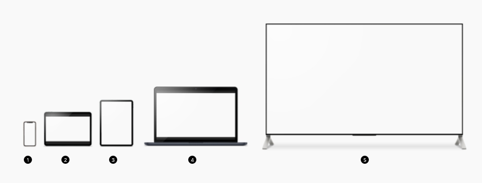
-
Mobile
Size ratio 1:2.16
-
Tablet landscape
Size ratio 16/9
-
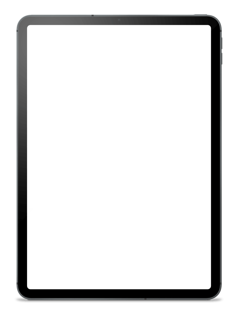
Tablet portrait
Size ratio 1:1.43
-
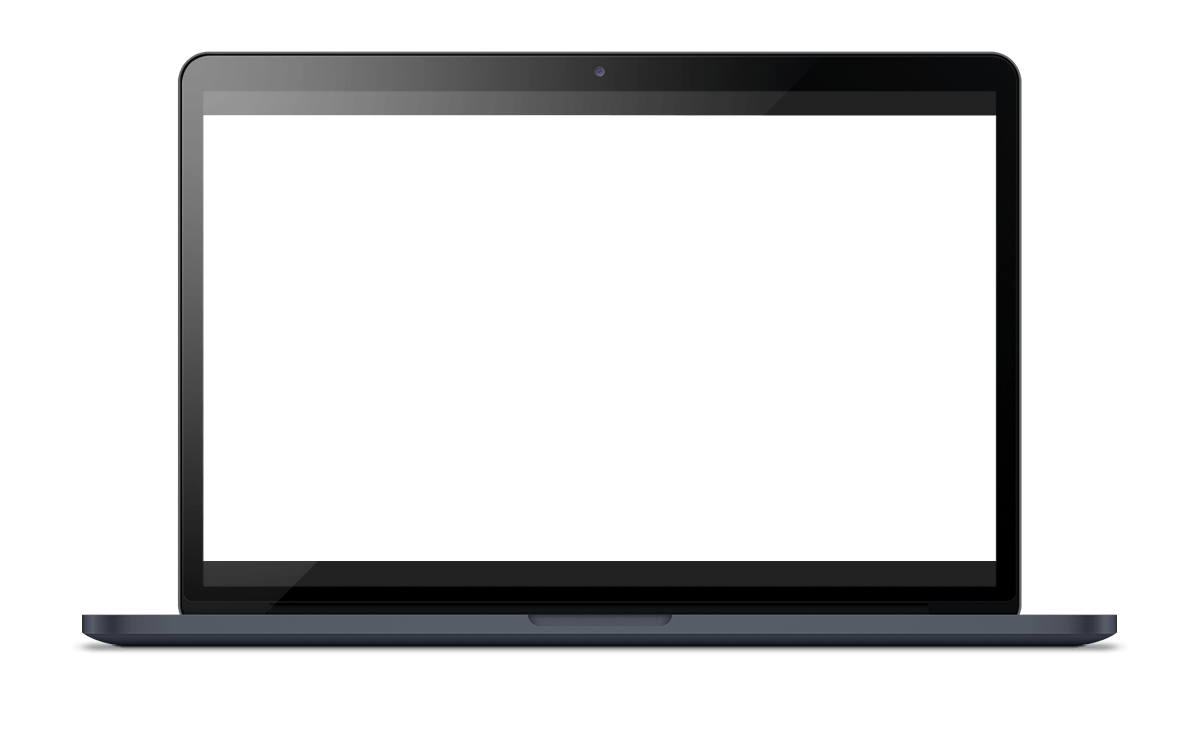
Laptop
Size ratio 16/9
-
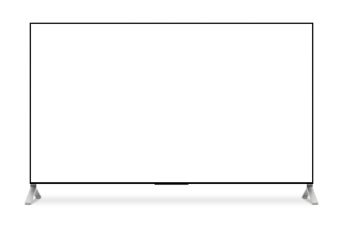
Tv
Size ratio 16/9
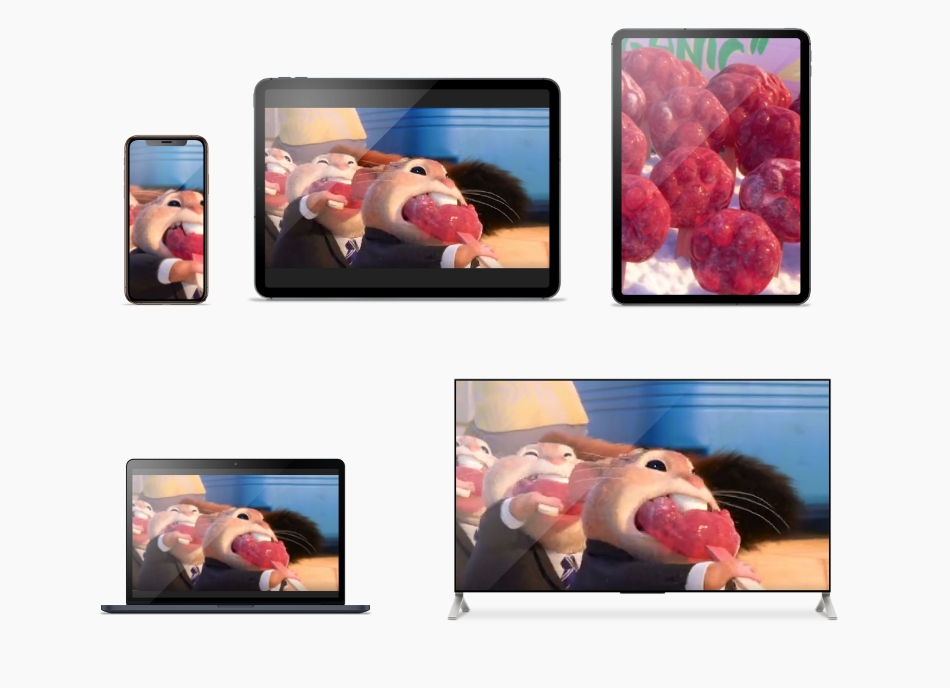
Compositions
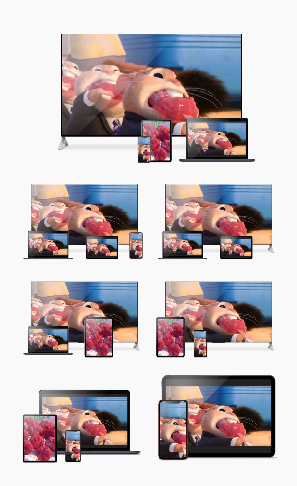
Your are free to mixed devices and choose among 5 compositions.
Anatomy
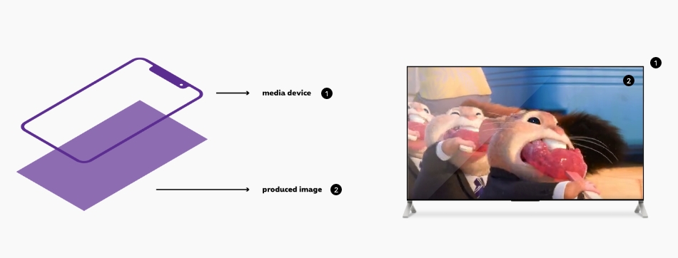
-
Media-device (Mandatory)
This is the image of the device you want to use.Design your ownYour are free the design your own device according the types of devices available.
-
Produced image (Mandatory)
This area contain the content of the device. It could be an image or a video.AccessibilityPlease refer to accessibility documentation for your image or you video.
Sizes
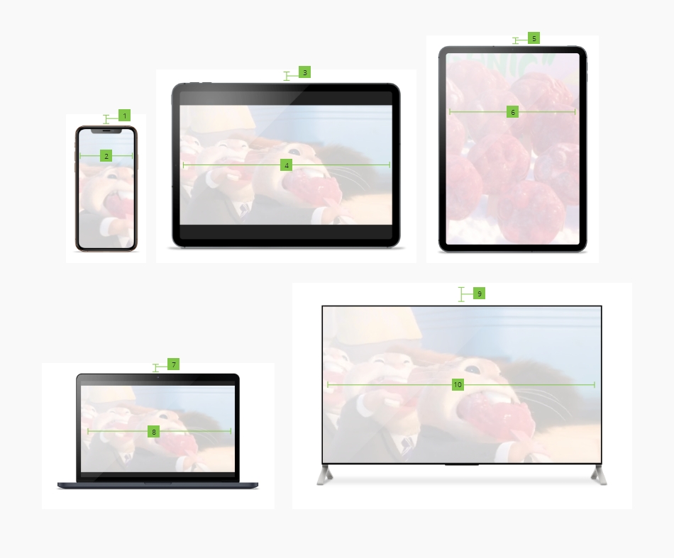
| Attribute | mobile/tablet/desktop | |
|---|---|---|
| 1. Mobile | Margin-top | 18.2% |
| 2. Mobile | Width | 70% |
| 3. Tablet landscape | Margin-top | 13.8% |
| 4. Tablet landscape | Width | 82% |
| 5. Tablet portrait | Margin-top | 10% |
| 6. Tablet portrait | Width | 78% |
| 7. Laptop | Margin-top | 9.5% |
| 8. Laptop | Width | 66.5% |
| 7. TV | Margin-top | 6.9% |
| 8. TV | Width | 82.2% |
Gridding
You are free to place devices and/or compositions in the gridding the way you want.
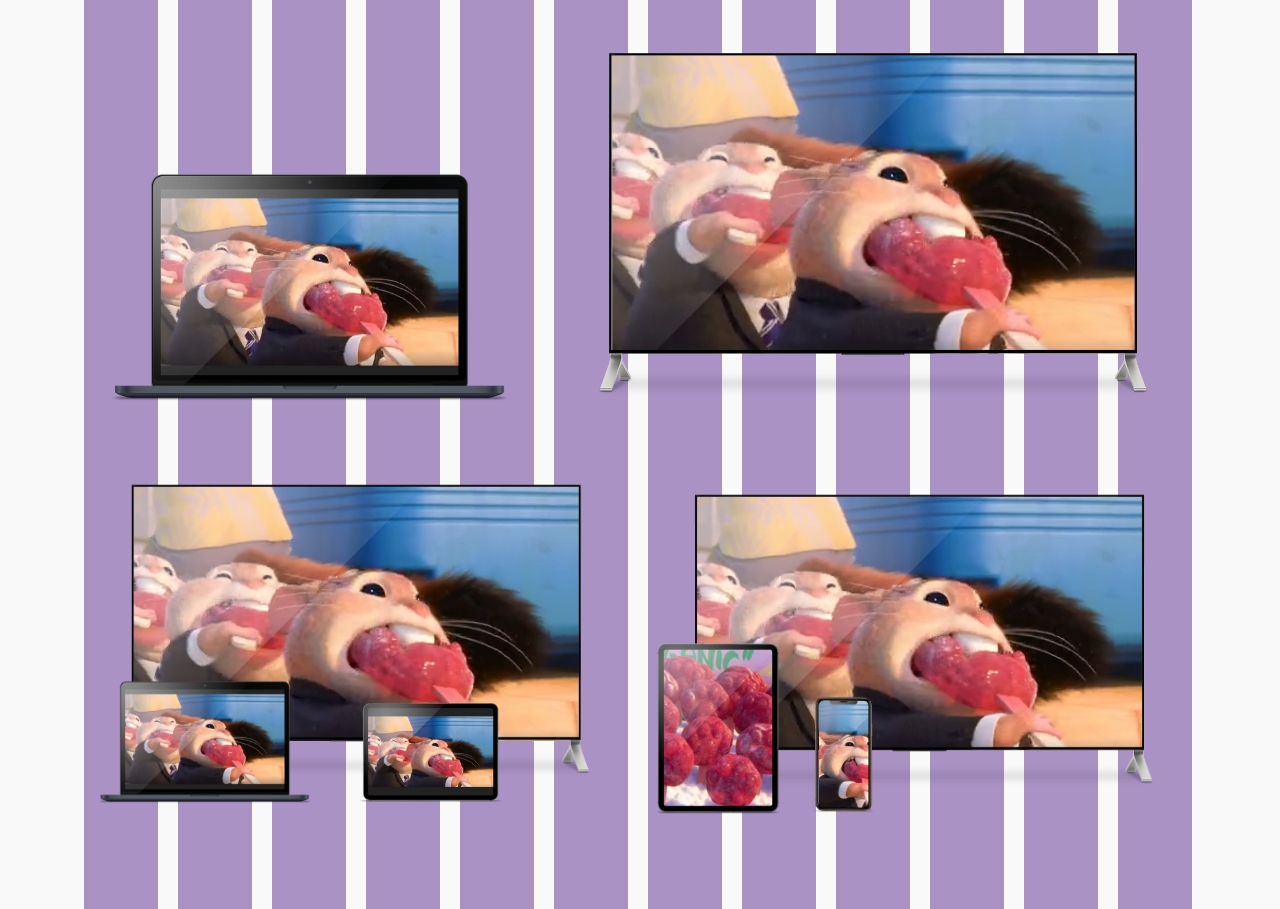
There is 3 types of panels: You are free to use standalone devices or compositions of multiple devices.
A media devices are block elements taking full width of its container. Then the size of the device depends on its grid container.
Lazy load should be added on all images, background images and videos except on the first section of the page as they should be directly loaded and visible.
jsrs-resizerContainer/jsrs-resizerPart cannot be used togetherNot inside, nor around the image.
Because equalizer is not triggered after image is loaded.
If the video is informative, an alt
must be added to the device <img>
with a short description or title of the video.
If the video is decorative, the <img>
alt
should be empty.
The poster
attribute specifies an image to be shown while the video is downloading, or until the user hits the play button. If this is not included, the first frame of the video will be used instead.
Media in a smartphone

Media in a tablet (landscape & portrait)

Media in a Laptop
Media in a tv
You are free to use the gridding to create as composition as you want but we recommend to the five templates below.
Composition 1


Composition 2


Composition 3


Composition 4


Composition 5
