 Design System
Please don't forget to read Usage part of each element.
Pagination
Pagination is a navigation system dividing content into separate pages, facilitating easier browsing through large datasets or search results.
Overview
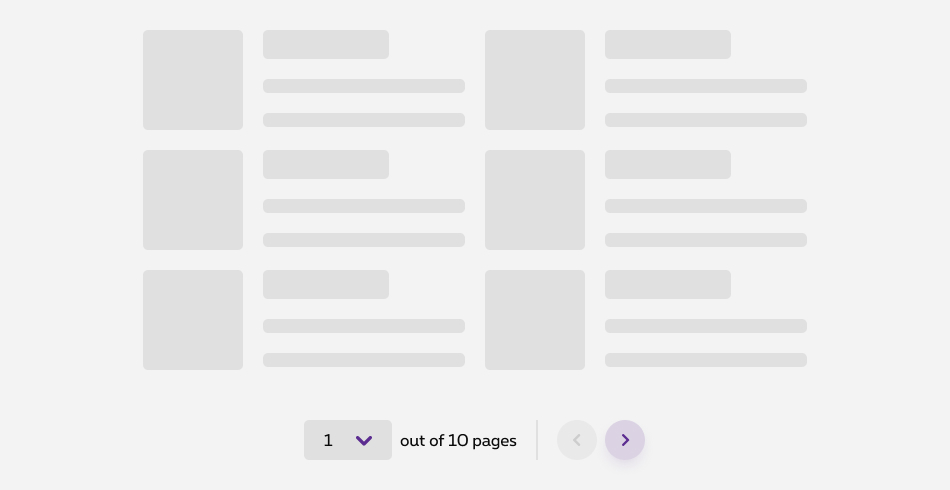
Depending on pages size, content can be split up into several pages. Especially usefull on results pages or product catalog, use pagination to keep good balance between a long page and and extra action for the users.
We developped a specific pagination for data tables, the "data pagination". This specific pagination offers more options than the traditional pagination component.
More infos about the data table
States
The pagination is composed of different components of the Design System. For more details on the pagination states, please refer to the articles select and navigation arrows articles.
-
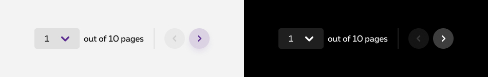
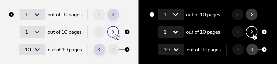
Default state
State visible before click. -
Hover/Focused state
State visible when the cursor hovers the navigation arrows and triggered by keyboard navigation or click. -
Disabled state
State visible when the minimum or maximum numbers of elements is reach. The navigation arrow is than not clickable anymore.
Anatomy
The pagination is composed of different components of the Design System. For more details on the pagination anatomy, please refer to related articles.

-
Select
Select allows the user to navigate to a specific page by selecting the page number and identify which page he is on.
This is the default select of the Design System, without label. Anatomy details available in select article. -
Total
Provide context into how many pages/items there are in total. -
Separator
Anatomy details available in separator article. -
Previous and next
Navigate backward and forward from the currently selected page.
Anatomy details available in navigation arrows article.
Place it correctly
Users will want to change the page after reading the results. For that reason, use pagination at the end of the page and prefer a centered alignement.
Not too few, not too much
Pagination by definition adds a layer of friction for the users. It is important to use it wisely. Depending on the type of page you'd like to add pagination to, try to find a good balance between the number of entries and the pagination. In other words, find the equilibrium between scrolling and changing page.
In specific cases, such as table, you can offer more control to users by allowing the customise the number of entries per page. That being said, when possible, try to remember the preferences of the users when giving such an option. So the next visit, the number of entries displayed will already be fitted to the users' needs.
Sizes and colors
Pagination is using default and negative "Navigation arrows" basic element. See ad hoc documentation for more details.
There must always be a selected page on <select>
even if you're on the first one. Add selected
attribute on the <option>
element.
Simply add disabled
attribute on the <option>
element to disable a link to a page.
-
aria-label='Pagination'has to be added to the pagination container and must be translated. - "Select" component requires some accessibility attributes. See ad hoc documentation for more details.
- Select label is required but only visible for screen readers. Be sure it has the class
show-for-sr.
All
| Name | Type | Description | Default value |
|---|---|---|---|
| sSelectBoxId | string | Page <select> id | "ac-selectBox" |
| iNbrOfPages | integer | Number of pages | 10 |
| iSelectedPage | integer | Selected page | 1 |
| sXtraClass | string | Extra class to rs-pagination
container |
"" |
Default pagination
Default negative pagination
Add rs-pagination-neg
class to pagination container.
Wrap rs-form-item
layer with a rs-form-neg
layer.
Use negative version of the "Navigation arrows" component. See ad hoc documentation for more details.
Alignment
By default, pagination is centered. You can easily change this alignment by adding an utility class
(eg: rs-justify-left
to align left or rs-justify-right
to align right) on pagination container.
Configuration metadata (DSPaginationComponent)
Selector: ds-pagination
Class: DSPaginationComponent
Use case example
NOT AVAILABLE LIVE PREVIEW
Inputs
| Name | Type | Default | Required | Description |
|---|---|---|---|---|
| translations | IPaginationTranslations | undefined | Yes | Defines the component translations |
| cypressTag | string | undefined | No | Automation tag of the component |
| setPaginationArray | IPaginationElementOptions | { value: 0, label: $0, isSelected: true } | No | Sets the pagination options |
Outputs
| Name | Type | Description |
|---|---|---|
| setPageClicked | EventEmitter<number> | Emits when a page is selected from the dropdown list |
| nextPageClicked | EventEmitter | Emits when next pagination number is clicked |
| previousPageClicked | EventEmitter | Emits when previous pagination number is clicked |
| page | EventEmitter | Emits the selected page number (first = 0) |
Models
        export interface IPaginationTranslations {
            pages: string;
            of: string;
            nextPage: string;
            previousPage: string;
            selectPage: string;
            pagination: string;
        }

        export interface IPaginationElementOptions {
            totalPages: number;
            number: number; // the initial value is 0
            selectId?: string;
            extraClasses?: string;
            negative?: boolean;
            alignment?: 'left' | 'right' | 'center' | 'table';
        }