 Design System
Please don't forget to read Usage part of each element.
Links
Links are clickable elements allowing users to navigate to another location, such as a different page, site, resource, or section within the same page.
Types
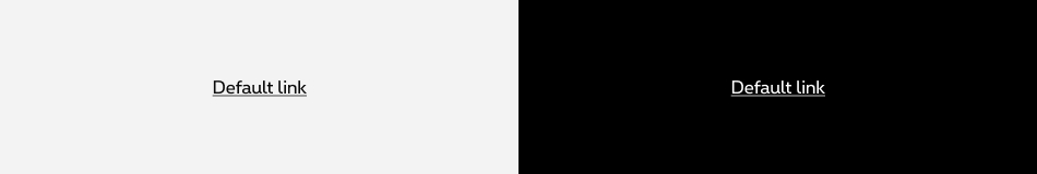
Default links are mostly used within paragraphs or chunks of text.
States
-
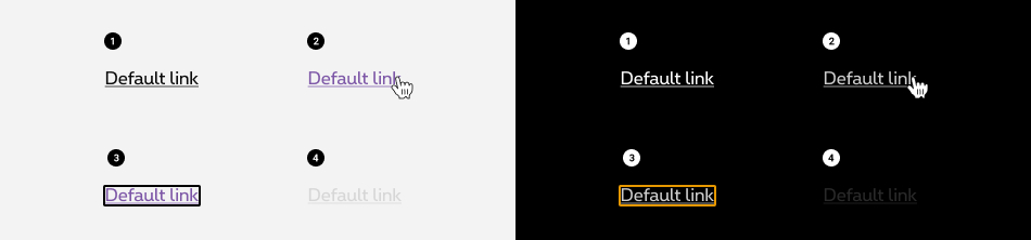
Basic state
State visible before click. Label is underlined and its colour differs from default text. -
Hover state
State visible when the cursor hovers the link. Underline label is displayed in another colour. Cursor becomes a pointer. -
Focussed state
State visible when users tab on the link. All elements are displayed with a frame around the label. -
Disabled state
State visible if the link is not clickable. All elements are displayed but they are greyed out in order to signify the change of state.
Anatomy
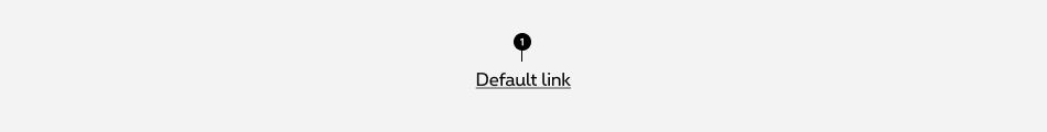
- Default link label
Label
- Links should be three words or less.
- Avoid using generic terms like "click here". Use meaningful labels that match the destination
- When having a several words long, try to maintain a good balance between having a link long enough to be understood and short enough to avoid text wrapping.
The label alone has explicit to be sufficient to understand the link purpose and target. Make sure link contains an explicit label and a link to make people understand what's the content of the link and where they go if they click on it.
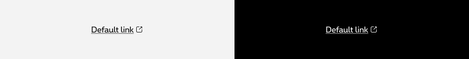
Open in new window
To be accessible, we have to give users advanced warning when opening a new window. To provide a warning before automatically opening a new window or tab, we display a target blank icon.
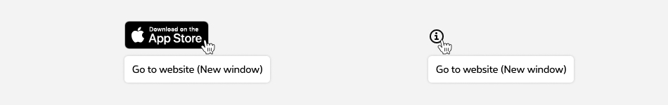
Link with target="_blank" image/icon
When an image opens a link in target="_blank", a tooltip is added to the link.
Download a file (pdf, doc, xls...)
When the content includes links for downloading files, the following information should be included in the link text:
- Document title/name
- Document type/format
- FR/EN/DE: PDF, DOC, XLS,...
- NL: pdf, doc, xls,...
- Size of document
- Document language
The language is optional and is only indicated if the language of the uploaded file is different from the page language.- FR: en anglais, en néerlandais, en allemand
- NL: in het Engels, in het Frans, in het Duits
- EN: in French, in Dutch, in German
- DE: auf Englisch, auf Französisch, auf Niederländisch
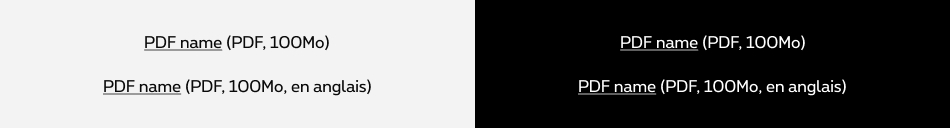
Information are separated by commas and always indicated in this order: format, weight, language (optional).
Sizes and colors
Make sure <a></a> contains an explicit text and an href to make people understand what's the content of the link and where they go if they click on it.
Don't add any title to the link unless you don't have any other choice. In most of the cases,the content of the <a> is enough.
Default link
Default negative link
rs-link-neg
must be added to the <a>
to display the text in negative.
Or rs-neg
class could be added around.
Disabled link
For Screen Reader add:
-
aria-disabled="true" tabindex="-1"to <a> -
disabledto <button>
Disabled negative link
Link with target="_blank"
- An icon is added to the link to inform that a new window will be opened.
-
title="New window"attribute is added to icon <i> to display browser tooltip indicating link opens a new window. - <span class="show-for-sr">New window</span> is added inside the icon <i> for screen readers to read this text indicating link opens a new window.
- The copy has to be translate by language:
EN: New window
FR: Nouvelle fenêtre
NL: Nieuw venster
DE: Neues Fenster
Negative link with target="_blank"
Disabled link with target="_blank"
Link with target="_blank" image/icon
- A tooltip is added to the link with
data-tooltipattribute on the <a> . -
titleattribute is added to the <a> with information about the image + (New window).
EN: New window
FR: Nouvelle fenêtre
NL: Nieuw venster
DE: Neues Fenster -
aria-labelattribute is added to the <a> with the name of the link. -
aria-hidden="true"attribute is added to the <img> .
Link to download a file (pdf, doc, xls...)
The <a>
should contain the title, format, weight and language (only if different from the page's) of the document.
Format, weight and (optionnal) language are added in parentheses after the file name within <span class="rs-link-download-info">
.
The <target_blank> is mandatory in the case of a file download but does’nt need to be indicated by a "new window" text or an icon (in this case only!)
Useful classes
rs-link-no-decoration
removes the underline of the link.
rs-link-decoration
add underline to the link.
rs-link-hover-decoration
add underline to the link on hover and focus.
rs-link
gives the link style without being a <a>
.
rs-no-pointer-events
prevents all click, state and cursor actions on the element (pointer-events: none;)
rs-clickable
adds the "hand" representing a link on mouse hover on any element (cursor: pointer;).
jsrs-clickable
adds cursor: pointer + javascript making all the element clickable pointing to the first link found within the element.