 Design System
Please don't forget to read Usage part of each element.
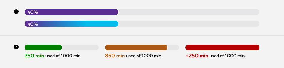
Progress bar
Progress bar is horizontal visualisation on a 100% scale.
Types
Progress bar is a horizontal part-to-whole data visualization showing relationship of one value compared to its total.
-
Progress bar
The default progress bar can be used to illustrate a subject such as loading speed,... -
Consumption bar
The consumption bar is used in a dashboard to inform the user about an ongoing usage by displaying a status color.
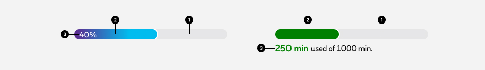
Anatomy
-
Progress bar container
Represents 100% of the displayed value. -
Usage bar
Shows the percentage of the total value. -
Legend (optional)
Position of the legend depends of the type of progress bar.
Colors
Progress bar
As the usage of secondary colors is defined by segment, here are the colors possibilities for the default progress bar:
Residential
Business
Enterprise
Consumption bar
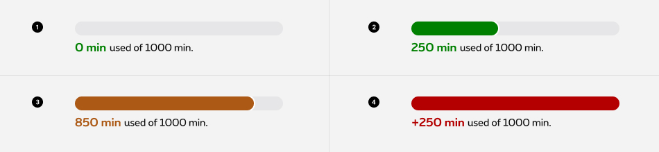
Color defines the status of the users consumptions (datas, minutes, smses, etc.). Four statuses are available:
-
No usage
The customers' usage is not yet started. -
On going usage
The customers have already consumed some of their content... -
Approaching the full usage
The customers' usage has reached 80%. -
Exceeding usage
The customers' usage has reached or exceeded 100%.
If the customer's plan is unlimited, keep the usage bar colour green all along.
Sizes and colors
<div>
with rs-progress
class must have:
- role="progressbar" attribute;
- aria-valuemin="0" attribute;
- aria-valuenow="" attribute, with the number of the current value;
- aria-valuemax="100" attribute, with the maximum value;
- aria-valuetext="%" attribute, if the value is in % write the number of the current before the % symbol.
- aria-valuetext="current of max"
if the value isn't in % write the current value "of" max value. Don't forget translations
EN: of
FR: sur
NL: van
DE: von
Progress bar is a webcomponent which needs data-rslib-webcomponent-load="rslib.apps.progressbar" attribute to work.
Progress bar itself must have a jsrs-progressbar
class. It will take the value of the aria-valuenow
and give the size of the progress bar.
Default progress bar
Warning progress bar
Simply add the class rs-meter-full
to the span rs-meter
.
Error progress bar
Simply add the class rs-meter-error
to the span rs-meter
.
Gradient progress bar
The component needs the class rs-progress-gradient
in place of rs-progress
and you need to add the color of the gradient to the span rs-meter
.
Residential variant
Only the gradiant color class changes rs-bg-blue
/ rs-bg-magenta
/ rs-bg-green
/ rs-bg-yellow
/ rs-bg-orange
.
Business & Enterprise variant
Only the gradiant color class changes rs-bg-blue
/ rs-bg-turquoise
.
Usage bar
<div>
with rs-usage-progress-bar
class must have the same attribute than the default progress bar and the following ones:
You also must have inside <div class="rs-usage-progress" :
- One <div>
with
rs-usage-progress-titleclass who will be the title of the progress bar; - One <span>
with
rs-usage-progress-usedclass who will be the value of data used; - One <span>
with
rs-usage-progress-amountclass who will be the amount of data.
Usage bar has the class rs-usage-progress
instead of rs-progress
.
The bar itself has the class rs-usage-progress-bar-meter
and depending of the status you have to add another class:
- warning state:
rs-usage-progress-bar-warn - exceed state:
rs-usage-progress-bar-exceed
The <span> with the amount has a class according to the state of the progress bar.
- default state:
rs-usage-progress-used - warning state:
rs-usage-progress-warning - exceed state:
rs-usage-progress-exceeding - no activity state:
rs-usage-progress-noactivity
Progress bar animation
Animation duration
The animation can be change by adding the attribute data-progress-duration="1s"
to the <span>
called rs-meter
or rs-usage-progress-bar-meter
.
Indicate the number of secondes of your animation duration
Scroll parent
If your parent container has its own scroll then you need to identify this parent through the attribute data-progress-scrollparent="SELECTOR" . SELECTOR can be a class / id.
JavaScript
As Progress bar is a webcomponent, you will have to load
Next time you add Progress bar to the page, you have to call this JS:
CONTEXT refers to document or html element parent.
Configuration metadata
Selector: ds-progress-bar
Class: DSProgressBarComponent
Use case example
NOT AVAILABLE LIVE PREVIEW
Inputs
| Name | Type | Default | Required | Description |
|---|---|---|---|---|
| currentValue | number | undefined | No | Defines the current value |
| isUsageBar | boolean | false | No | Set the style to usage |
| type | ProgressBarTypeEnum | ProgressBarTypeEnum.DEFAULT | No | Defines the type of the visual (exceed, warning, ...) |
| options | IProgressBarOptions | undefined | Yes | Defines the progress bar options |
| inputProgressBarContent | IProgressBarContent | undefined | Yes | Configures the progress' bar functionality |
Outputs
None
Models
        export interface IProgressBarOptions {
            /* Check on the pxs design system website
             * to know which color class to use,
             * if no class specified the color will the default one.
             * If the progress bar is full, the color will not be rendered,
             * it will be overridden by the rs-meter-full.
             */
            colorClass?: ProgressBarColorClassEnum | '';
            animationDuration?: boolean;
            /*
             * If the scroll is not on the window
             * but on a specific div (ex: inside an overlayer)
             * add data-progress-scrollparent
             * with the class or the id of the element who is scrolled.
             */
            scrollParent?: boolean;
            /*
             * Choose between one of the following, not both.
             * If no one is chosen, it will be the default progress bar.
             */
            isGradientBar?: boolean;
        }
        export interface IProgressBarContent {
            minValue: number;
            maxValue: number;
            currentValue?: number;
            animationDuration?: number;
            scrollParent?: string;
            // To be used only if the progress bar is about usage
            usageBarTitle?: string;
            usageDataAlreadyUsed?: string;
            usageDataRemaining?: string;
        }
        export enum ProgressBarTypeEnum {
            DEFAULT,
            WARNING,
            EXCEED,
            NOACTIVITY,
        }

        export enum ProgressBarColorClassEnum {
            BLUE = 'rs-bg-blue',
            MAGENTA = 'rs-bg-magenta',
            GREEN = 'rs-bg-green',
            YELLOW = 'rs-bg-yellow',
            ORANGE = 'rs-bg-orange',
        }