 Design System
Please don't forget to read Usage part of each element.
Rating
Ratings provide a quick feedback on the quality, satisfaction or popularity of items, such as products, services or content, helping users in decision-making.
Smiley Ratings
Smiley ratings are used to enable users to provide emotional feedback on an experience, product or service. They are particulary effective for collecting quick and intuitive reactions. It can be integrate into surveys, product evaluations, user feedback, and more.
States
-
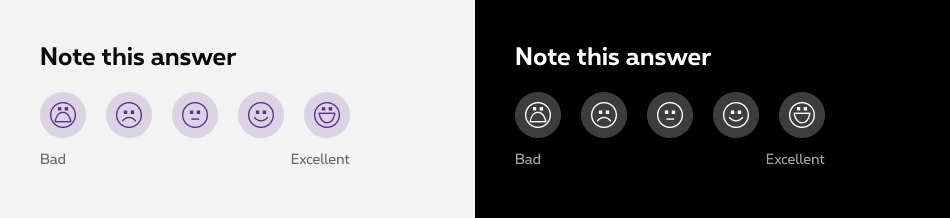
Default state
The default state displays the five smileys in a neutral state. User can click or tap on the smileys to select their mood level. -
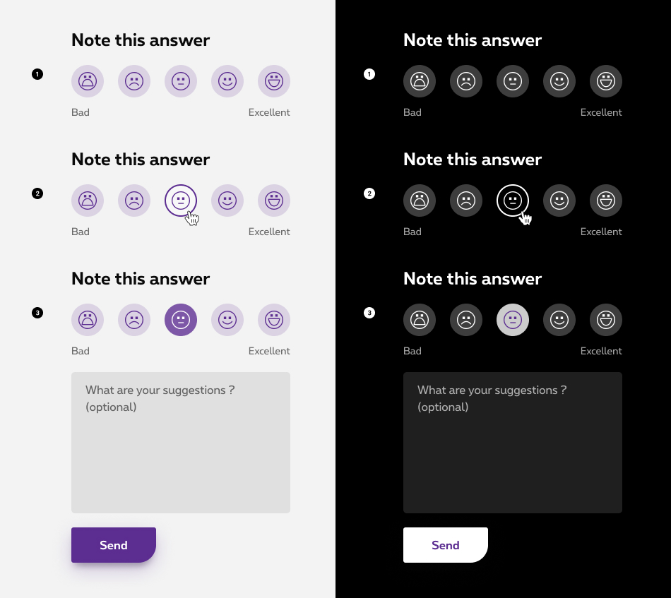
Hover state
When user hovers over a smiley with their mouse, the smiley visually changes to indicate that it can be selected. This enhances the user experience by clearly indicating interactivity. -
Selected state
Once user clicks or taps on a smiley, it changes color to indicate that it has been selected with the corresponding mood level. A text area appears to give more details or suggestions about the user experience.
Anatomy
-
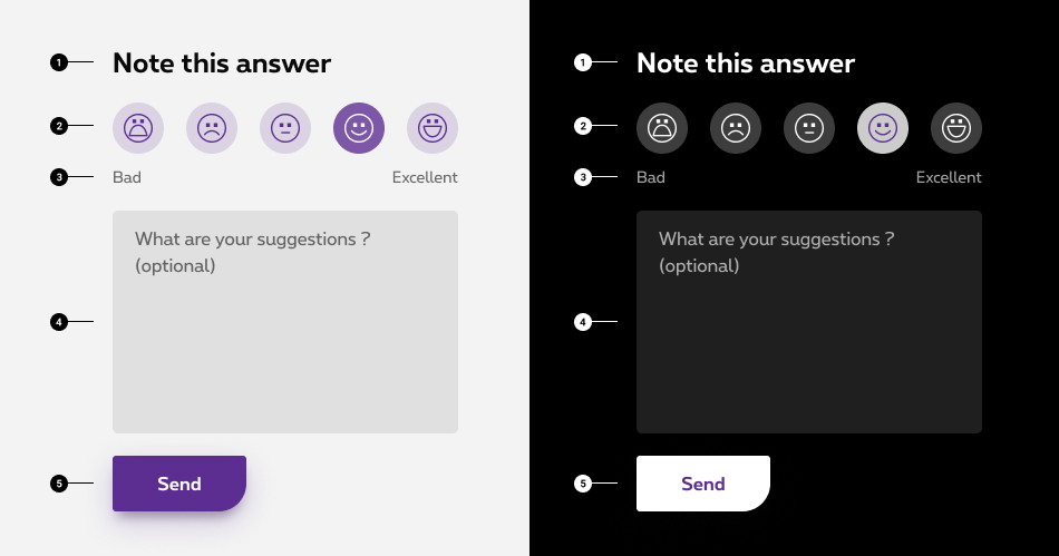
Instructions
Clear and concise message that helps the user provide feedback. -
Ratings
Smileys representing emotional states about the experience. -
Rate legend
From very bad to excellent. Helps the user to understand the rate scale of the smileys. -
Text area
Allow user to give more details or suggestions about his experience. More info about text area. -
Button
Allow user to submit his feedback.
Specific legend
To ensure the consistency of the legend accross all Proximus plateforms, please use these rates label:
| EN | FR | NL | DE |
|---|---|---|---|
| Bad - Excellent | Mauvais - Excellent | Slecht - Uitstekend | Schlecht - Ausgezeichnet |
Sizes and colors
Default rating
<legend>
is required as Rating is using radio buttons. Then same rule is applied: if the title should not be displayed, it should be readable for screen reader only with show-for-sr added
class.
<label>
needs title="xxx"
attribute and icon <i>
needs aria-label="xxx"
attribute. Put same value for both and maintain consistent values for all languages.
Since the description of the icon (bad, excellent) is purely decorative, aria-hidden="true"
is added to rs-rating-legend
to be ignored by screen readers.
| Name | Type | Description | Default value |
|---|---|---|---|
| sLegend | string | Fieldset legend | "Note this answer" |
| sName | string | Radio button name (also used to generate ID) | "radioRates" |
| dIcons | dynamic | List of icons name | new [] {"Mood-very-bad", "Icon-Mood-unhappy", "Icon-Mood-neutral", "Icon-Mood-happy", "Mood-joy"} |
| dLabels | dynamic | List of labels name | new [] {"Bad","Not good","Neutral","Good","Excellent"} |
| sXtraClass | string | Extra class to rs-rating
container |
"" |
Default negative
You just need to add rs-neg
class as parent of any rs-rating
version to have it with negative colors.