 Design System
Please don't forget to read Usage part of each element.
Patches
expiry date: 03/2023
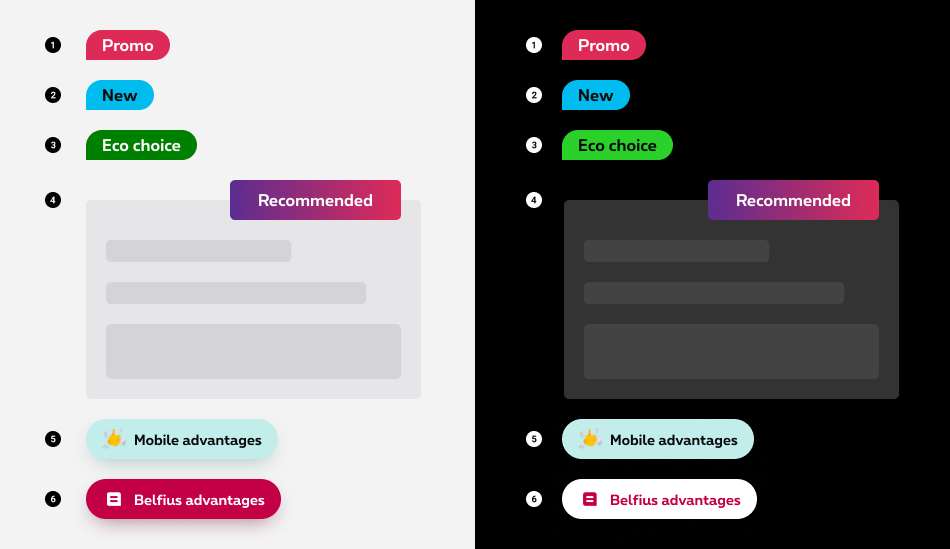
Patches provide a way to highlight two types of content: informational and promotional messages.
Types
Patches
Patches are used in the context of a promotion, a launch, or to convey a notable fact about a product or service. You can use on their own, on an image or in combination with a text description/price.
Different types of patches are available for different types of information:
-
Promo patch
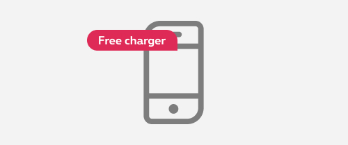
Used mention a discount, a promotion, a marketing technique that is used to entice customers to purchase a product. -
Info patch
Used as point of attention to communicate informational messages to the customers. -
Eco patch
Used to communicate ecology-related information, such as when one delivery choice is more environmentally friendly than another. -
Recommended patch
Used in the context of Proximus'recommendation on a product or a service. -
Multi-mobile advantage patch
Used for the "extra mobile advantage" of the Flex pack. -
Belfius advantage patch
Used to highlight an advantage related to Belfius.

There is also a Black friday patch that can only be used during the Black Friday period for all promotions related to this event.
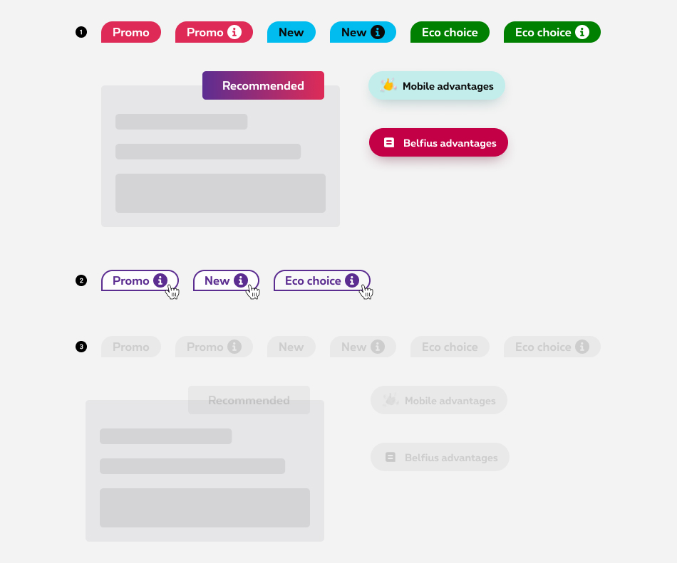
Clickable patch
When an explanation of the patch label must be given to the customer, the promo patch can be made clickable. An "information" icon is then added to the patch and when clicked an overlayer opens with all the explanations of the promotion.

States
-
Default state
State visible by default. -
Hover/Focused state
State visible when the cursor hovers the clickable patch and triggered by keyboard navigation or click. Cursor becomes a pointer. -
Disabled state
State visible when the element is not yet accessible due to pre-requisite actions.
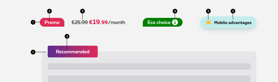
Anatomy
Patches
-
Container
A container is displayed around the text label/icon with a solid color. -
Label
Label is the key message element and follows these rules. -
Description
A short explicit text and/or price can be displayed next to the patch. - Information icon (only for the clickable patch)
Information icon informs the user that an overlayer will open to give more information. - Icon/Logo (only for the Advantages and Belfius patches)
Icon or logo illustrates the advantage patch.
Patch specifications
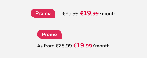
Patch with description
The most common composition is the description to the right of the patch, but it's also allowed to put the description below the patch.
Do

Don't
Shape
The shape of the promo, info and eco patches is inspired by our symbol and is composed with 3 rounded corners and a square corner. The square corner should be oriented in the general direction of the main object in the lay out.

Label
Best practices
- Use a capital letter at the beginning of the copy in the patch as for the sentence.
- The copy of the patch cannot written in uppercase.
- Try to be as concise as possible. No sentence, only keywords to keep the label in one single line.
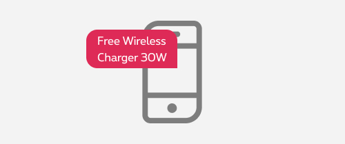
- Label text has to be in one line on mobile and desktop
Do
Keep the label on one single line.
Don't
Don't wrap the label in multiple lines.
Specific labels
To ensure the consistency of the message accross all Proximus plateforms, some label texts are predefined for the promotional patches:

| EN | FR | NL | |
|---|---|---|---|
| Web promo Promo only available online, not in the shops. |
Web promo | Promo web | Webpromo |
| Free Mention to apply for a free product, service,... |
Free installation | Installation gratuite | Gratis installatie |
| 1 month for trial For TV promo |
1 month for trial | 1 mois d'essai gratuit | Test 1 maand gratis |
Recommended patch
The recommended patch is placed on overlap and can have different lenght depending of the context.
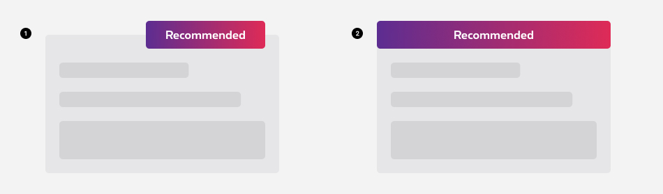
- Default (left or right overlap)
- Full width
Branded Component
Business and Enterprise Business Unit
As the secondary colors usage is defined by segment to follow brand identity, the recommended patch is diffent for SME (1) and EBU (2) segments.
Sizes and colors
The shape is composed by 3 rounded corners and a square corner. The straight corner should be oriented in the general direction of the main object in the lay out, so the radius can change depending of the layout.
Promo patch
To create a promo patch, add rs-patch-promo
and a shape class like rs-patch-corner2
in a <div>
element. This <div>
include another <div>
with rs-patch-content
and text-center
classes.
Shape
The shape is composed by 3 rounded corners and a straight corner. The straight corner should be oriented in the general direction of the main object in the lay out, so the radius can change depending of the layout.
To change the radius, 4 classes exist: rs-patch-corner1
, rs-patch-corner2
, rs-patch-corner3
and rs-patch-corner4
.
Info patch
To create a info patch, use rs-patch-info
instead of rs-patch-promo
class.
Black Friday patch
To create a black friday patch, use rs-patch-blackfriday
instead of rs-patch-promo
class.
Negative version
To create a black friday patch negative, add rs-neg
as parent container of rs-patch-blackfriday
class.
Eco patch
To create a eco patch, use rs-patch-eco
instead of rs-patch-promo
class.
Patch with content
Here are some examples. Use the needed gridding depending of the wanted display. All kind of patch could be used.
Patch at the left of the content on mobile
Mobile vertical alignment in the middle. A partir de
instead of €25.50 €19.99
/mois/pour 5 appareils (HTVA)
Mobile vertical alignment above. A partir de
instead of €25.50 €19.99
/mois/pour 5 appareils (HTVA)
Patch at the top of the content on mobile
Pay attention to the space between the patch and the content on mobile. Place rs-margin-bottom1-s rs-margin-bottom2-m
classes in the patch.
A partir de
instead of €25.50 €19.99
/mois/pour 5 appareils (HTVA)
Patch with overlayer
Pay attention to accessibility.
- Check the DS about Overlayer to have more info.
- An icon is added to the patch to inform that an overlayer will be open.
-
title="Open a modal"attribute is added to icon <i> to display browser tooltip indicating button Modal. - <span class="show-for-sr">Open a modal</span> is added inside the icon <i> for screen readers to read this text indicating button Modal.
Modal Large
Modal Large subtitle
Negative version
Recommended patch
Right alignment
By default, you have to use alignment on top/right.
Left aligment
To force alignment on the left, remove rs-is-overlapping-right
to rs-is-overlapping
class in the patch.
Overlapping banner in a clickable box
You can find all the informations about how to make a clickable box with overlapping child in the Overlap article.
Recommended full width
The banner also exist in full width. Use rs-patch-recommended-full-so rs-patch-recommended-full-m
classes together in the patch.
Full width for small only
Only use rs-patch-recommended-full-so
class in the patch.
Full width for medium-up
Only use rs-patch-recommended-full-m
class in the patch.
Advantage patch
Overlapping
This kind of patch can be used in overlap. Just add rs-has-overlap
class around the content and rs-is-overlapping
class in the patch.
Belfius advantage patch
Negative version
To create a belfius advantage patch negative, add rs-patch-belfius-neg
to rs-patch-belfius
class. The 2 classes together.
Disabled
Also add aria-hidden="true"
to the section/div disabled to hide it for screen readers.
If it's overlayer case, check the DS about Button to know how to disable it.
To create a disabled patch, add rs-disabled
class around (or on the section).
Negative version
Also add aria-hidden="true"
to the section/div disabled to hide it for screen readers.
If it's overlayer case, check the DS about Button to know how to disable it.
To create a disabled patch neg, add rs-disabled-neg
class around (or on the section). Why a negative class here? Because negative patch doesn't exist.
rs-disabled
and rs-disabled-neg
classes could be used together if needed.
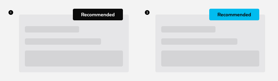
Branded component
SME segment
Recommended banner
The color of the patch will be adapt automatically if the body has rs-se
class.
EBU segment
Recommended banner
The color of the patch will be adapt automatically if the body has the rs-ebu
class.
Scarlet website
Rounded patch for price
This rounded patch is for Scarlet only.
Negative version
You only need to add rs-neg
as parent of rs-patch-price
Deprecated
The element below are not usefull anymore and should no longer be used.
This element will no longer be available from the expiry date meaning the related css will be removed and the element design will be broken if it's not adapted to the new html.
To find it, look for patch class like rs-patch-promo
with data-reveal
attribute.
Those classes are deprecated and must be replaced by rs-patch-promo
:
-
rs-patch-webpromo -
rs-patch-webdeal -
rs-patch-trybuy
The element below are not usefull anymore and should no longer be used.
This element will no longer be available from the expiry date meaning the related css will be removed and the element design will be broken if it's not adapted to the new html.
To find it, look for recommended patch inside .rs-has-overlap.rs-no-padding-top
element.
Remove rs-no-padding-top
class from parent and add rs-is-overlapping
on recommended patch.
Replace rs-patch-recommended-full
by rs-patch-recommended-full-so
class.