 Design System
Please don't forget to read Usage part of each element.
Actions
expiry date: 30/04/2024
List of different action components for the user.
Types
-
Action links
Action link allows the user to do a concrete action in the interface such as a composition of products, a profile settings, etc. -
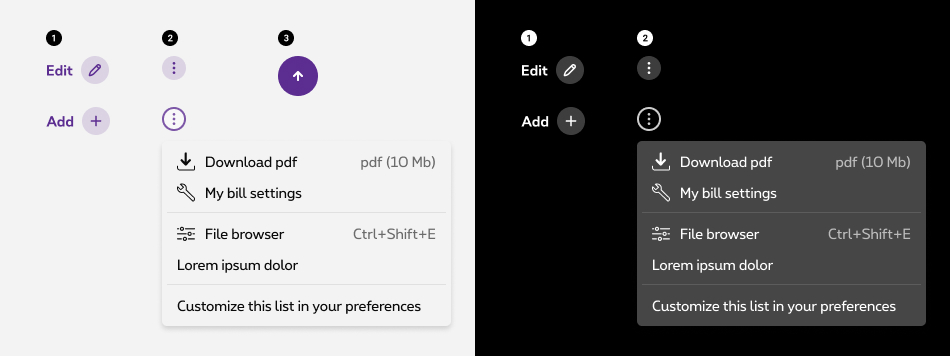
Action menu
Action menu is used when additional options are available to the user and there is a space constraint. The action menu keeps key actions close by in a clean and unobtrusive menu. -
Floating action button (not available in negative mode)
Floating action button allows the user to go back to the top of the page.
Action links
A list of action icons is defined to ensure consistency on all Proximus' interfaces:
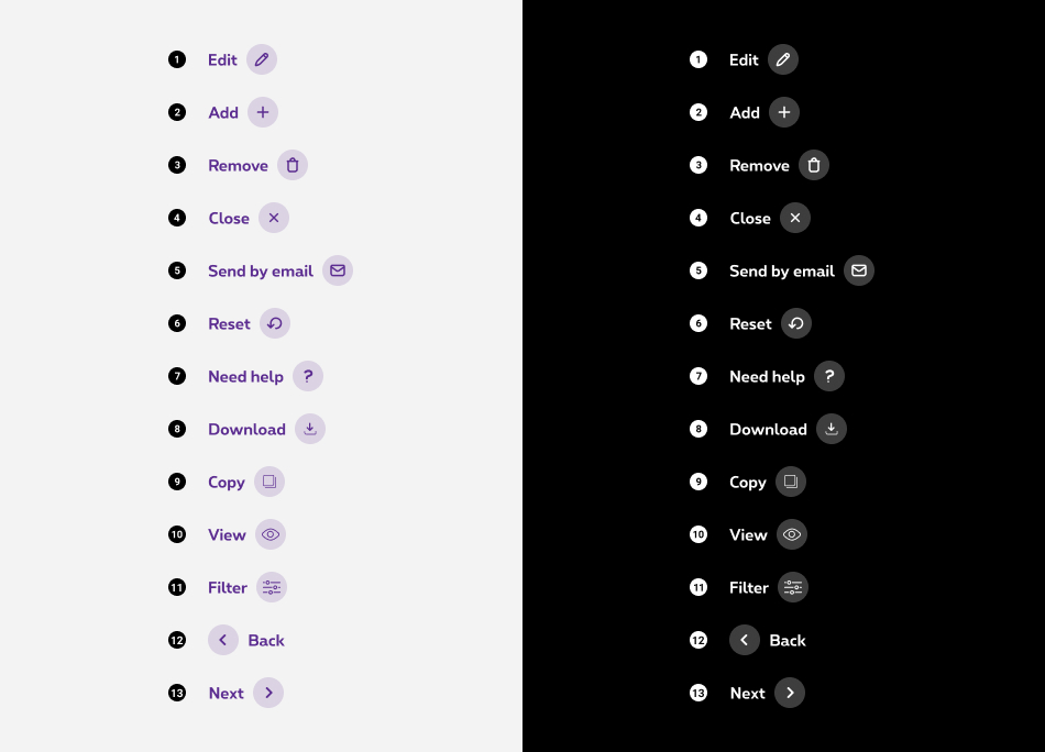
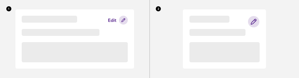
- Edit
- Add
- Remove
- Close
- Send by email
- Reset
- Need help
- Download
- Copy
- View
- Filter
- Back / Previous
- Next
Currently we do not allow using other actions. If you ever need another action that the ones stated above, please contact us and we'll add it to the Design System
Show / hide action label
The label is not a mandatory element in the action links. If necessary, it can be hidden in one of the breakpoints and shown in others.
- Desktop
- Mobile
On mobile, the label is hidden by default but can be displayed if required.
Action menu
Size matters
Action menu button comes out of the box in two sizes. Depending on your needs, you can use the small or the big version.
-
Small action menu
-
Big action menu
Positioning
Action menu can be aligned on the right or on the left. Choose the version that fits your design.
Action cannot be used as dropdown, selection pattern or any other form element. If you are looking for a selection pattern, use either the dropdown or the select component.
Floating action button
Back to top
The floating action button appears when the user scrolls down on a page. It disappears if the user goes back to the top. This button only serves one purpose which is to go back to the top of the page.
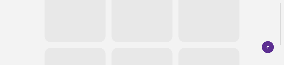
It can't be used for any other action.
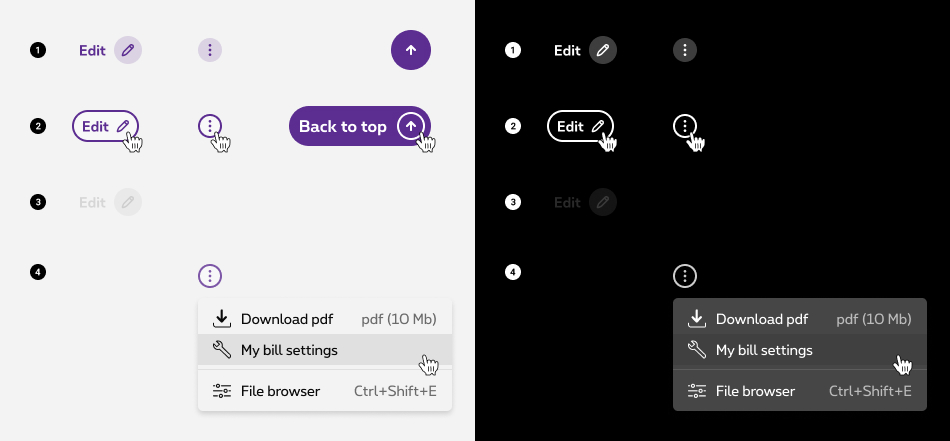
States
-
Default state
State visible before click. -
Hover/Focused state
State visible when the cursor hovers the action link/button and triggered by keyboard navigation or click.. Cursor becomes a pointer. -
Disabled state (only for action links)
State visible if the action link is not clickable. All elements (container & label) are displayed but they are greyed out in order to signify the change of state. -
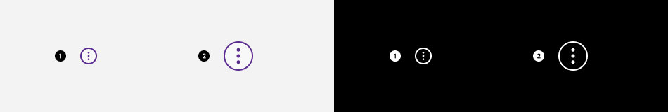
Active state (only for action menu)
State visible when the action menu button is clicked, the action menu container is revealed with its content. Action menu button is in active state.
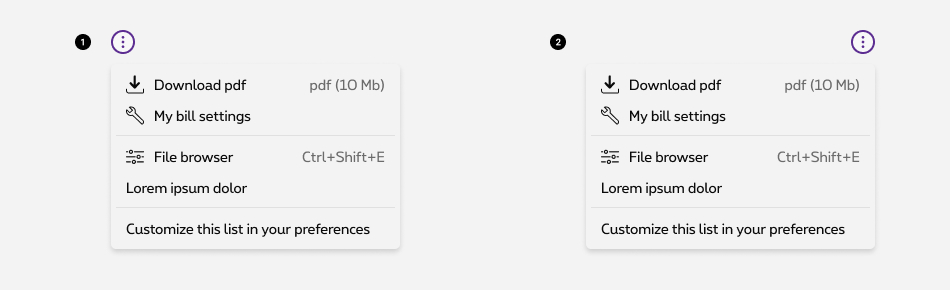
Anatomy
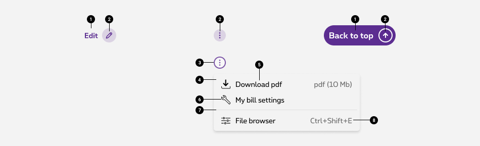
- Action label (optional)
- Action icon (mandatory)
- Action menu button
Triggers the action menu. - Action menu container
It contains list of menu items. - Menu item label
Use concise labels so users can quickly decide on an action. - Menu item label icon (optional)
You can use an icon to illustrate the action. - Separator (optional)
When action can be grouped, use the separator to facilitate scanning - Menu item label details
Use this dedicated zone to give additional information about the action such as: keyboard shortcut, file size, etc.
Sizes and colors
Action Links
An action link always comes with an icon on its right and have a specific purpose, the icon illustrate the action. The icon is mandatory but the label is optional.
On mobile, the label is hidden by default with show-for-medium-up
Zurb Foundation class.
Action links are used by default with <button> but can be used with <a> as well.
As the icon is mandatory but not the label, the label is hidden for screenreaders and title="Label"
attribute is added to icon
to display browser tooltip describing the purpose of the action link as well as a <span class="show-for-sr">Label</span>
for screenreaders.
This is visualy similar to Tertiary Button, find more info in the DS.
All
| Name | Type | Description | Default value |
|---|---|---|---|
| txtLabel | string | Label |
|
| XtraClass | string | Extra class to rs-link-action
container |
"" |
| bIsLabelHiddenOnMobile | boolean | Hide label on mobile | true |
| bNoLabel | boolean | No label | false |
| bIsLink | boolean | Is it <a> instead of <button> | false |
| sUrl | string | URL if it's a link instead a button | "javascript:void(0)" |
| XtraParameters | string | Extra parameters to rs-link-action
container |
"" |
| bDisabled | boolean | Is disabled | false |
| bIconLeft | boolean | Icon is on the left | false |
With <a> instead of <button>
Negative
Add rs-neg
as parent class of rs-link-action
Disabled
For Screen Reader add:
-
aria-disabled="true" tabindex="-1"to <a> -
disabledto <button>
Label not hidden on mobile
Without label
Icon on left
Action menu
Action menu trigger button requires some attributes:
- It must have an ID which is usefull for action menu content.
-
data-dropdownandaria-controlsmust contain ID of the action menu content. -
aria-haspopupmust be set totrue. -
aria-expandedmust be set tofalse.
Action menu content also requires some attributes:
- It must have an ID which is usefull for action menu trigger button.
-
aria-labelledbymust contain ID of the action menu trigger button. -
aria-hiddenmust be set tofalse.
Separators must have aria-hidden
attribute set to false
.
Action menu is a webcomponent which needs data-rslib-webcomponent-load="rslib.apps.actionmenu" attribute to work.
"Drag and Drop" component can be used in"Action menu".
Don't forget to add a title with rs-action-menu-title
class like in the example below.
This type of Drag and Drop is not necessary for screen readers.
So please add aria-hidden
attribute set to false
to parent rs-action-menu-item
.
Negative
Add rs-action-menu-neg
class to rs-action-menu
container.
Use negative version of the"Drag and Drop" component if you need it.
Disabled
Add disabled
attributes to button
.
Big action menu
Just add rs-action-menu-trigger-big
class to action menu trigger button for a bigger button.
Negative
Add rs-action-menu-neg
class to rs-action-menu
container.
Use negative version of the"Drag and Drop" component if you need it.
Position the Action menu
You can position action menu on the bottom right or bottom left of the target element. Default position is bottom right.
Add rs-action-menu-left
class to rs-action-menu
container to get your action menu positioned on bottom left.
Back to top
Add tabindex="-1" attribute to hide the button from keyword users.
Back to top is a webcomponent which needs data-rslib-webcomponent-load="rslib.apps.backtotop" attribute to work.
Back to top button is part of floating action so you need to use rs-floatingaction
to make it work. To have this specific button just add rsjs-backtotop
class.
Inside the anchor you will have 2 span
: one for the label with rs-floatingaction-label
class and one for the icon with rs-floatingaction-icon
class.
hide
class need to be added, to avoid jump while JavaScript is loading.
It is mandatory to have #maincontent
as href
attribute. Nothing else can be accepted.
JavaScript
Action menu
As Action menu is a webcomponent, you will have to load
Next time you add Action menu to the page, you have to call this JS:
CONTEXT refers to document or html element parent to data-action-menu.
If you have a Drag & Drop inside your Action menu, don't forget to launch Drag and drop JavaScript.
Back to top
As Back to top is a webcomponent, you will have to load
If you need to refresh the component, you can use
CONTEXT refers to document or html element parent to the component.
Informations about how to use drag and drop
Informations about how to use drag and drop
Deprecated
The negative versions of action links below should no longer be used.
Simply add rs-neg
as parent class of rs-link-action
.
Deprecated Class: rs-link-action-neg