Please don't forget to read Usage part of each element.
Radio buttons
expiry date: 30/09/2021
Radio buttons are used when a list of two or more options are mutually exclusive, meaning the user must select only one option.
Overview
Radio buttons are used for mutually exclusive choices, not for multiple choices. Only one radio button can be selected at a time. When a user chooses a new item, the previous choice is automatically deselected.

When to use
- In forms on a full page, in overlayers,...
- To change from one setting to another
- To choose a single item within data tables or lists.
If a user can select only one option from a list, radio buttons should be used instead of checkboxes. Checkboxes allow the user to select multiple items in a set whereas radio buttons allow the user to select only one option.

Do
Do use radio buttons when only one item can be selected.

Don't
Don't use checkboxes when only one item can be selected.
Forms can be simple or complex, so we have prepared clear recommendations for you to use. These guidelines will help you build your forms and maintain consistency between all the forms of our digital platforms. Discover our recommandations to build a form.
States

-
Default state - Unselected
State visible by default with no option selected. -
Hover/Focused state
State visible when the cursor hovers the button and triggered by keyboard navigation or click. Cursor becomes a pointer. -
Selected state
State visible with option is selected. -
Disabled state
State visible if the radio button is not clickable. All elements are displayed but they are greyed out in order to signify the change of state. -
Error state
State visible when a radio button should be checked and it’s not the case. All elements are displayed in another colour in order to signify the state.
Anatomy

-
Legend (optional)
Communicates what needs to be selected below. -
Input
A radio button input indicating the appropriate state. By default it is unselected. -
Label
Labels indicates the option that will be selected when clicked.
Alignment
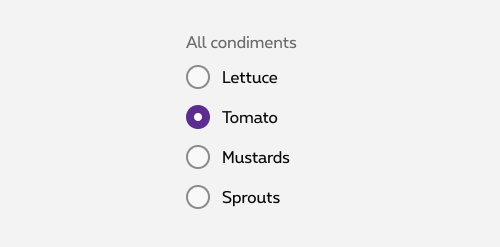
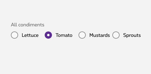
Radio button labels are positioned to the right of their inputs. If there is a radio button grouping, they are laid out vertically. Vertical listings are easier for the reader to identify which radio button is related to which label.

Do
Vertically stacked

Don't
Horizontally stacked
Content
Legend
- If necessary, a legend can accompany a set of checkboxes to provide further context or clarity.
- A group label (legend) can either state the category of the grouping or describe what actions to take below.
- Regardless of whether the label is visible in the interface, a group label is always needed in code as from 2 checkboxes. See the radio button code tab for more information.
Label
- Make the label selectable. Users should be able to tap on or click on either the text label or the checkbox to select or deselect an option.
- Always use clear and concise labels for checkboxes.
- Be explicit about the results that will follow if the radio button is selected.
- Labels appear to the right of radio button inputs.
- We recommend radio button labels being fewer than three words.
- Do not truncate radio button label text with an ellipsis.

Do
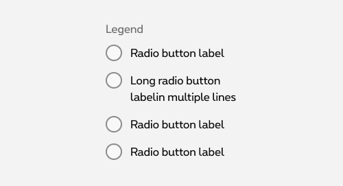
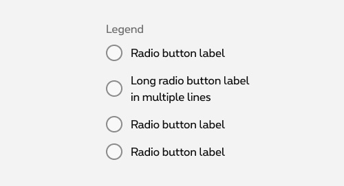
Do let text wrap beneath the radio button so the control and label are top aligned.

Don't
Don't vertically center wrapped text with the radio button.
Related elements
Radio button vs checkbox
Whereas radio buttons represent a group of mutually exclusive choices, users can select one or more checkboxes from a group. In use cases where multiple selection of a group is allowed, use the checkboxes component instead of the radio buttons.
More info about checkboxes
Radio button vs. switch
Generally, toggle switches are preferred when the resulting action will be instantaneously applied, without the need for further confirmation. Checkboxes generally represent one input in a larger flow which requires a final confirmation step.
More info about switch
Radio button vs. select
If available options can be collapsed, consider using a select menu instead, as it uses less space.
More info about select
Radio button vs selected boxes
Selectable boxes allow the user to select unique or multiple options.
More info about selectable boxes
Sizes and colors
Group of radio buttons must be wrapped in a <fieldset>
containing a <legend>
for the title.
If the title is not visually needed, <legend>
can be hidden and showed only for screen reader with show-for-sr
class.
Single radio button must make sense from its label. Single radio button can't have <fieldset>
as the fieldset is only use to group elements. A group with a single element doesn't make sense.
We put ac-
prefix (abbreviation for "accessibility") to know that this id
has been added for accessibility matter.
Default Radio
Each <input>
must be wrapped within <div class="rs-radio">
container.
By default, all form fields are mandatory, except those mentioned with (optional) in the label.
Default Radio with displayed legend
Default Radio with stylized legend
Negative Default Radio
rs-form-neg
class added on <form>
or a <div>
container (if <form>
is not needed in particular cases like with Angular) allows to switch all form fields to negative version.
Disabled Radio
Just add disabled
attribute to the <input>
.
Error Radio
To use Zurb Foundation form check javascript, data-abide="ajax"
attribute should be added to <form>
so error class will be added/removed dynamically when needed, for example if <input>
is required.
The error message <span>
should have an id
(prefixed with "ac-" as accessibility abbreviation to know this is added for accessibility matter) which should be referenced in the <input aria-describedby="error_id">
for screen readers when the error is displayed. This is automatically added by the javascript.
Negative
rs-form-neg
class added on <form>
or a <div>
container (if <form>
is not needed in particular cases like with Angular) allows to switch all form fields to negative version.
JavaScript
Each time you add Radio input to the page, you have to use this JS function
CONTEXT refers to document or html element parent.
Deprecated
The radio buttons below are not accessible and should no longer be used.
This element will no longer be available from the expiry date meaning the related css will be removed and the element design will be broken if it's not adapted to the new html.
Class:
-
rs-label-radio -
rs-label -
label.rs-radio -
rs-mandatory -
rs-radio-big -
rs-radio-big-standalone -
rs-input-info
Big Radio buttons
Normal state:
Disabled state:
Error state:
Standalone in a panel:
Standalone & disabled in a panel:
Standalone & error in a panel:
Configuration metadata (DSRadioComponent)
Selector: ds-radio
Class: DSRadioComponent
e2e testing Id: None
Use case example
NOT AVAILABLE LIVE PREVIEW
Inputs
| Name | Type | Default | Required | Description |
|---|---|---|---|---|
| error | boolean | false | No | Applies the error CSS class |
| errorMessage | string | null | No | The text in case ot an error |
| label | string | null | No | Control label |
| legend | string | null | No | Control legend |
| negative | boolean | false | No | Defines light/dark style of the component |
| id | string | undefined | Yes | Component unique id |
| disabled | boolean | false | No | Defines if the control is disabled |
| selected | boolean | false | No | Defines if the control is selected |
| name | string | null | No | Defines name attribute of the control |
Outputs
| Name | Type | Description |
|---|---|---|
| onSelect | EventEmitter | Emits when the control is selected |
Models
None
Configuration metadata (DSRadioButtonComponent)
Selector: ds-radio-button
Class: DSRadioButtonComponent
e2e testing Id: None
Use case example
NOT AVAILABLE LIVE PREVIEW
Inputs
| Name | Type | Default | Required | Description |
|---|---|---|---|---|
| config | IRadioButtonConfig | { choices: [], errorMessage: '' } | No | The component configuration |
| error | boolean | false | No | Applies the error CSS class |
Outputs
None
Models
        export interface IRadioButtonConfig {
            choices: IRadioButtonChoice[];
            preselected?: string;
            legend?: string;
            legendNgClass?: string;
            errorMessage?: string;
            negative?: boolean;
            fieldsetNgClass?: string;
        }

        export interface IRadioButtonChoice {
            id?: string;
            label: string;
            value?: string;
            disabled?: boolean;
        }