 Design System
Please don't forget to read Usage part of each element.
Progress indicator
A progress indicator visually communicates the status of ongoing tasks or processes, informing users about completion or remaining duration within interfaces
Overview
Use progress indicator to help user to keep track of their progression. By dividing the end goal into smaller, sub-tasks, it increases the percentage of completeness as each task is completed.
States
-
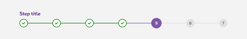
Default state
State visible on the next steps. -
Active state
State visible when a step is active. -
Complete state
State visible when the step is complete.
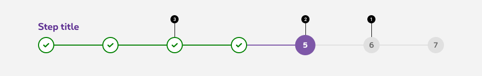
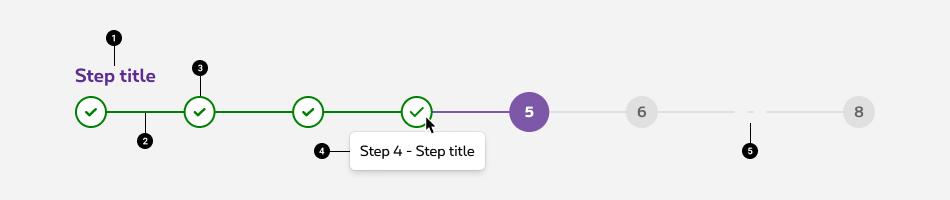
Anatomy
Progress indicator can display up to 7 steps. If the process contains less that 7 steps, they will occupy the whole width of their container. If more than 7 steps, the indicator will truncate a portion of the steps, depending on the user's progression.
-
Step title
Indicate the name of the step. Use clear and concise labels to facilitate user's understanding (e.g.: delivery method, document upload) -
Progression bar
Provides an additional hint about the progression, depending on its location. -
Progress step
Displays the step number and status. -
Tooltip
Shows the name of a given step on hover (or tap on mobile), it gives some context about passed and future steps. More infos about the tooltip -
Truncation indicator
When the tasks takes more than 7 steps, the steps are truncated to keep a reasonnable amount of steps displayed on the screen.
Behaviour
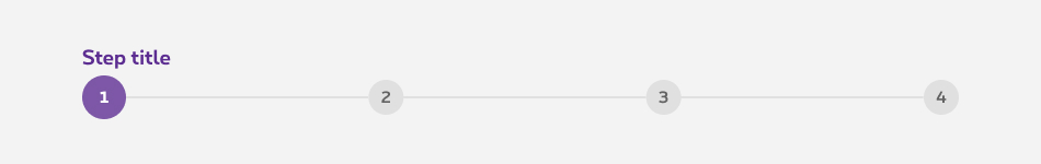
Less than 7 steps
Steps will spread horizontally to take up the full width of the container.
More than 7 steps
Depending on the progression of the user, truncation can happen at the beginnning, the end or both ends of the progress indicator.
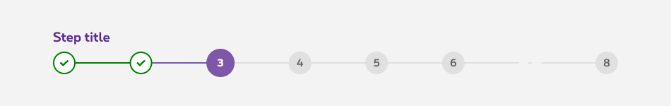
When the user is at the first 5 steps of the process, the truncation happens at the end of the component.
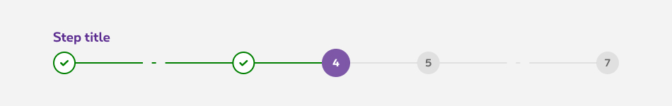
When the user is in the middle of the process not close enough to display the 5 first ones, not far enough to display the 5 last ones. The truncation happens on both ends.
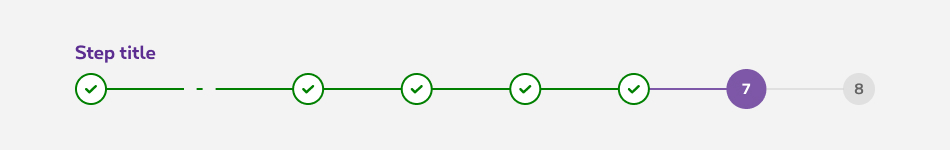
When the user have already performed enough steps to display the last 5 ones. The truncation happens at the beginning of the progress indicator
Best practises
Logical progression
Display the steps in order from left to right. Indicate to the user that they are performing a multistep process, and show the direction of movement. Allow the user to return to the previous step to review their data submission via a previous at the end of the current screen
Indicate the current step
Keeping the user informed of where they currently are within the process or task at hand will give them a sense of control. This helps the user to know where they are in relation to where they have been, and what sections are to follow. Clear labels should accompany the progress indicator to indicate what the user will accomplish within each step. Keep labels between one to two words.The endowment progress effect
Improve tasks completion rate by starting at step 2 with a step one already completed.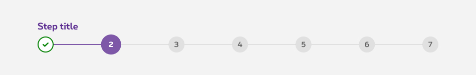
Validation
Use validation to confirm that a previous step has been completed. If the user cannot proceed onto another step without first completing a task, display a disabled button at the end of the task.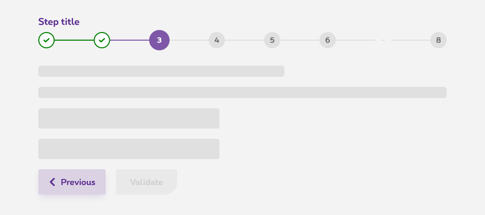
Related elements
Progress indicator vs. Timeline
Progress indicator offers an indicative information about the progression of the user within a multi step task. Whereas timeline is more adapted to offer the user an interactive set of elements to indicate a chronology of events. (e.g. tickets follow up, informative content about processes, etc.)
Sizes and colors
The progress indicator is only available for the default mode (positive). If you need the negative version, please contact us.
Default progress indicator
-
rs-proginddiv must have an explicite aria-label attribute; - The current step must have an explicite aria-current attribute;
-
rs-progind-elmust have an explicite tooltip.
| Name | Type | Description | Default value |
|---|---|---|---|
| sStepsTitles | string | Steps titles | "Title 1, Title 2, Title 3" |
| iCurrentStep | integer | Current step number | 1 |
| sTagName | string | Tag name | "div" |
| iTruncateFrom | integer | Step number from which truncate is needed | 0 |
| iTruncateTo | integer | Step number to which truncate is needed | 0 |
| sXtraClass | string | Extra class to rs-progind
container |
"" |
Long progress indicator
The limit of displaying steps in the progress indicator is 7. Therefore, you need to crop it. Add a span
tag with rs-progind-ellipse
class inside the concerning li
tag.
Truncation at the end of the progress indicator
If the user is at the first 5 steps, the truncation happens at the end of the component.
Truncation at the start of the progress indicator
If the user is at the last 5 steps, the truncation happens at the beginning of the component.
Truncation at both sides of the progress indicator
If the user is in the middle of the process, the truncation happens at the both sides of the component.
Statuses type
You have 3 possible statuses for the progress indicator:
-
rs-progind-item rs-done: completed; -
rs-progind-item rs-selected: ongoing; -
rs-progind-item: next / todo.
Configuration metadata
Selector: ds-progress-indicator
Class: DSProgressIndicatorComponent
e2e testing Id: None
Use case example
NOT AVAILABLE LIVE PREVIEW
Inputs
| Name | Type | Default | Required | Description |
|---|---|---|---|---|
| id | string | undefined | No | Component id |
| stepTranslations | string[] | undefined | Yes | The translations for each steps |
| numberOfSteps | number | undefined | Yes | Set the number of steps for efficiency |
| currentStep | number | undefined | Yes | The current step. Initial step is 0. |
Outputs
None
Models
None