ACCORDION CONTENT HERE
Panel 1. The content is not an integral part of the accordion component, it can be replaced by any content (pay attention to light & dark theme rules).
Accordions are interactive UI elements that expand and collapse content sections upon user interaction, conserving space, and organizing information hierarchically for improved readability and navigation within pages.
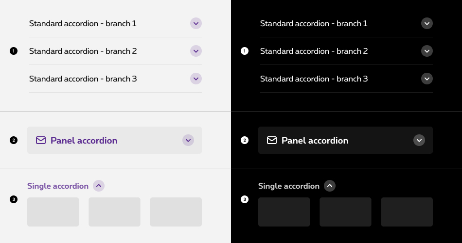
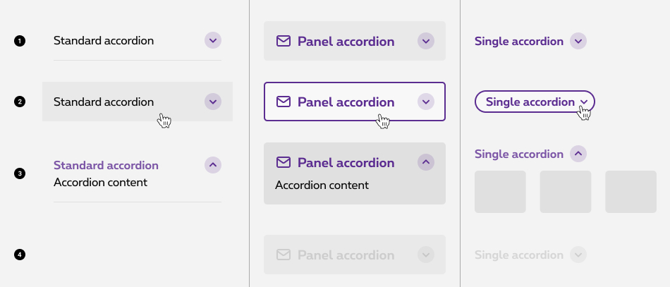

If you need to use several accordion panels underneath each other, please take the pyjama version. In this case, it's considered a list and the different states are visually different from the default panel accordion. In the pyjama version, the accordion panels are glued together and alternating colours are applied.

Accordions begin by default in the collapsed state with all content closed. Starting in a collapsed state gives the user a high level overview of the available information.
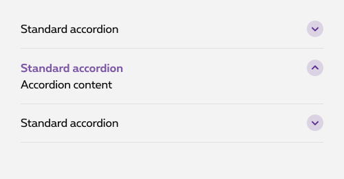
By default, the user can open one branch at a time. When a new branch is opened, the previous one is closed.
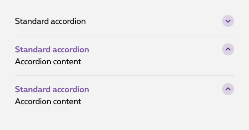
If needed, you can parameter the accordion to allow the user to expand multiple branch at once.
Users can trigger a state change by clicking on the chevron or clicking anywhere in the label area.

Accordions begin by default in the collapsed state with all content closed. The expand/close action can triggered by another button than the branch itself. This option can be used as an anchor to redirect the user to the good branch of the accordion with its content already revealed or an external close button can be added on mobile at the end of the content to close the branch when its content is really long.
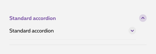
Don't
Putting an expand/collapse behaviour inside of an accordion item is not considered as a good UX practise.
The clickable expandable title should be a heading. You got 2 options to do it:
role="heading" aria-level="2"
to simulate a heading. In this case, it will be interpreted as <h2>
. aria-level="2"
should then be adapted according to its position on the page titles hierarchy!Panel 1. The content is not an integral part of the accordion component, it can be replaced by any content (pay attention to light & dark theme rules).
Panel 2. The content is not an integral part of the accordion component, it can be replaced by any content (pay attention to light & dark theme rules).
Panel 3. The content is not an integral part of the accordion component, it can be replaced by any content (pay attention to light & dark theme rules).
To switch it to negative, add rs-accordion-neg
to accordion
foundation class.
Panel 1. The content is not an integral part of the accordion component, it can be replaced by any content (pay attention to light & dark theme rules).
Panel 2. The content is not an integral part of the accordion component, it can be replaced by any content (pay attention to light & dark theme rules).
Panel 3. The content is not an integral part of the accordion component, it can be replaced by any content (pay attention to light & dark theme rules).
In case you need a heading, span
with rs-accordion-title-txt
could be replace by the one you want.
For accessibility, it's imperative to set the aria-labelledby attribute to indicate the IDs of the elements that label the object. It is used to establish a relationship between components, or groups, and their labels.
role="button"
attribute is used to simulate a button. Put it on <a class="rs-accordion-title">
.
aria-expanded
attribute is used to tell in screen reader if the accordion is expanded or collapsed. Put it on <a class="rs-accordion-title">
.
aria-controls
is used to associate a control with the fields it controls. The fields are identified with an ID
rs-bg-hover
is used to trigger a hover effect on the border of the whole div
. If you need another hover effect, you can use background hover classes.
If no hover is needed (due to accordion content for example), you can just remove this class.
To create a disabled accordion, add rs-disabled
around (or on the section). This also do the job with negative and theme.
Also add aria-hidden="true" aria-disabled="true"
to completely hide the component for screen reader.
To avoid focus and the posibility to use it with keyboard, you also need to add tabindex="-1"
on all <a>
.
To have a pyjama effect wrap your panel accordions inside a <div>
with rs-accordion-pyjama
. No need to add background color classes on the rs-accordion-panel
To have the negative version, add rs-accordion-pyjama-neg
to rs-accordion-pyjama
. No need to add background color classes on the rs-accordion-panel
Use class rs-accordion-single-container
to include button and content with associates classes.
data-expandable
should be added on the <button>
to enable the open/close.
To open it by default for a specific breakpoint, add data-expanded-breakpoint="large"
on the <button>
. Value could be for example: "small-only", "medium", "large"...
| Html element | Attribute | Attribute value | Explanation |
|---|---|---|---|
| <button> | aria-expanded
|
false
/ true
|
Depending wether the accordion should be opened or closed by default. The js allows to toggle between "true and "false". |
aria-controls
|
ac-XXX
|
Refering to the related content of the expanding part to establish a relationship between the button and its expanding content. | |
id
|
ac-XXX
|
Button's id prefixed with "ac-" (meaning this id is added for accessibilty needs) | |
| <i> | aria-hidden
|
true
|
Making the screen reader ignore the icon |
| <div class="rs-accordion-single-content"> | role
|
region
|
To allow keyboard navigation on the accordion content |
id
|
ac-XXX
|
Expanding content id prefixed with "ac-" (meaning this id is added for accessibilty needs) | |
aria-labelledby
|
ac-XXX
|
Refering to button's id which expands the content to establish a relationship between the button and its expanding content. | |
aria-hidden
|
true
/ false
|
Depending wether the expanding content should be expanded or not by default. The js allows to toggle between "true and "false". |
Add this class rs-accordion-single-container-neg
to existing div
that contains rs-accordion-single-container
.
Add disabled to button to disabled the single accordion.
To allow several accordions opening at the same time, you must add data-expandable-depencies="#ac-ID1, #ac-ID2"
on the <button>
" specifying the id of other accordion(s) separated by commas, it is possible to apply the opening behaviour on several accordions at the same time.
You can trigger the expand of the accordion by another button than his button. In order to do that you have to add data-accordion-toggle attribute to the element with the id of the initial accordion button.
By default it opens the accordion, if you need to close it by the new button, add , false to the attribute.
Panel accordion:
EL is referred to a DOM element containing a child with data-accordion-panel-trigger attribute.
Single accordion:
CONTEXT is referred to a DOM element containing a child with data-expandable attribute.
External button:
CONTEXT is referred to a DOM element with data-accordion-toggle attribute.
Selector: ds-accordion
Class: DSAccordionComponent
NOT AVAILABLE LIVE PREVIEW
| Name | Type | Default | Required | Description |
|---|---|---|---|---|
| id | string | undefined | Yes | Unique id that will be attached to the attributes "name" and "id" on the <input> element and "for" attribute in the <label> element. It is required as you could run into behavioral problems if not provided |
| accordionStyle | AccordionStyleEnum | AccordionStyleEnum.Standard | No | Panel, Standard, PanelPyjama, Single. The type of accordion you want this to be. See models below. |
| branches | AccordionBranch[] | undefined | No | It holds the title of the button (head) and the content. If you want a 'Single' accordion with dependencies you add a dependency per branch. Also see models below + some examples. |
| icon | string | undefined | No | For Panel and PanelPyjama you can specify an icon, it will be added to the element as the value of the class attribute |
| negative | boolean | false | No | Defines light/dark style of the component |
| Name | Type | Description |
|---|---|---|
| blurred | EventEmitter<boolean> | Emits true when opened |
        export enum AccordionStyleEnum {
            Panel,
            Standard,
            PanelPyjama,
            Single,
        }

        export interface AccordionBranch {
            title: string;
            content?: string;
            dependency?: string;
            isFromRichText?: boolean;
         }