 Design System
Please don't forget to read Usage part of each element.
Building forms
A form is a group of related input controls that allows users to provide data or configure options. Forms can be simple or complex, and may be presented as dedicated pages, side panels, or dialogs depending on the use case and the situation.
Overview
Where to use
Forms are incredibly common in user interfaces and their design and usage continues to evolve as input methods get smarter and more and more people use mobile and tablet devices. You might design a form for a user to:
- Sign up for / log into an account
- Register for a service
- Reconfigure settings (e.g. enabling notifications)
- Take a survey
- Purchase a product
- Provide feedback
Keep it short
Forms are used for submitting data so be as concise as possible when designing. Think about each field and what value the data will provide. What do you gain by collecting this information?
Begin by asking:
- Is this a piece of information that is valuable to us?
- Is this a piece of information that is so valuable that it's worth preventing the user from continuing if they choose not to provide it?
Filling a form is a painful and a mentally heavy task for users. They have to put a lot of effort into their completion, this is one of the reason that a lot of forms have a low completion rate. Be mindful of that when creating one.
Respect the user
Forms are meant to gather information and guide people with as little fuss as possible. To allow users to scan and complete the form quickly, forms should:
- Respect the user's GDPR and other privacy regulations by only asking for information that is absolutely necessary.
- Group related tasks under section titles to provide more context and make the interface easier to scan.
- Follow a logical, predictable order. e.g: first name first, last name second.
- Allow users to stay with a single interaction method for as long as possible (i.e. do not make users shift from keyboard to mouse numerous times in a single form).
- When designing be mindful of password managers and browser capabilities that populate data for users.
- Progressively disclose additional inputs only as they become relevant; see the Designing for longer forms section below.
Be inclusive
Designing a form while keeping in mind that users may be experiencing permanent, temporary or situational disabilities improves the experience for everyone. You must keep in mind that your form must be:
- perceivable
- operable
- understable
- robust and compatible
You can read more about accessibility in the dedicated article.
Anatomy
Forms are comprised of some or all of the following elements.
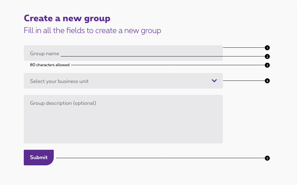
- Text inputs
Enable users to input free-form text. - Labels
Input labels helps users understand what the corresponding inputs mean. - Helpers
Provides in-context guidance like tooltips, placeholder text, or helper text, to assist the user in providing the right information. - Data inputs
Information can be entered through a variety of non-free form input fields as well, (e.g. checkboxes, radio buttons, dropdowns and selects, file uploader, date pickers, toggles, etc.) Visit the individual component pages for in depth details of their specific states and visuals. - Buttons
Allows users to submit or exit a form.
Building a form
Labels
Concise labels for text and data inputs help users understand what information is being requested of them.
- Use sentence-style capitalization for all text elements, except for product names and proper nouns. Sentence-style means only the first word of each sentence is capitalized.
- Although they may be formatted differently, all input components need labels.
- Labels should clearly state the required input.
- Do not use colons after label names.
- Labels are not help text; be succinct. Use one to three words only.

Optional vs. mandatory
All fields in a form are assumed required, with optional fields being tagged as so in the label. Although advise avoiding an excess of optional fields, if the situation arises, we recommend devoting an entire section to optional fields to avoid excessive repetition.

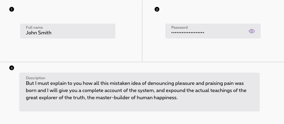
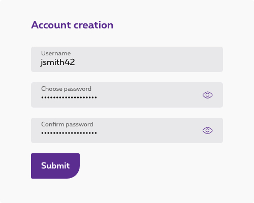
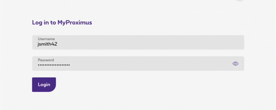
Text inputs
Free-form text inputs are the most commonly used components
- The field widths should reflect the intended length of the content while still aligning to the responsive column.
- Make sure users can enter their information at smaller screen sizes.
- Truncate when an input is too long to be fully displayed in the field.
- Pre-populate known values when possible, e.g. a client's name if known.
- The first required input field in a form should receive focus on presentation to a user.
Deciding what to use
| Control | Usage | Context |
|---|---|---|
| 1. Text input | To capture several words maximum | Names, phone numbers, addresses |
| 2. Password | To collect private data by hiding the characters | Passwords, PIN codes |
| 3. Text area | To capture multiple lines of text | Feedback, support requests |
Data inputs
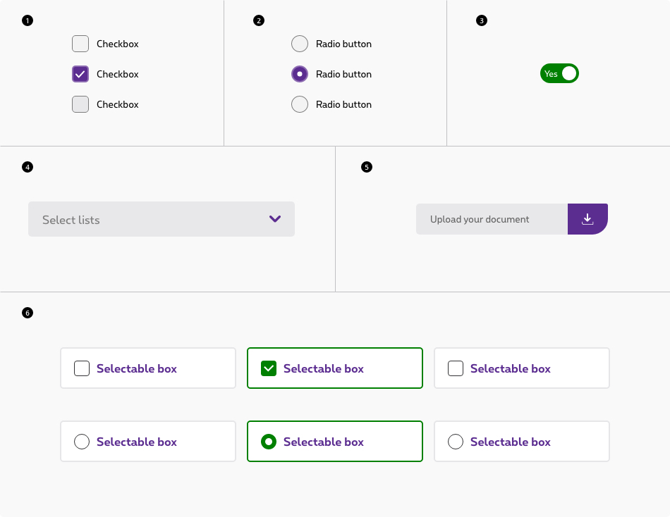
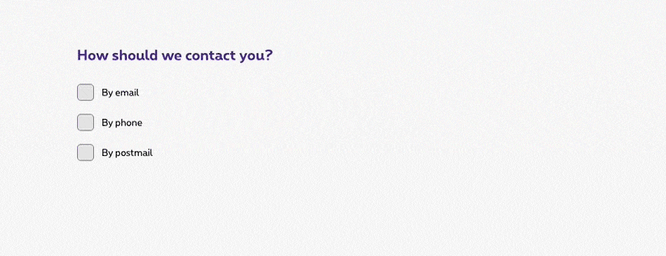
Selection controls
Selection controls offer users a selection from pre-determined options. When designing, consider how many options you need to present as well as how many items the user may need to select. These considerations will determine which component to use. Common selection controls include: checkboxes, radio buttons, file uploaders, toggles, and select lists.
Deciding what to use
| Control | Usage | Context |
|---|---|---|
| 1. Checkbox | To select or deselect one or more choices | Agree to terms and conditions, add optional items, select all that apply |
| 2. Radio button | To select only one option from two or more choices | Pick type, shipping method, etc. |
| 3. Switch | To select one binary option | Show/hide; On/off; Activate setting |
| 4. Select | To select a single item from a list. | Choose country, prefix or payment method |
| 5. File uploader | To upload/attach a file or multiple files to a form | Attaching legal documents, CVs, images, etc. |
| 6. Selectable boxes | To select a single or multiple items from a list. | Choose a plan, an option, etc. |
- Radio buttons and checkbox item text falls to the right of their controls.
- When possible, arrange the checkbox and radio button groups vertically for better scannability.
Offering help
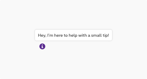
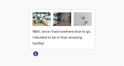
Tooltips
Tooltips can be very useful for providing additional explanation to users that may be unfamiliar with a particular form field. They can also offer rationale for what may seem like an unusual request. However, research suggests that users should not have to dig around for a tooltip to access information that's essential for the completion of their task.
Do
- Use tooltips with the outlined "i" (info) or "?" (question) icon.
- Use tooltips for explanatory or added information.
- Tooltips are microcontent; keep them concise.
Don't
- Tooltips are not catchalls for content that doesn't fit elsewhere; they must be used intentionally and very sparingly.
- Never house essential information in a tooltip.
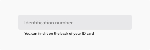
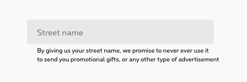
Help text
Help text appears below the input label and assists the user to provide the right information. Help text is always available, even when the field is focused, that's why it's the correct choice for need-to-know information. For context or background information that is "nice to have," use placeholder text or a tooltip.
Do
- Think of help text as crucial information that is secondary to the input label.
- Keep help text as short and specific as possible.
- Only use help text when truly necessary to avoid overloading the user.
Don't
- Never use help text in place of field labels.
- Help text should not run longer than the input area.
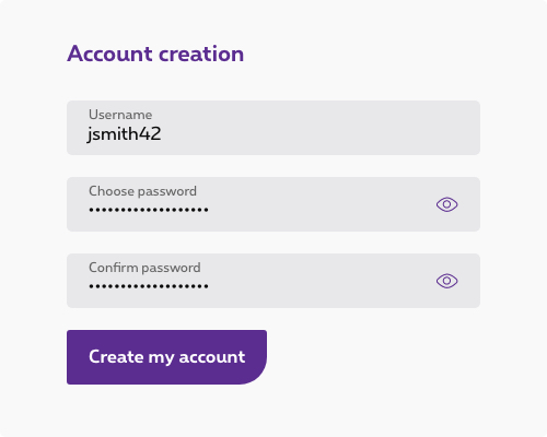
Buttons
Use a primary button for the main action, a secondary button for secondary actions like Cancel or Discard.
Button alignment
Please refer to button alignement section of the button article for more guidance about the subject.
Buttons labelling
Button label should describe the action the button performs, be specific rather than generic when choosing the label.
Do
Action is concrete and clear
Don't
Poor choice of label, too generic
Layout
Forms should be one column
Research suggest [1] [2] that using multiple columns layout can disrupt form scannability. Some exceptions may occur when input are linked or closely related (prefix + phone number, credit card + expiry date + cvv, etc.)

Do
Use a single column to design your form

Don't
Designing a multi column layout
Use field length as an affordance
The length of the field gives an additional indication on the expected input from users. Use this as a helper for defined character count fields (eg. id numbers, phone numbers, client id, etc.)
Behaviour
Errors and validation
Effective and immediate error messaging can help the user to understand the problem and how to fix it. First, inform the user what has happened, then provide guidance on next steps or possible resolutions. Always present error states on the form, and use inline errors whenever possible.
Client-side validation
We recommend validating the user's data before form submission. This type of real-time, inline validation (a.k.a. client-side validation) should happen as soon as the field loses focus. This will help to easily identify the elements that need to be corrected.
The validation label below the field should be as informative as possible when describing the issue with the user's data. For example, if password limitations require 16 characters, but the user inputs a password with only six characters, the text should read something like, "Password must be at least 16 characters".
Common user errors include:
- Incorrectly formatting data
- Leaving a mandatory field blank
- Leaving a mandatory field incomplete

Captcha are often used to validate whether the visitor is human or not. Although it is a common patterns on web interface, they are hardly recognizable by any assistive technology. It is recommended not to use them anymore.
Server-side validation
Inline notifications come into play when server-side errors are involved, i.e. the user tries to submit a form in its entirety and the page is reloaded with the detected errors.
In these situations, use an inline notification as well as inline error messaging wherever possible to help users make the fix. Inline error messages should disappear when the form criteria is met.
Enabling and disabling buttons
- For short forms that require server-side submission before returning errors, we recommend disabling primary action buttons until all of the form's requirements are met.
- For longer forms, do not disable primary action buttons because the error messages and the primary action button may not be visible on the screen simultaneously.
- When a user submits a form, disable the primary action button to prevent duplicate submissions.
- If it's going to take a while to process a form, communicate this to the user with feedback messages and progress indicators (e.g. spinners or progress bars).
Designing for longer forms
Product designers often ask about the appropriate length for web forms. Unfortunately, there's no one-size-fits-all answer. Your audience and their intentions, along with the context of your product will determine the solution that's best for you. Here are several techniques to help make longer forms less overwhelming.
Progressive disclosure
Use progressive disclosure to reveal any additional content that may arise based on the user's previous selection. This kind of show/hide approach allows the user to focus on relevant information while keeping workflows short.
Accordions forms
Accordion forms allow users to dynamically expose and hide sections of related information. Like progressive disclosure, accordion forms allow users to focus on relevant information without having to navigate between pages. As a general rule, this technique should not be used in dialog forms.
Research suggests that accordion forms can greatly enhance completion speed and page load times. However the same research also suggests that confusion can arise for users when it comes to primary action buttons and whether they apply only to sections vs. the full form.
Multistep forms
A multistep form spreads form fields across multiple screens and incorporates a progress indicator to track a user's status step by step. There should be a logical relationship between the fields on each screen and a linear relationship between sections.
This approach is good for saving form progress along the journey and allows users to return to a previous step to review their submissions.
A form should always have a submit button.
If for some reasons, the submit button has to be outside of the <form>
, add an id
to the <form>
and a form
attribute to the submit <button>
containing the form's id:
<form id="ac-myForm">
...
</form>
...
<button type="submit" form="ac-myForm" class="rs-btn">
Check the DS about:
Here are documentations about autofill: "Attribut HTML : autocomplete" - Help users checkout faster with Autofill. You could also use autocomplete="chrome-off" to avoid autocomplete on Chrome.
Example
JavaScript
Each time you add form element to the page, you have to use this JS function
CONTEXT refers to document or html element parent.