 Design System
Please don't forget to read Usage part of each element.
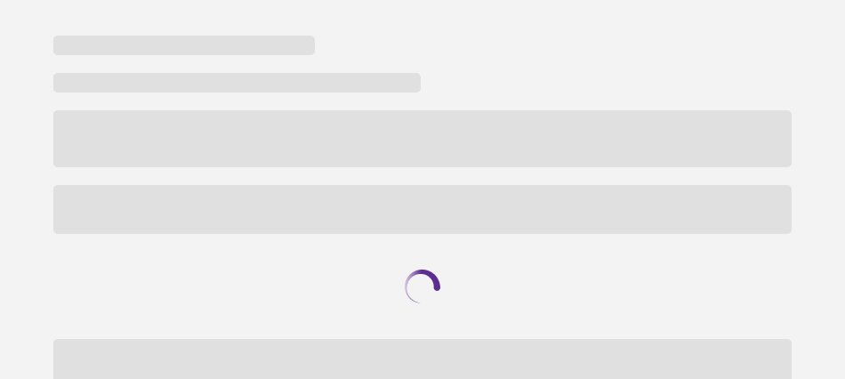
Spinner
A spinner is a visual indicator of loading or processing, reassuring users that an action is in progress within interfaces.
Types
Spinners are an indeterminate indicator which express an unspecified amount of wait time. They should be used when progress isn’t detectable, or if it’s not necessary to indicate how long an activity will take.
-
Default spinner
Spinner is a circular progress indicators that inform users about the status of ongoing processes, such as submitting a form or saving updates. It's tied to user-triggered actions.
-
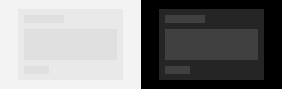
Skeleton
Skeleton are simplified versions of components used on an initial page load to indicate that the information on the page has not fully loaded yet. They should only appear for only a few seconds, disappearing once components and content populate the page.
Default spinner overview
After the user action, the spinner will replace the content and be center on the interface. Spinners attract attention because of their animation so they should be used sparingly. Ideally, only one spinner should be used at a time.
Skeleton overview
Only use skeleton on container-based components like panels, data tables, buttons,... Never represent toast notifications, overflow menus, dropdown items, modals, and loaders with skeleton. Elements inside a modal may have a skeleton state, but the modal itself should not.
Sizes and colors
Default spinner
On the container of spinner element, you have to set:
- role="alert" and aria-live="polite" attributes ; the screen reader will alert the user something is loading if the user is not busy somewhere else on the page
- aria-busy="true"
- an explicite value for aria-label
attribute:
- FR: Merci de patienter... Votre contenu est en cours de chargement
- EN: Please wait... Your content is loading
- NL: Even geduld aub... Uw inhoud wordt geladen
- DE: Bitte warten... Ihr Inhalt wird geladen
Once the spinner is replaced by the loaded content, you have to:
- update aria-busy attribute to false
- remove aria-label attribute
To built a spinner on your page, put a <div>
with rs-spinner
class.
By default, the spinner is centered. But if you want it on the left, just add rs-no-margin-left
class.
Negative
To have negative spinner just add rs-neg
around rs-spinner
element.
Spinner overlayer
On spinner overlayer element, you have to set:
- aria-busy="true"
- an explicite value for aria-label
attribute:
- FR: Merci de patienter... Votre contenu est en cours de chargement
- EN: Please wait... Your content is loading
- NL: Even geduld aub... Uw inhoud wordt geladen
- DE: Bitte warten... Ihr Inhalt wird geladen
On the overlayer itself: change role="dialog"
to role="alert"
.
Pay attention this overlayer doesn't take the other overlayers' accessibility attributes
Once the spinner is replaced by the loaded content, you have to:
- update aria-busy attribute to false
- remove aria-label attribute
Skeleton
A skeleton is designed by panel
combined with rs-bg-skeleton
class. You can set width and height.
If you need multiple levels, don't change the background color, with its transparency rs-bg-skeleton
is sufficient on its own
On section/element that contains skeleton, you have to set:
- role="alert" and aria-live="polite" attributes ; the screen reader will alert the user something is loading if the user is not busy somewhere else on the page
- aria-busy="true"
- an explicite value for aria-label
attribute:
- FR: Merci de patienter... Votre contenu est en cours de chargement
- EN: Please wait... Your content is loading
- NL: Even geduld aub... Uw inhoud wordt geladen
- DE: Bitte warten... Ihr Inhalt wird geladen
Once the skeleton is replaced by the loaded content, you have to:
- update aria-busy attribute to false
- remove aria-label attribute
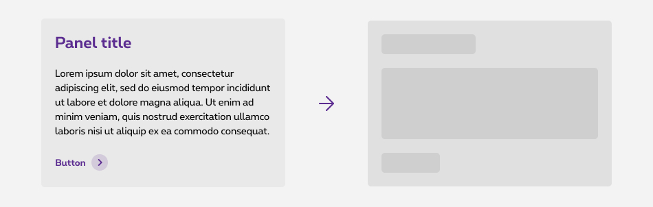
See a concrete exemple of skeleton
See its page
Title
Curabitur sed hendrerit quam. Vestibulum ante ipsum primis in faucibus orci luctus et ultrices posuere cubilia Curae; Suspendisse id massa vel nunc vestibulum posuere et at dolor. Vestibulum ante ipsum primis in faucibus orci luctus et ultrices posuere cubilia Curae; Proin accumsan vulputate arcu et auctor nulla vestibulum id. Sed
ButtonSkeleton animation
Add rs-anim-loading
class on the element who needs the animation.
Title
Curabitur sed hendrerit quam. Vestibulum ante ipsum primis in faucibus orci luctus et ultrices posuere cubilia Curae; Suspendisse id massa vel nunc vestibulum posuere et at dolor. Vestibulum ante ipsum primis in faucibus orci luctus et ultrices posuere cubilia Curae; Proin accumsan vulputate arcu et auctor nulla vestibulum id. Sed
ButtonConfiguration metadata (DSSpinnerComponent)
Selector: ds-spinner
Class: DSSpinnerComponent
e2e testing Id: None
Use case example
Inputs
| Name | Type | Default | Required | Description |
|---|---|---|---|---|
| isNegative | boolean | false | No | Defines light/dark style of the component |
| alignment | 'LEFT' | 'RIGHT' | 'NONE' | 'NONE' | No | Horizontal component alignment |
Outputs
None
Models
None
Configuration metadata (DSSpinnerOverlayComponent)
Selector: ds-spinner-overlay
Class: DSSpinnerOverlayComponent
e2e testing Id: None
Use case example
NOT AVAILABLE LIVE PREVIEW
Inputs
| Name | Type | Default | Required | Description |
|---|---|---|---|---|
| popUpID | string | jsrs-loadingDialog | No | Component id |
| ariaLabel | string | undefined | No | Accessibility label |
| modalTitle | string | undefined | No | Title attribute |
| showOverlayer | boolean | false | No | Show/hide modal |
Outputs
None
Models
None