 Design System
Please don't forget to read Usage part of each element.
States
States are visual representations used to communicate the status of a component or interactive element.
Types
States communicate the status of the components to the users. States must have a clear affordance, distinguishing them from one other and the surrounding UI, emphasising their priority levels.
-
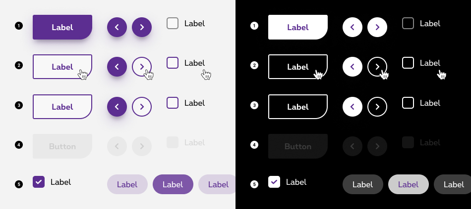
Enabled / Default state
State visible when a component is interactive. -
Hover state
State visible when a user has placed a cursor above an interactive component. Cursor becomes a pointer. -
Focused state
State visible when a user has highlighted an interactive component, using an input method such as a keyboard or voice. -
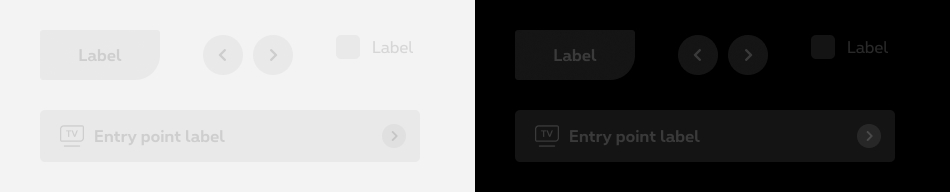
Disabled state
State visible when a component is noninteractive. This state is applied to a component when the user cannot interact with it due to permissions, dependencies, or pre-requisites. Disabled states remove the interactivity a component. -
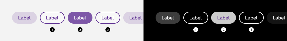
Selected state
State visible when users make a choice.
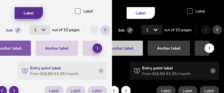
Enabled/default state
The enabled state is the default state of a component/element that users see before any interaction. To follow the Proximus brand, the major part of our components are purple and grey colours based.
Hover state
A hover state communicates interactivity of a component or element, and should be emphasized in a UI. This state is initiated when users hover one of them.
-
Default hover
The default hover gives a clear affordance, distinguishing this state from the enabled one and the surrounding UI. -
Light hover
The light hover is a semi-transparent layer of colour filling the background to indicate its state. Light hover state provides a way to highlight the components on hover without emphasising it too much. An overlay can be applied to an entire component. We are using this type of hover state for lists. This hover effect is used for list components such as drag and drop, action menu,...
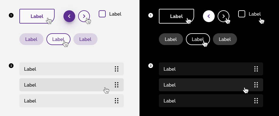
Focused state
A focused state communicates when users highlight an element using a keyboard or voice. Focus states apply to all interactive components.
By default, browsers render the focus in several different ways. We customised it to match to Proximus brand guidelines. The focused state is visualy the same than the hover state.
To be accessible, all interactive components on a page need a focus state, not just buttons or links. A focus state highlights interactive components, this state is crucial to help users find their way in the page when navigating with alternative method (keyboard, etc.).
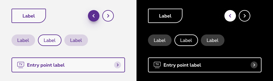
Focused state combined with selected state
Focused state can be combined with selected state and remain strighly visible. When an element is on selected state, the outline is placed outside to be still visible.
- Focused state
- Selected state
- Selected + focused states
Disabled state
A disabled state communicates when a component or element isn’t interactive, and should be deemphasized in a UI.
Best practices
- Disabled components can be hovered over, but won’t display state changes to the component or cursor.
- Disabled components don’t change state when tapped.
Selected state
A selected state indicates user selection of options. This state should receive medium emphasis so they are easily identifiable, but not distracting.
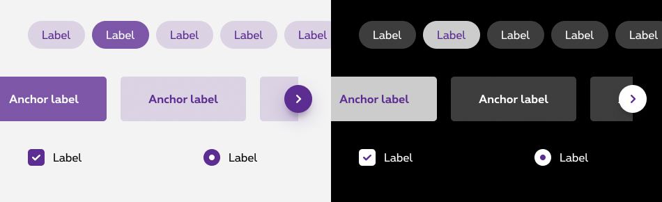
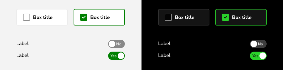
Selected state with positive emphasis
For some components, the selected state is using green color to emphase a positive and success message.
Sizes and colors
Disabled
For Screen Reader add:
-
aria-disabled="true"to <a> -
disabledto <button>
rs-txt-disabled
rs-bg-disabled
Negative disabled
rs-txt-disabled-neg
rs-txt-disabled with rs-neg parent
rs-bg-disabled-neg
rs-bg-disabled with rs-neg parent
Hover
rs-txt-hover
rs-bg-hover
rs-bg-hover-second
Negative hover
rs-txt-hover-neg
rs-bg-hover-neg
rs-bg-hover-second-neg
rs-txt-hover with rs-neg as parent
rs-bg-hover with rs-neg as parent
rs-bg-hover-second with rs-neg as parent
Selected
Don't forget to put aria-selected="true"
to indicate the current state of interactive element. You could find more info about aria-selected on W3C website.
rs-txt-selected
rs-element-selected
Negative selected
rs-element-selected-neg
rs-element-selected with rs-neg parent
Focused
rs-txt-focus
rs-bg-focus
Negative focus
rs-bg-focus-neg
rs-bg-focus with rs-neg parent
Clickable
rs-bg-clickable
Negative cliquable
rs-bg-clickable-neg
rs-bg-clickable with rs-neg parent