 Design System
Please don't forget to read Usage part of each element.
Select
expiry date: 30/04/2021
Select is a dropdown menu allowing users to make a choice from a predefined list of options.
Types
There is one type of select, available for our different themes:

Forms can be simple or complex, so we have prepared clear recommendations for you to use. These guidelines will help you build your forms and maintain consistency between all the forms of our digital platforms. Discover our recommandations to build a form.
States
For text fields states info, please refer to the text field article.
-
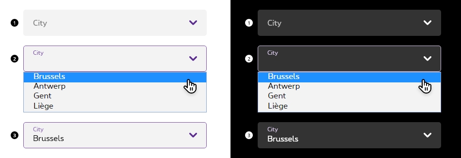
Basic state
State visible before click. Field and label are displayed, and chevron pointing to the bottom. No user input yet. -
Opened
State triggered by keyboard navigation or click. The modal menu opens, allowing the user to select an option. Container is outlined to help the user identify the field state and chevron is changing its direction to point to the top. -
Filled state
State visible when the user has done his selection. Container and input are visible.
Anatomy

-
Select container
A select field displays with a pointing down chevron indicates the type of action required by the user. Refer to the text field article to have more info. -
Options list
The options list contains all the available options. Select usess the native behaviour from the browser, thus the design might slightly change from a browser to another. -
Chevron
Chevron informs the user about the possible interaction with the field and its state. Pointing down, the options are hidden. Pointing up, the options are displayed. -
Option label
Option label indicates the option/choice that will be selected when clicked. Try to be as concise as possible.
- Native behaviour only allow to display text within the select field.
- When user is prompted to choose form a larger set of options, consider grouping the options.
Interaction
The modal menu appears on click on the field and should be displayed above all other UI elements. They can be dismissed by clicking outside of the modal menu item or on the select field itself.
The select, like the text field, displays the selected option as input content in the field when the user has selected it in the modal menu.
Please refer to the text field article for all select text field sizes and colors info.
No UI specification for the modal menu itself since it's a select native from the browser.
All form fields have a 100% width so they need to be included in a gridding to have the wished size.
Each <select>
must be wrapped within <div class="rs-form-item">
container. This container must contain the <select>
and the <label>
linked to the input thanks to for
attribute refering to the id
of the <select>
.
We put ac-
prefix (abbreviation for "accessibility") to know that this id
has been added for accessibility matter.
By default, all form fields are mandatory, except those mentionned with (optional) in the label.
When possible, select options should be alphabetically sorted.
| Name | Type | Description | Default value |
|---|---|---|---|
| sLabel | string | Label | "Select label" |
| lOptions | string [] | Options list | new [] {"", "Apple", "Banana", "Orange", "Stawberry"} |
| iSelectedOption | integer | Selected option | -1 |
| sID | string | ID | "ac-defaultSelect" |
| sName | string | Name | "defaultSelect" |
| bIsOptional | boolean | Optional | false |
| sXtraClass | string | Extra class to <div class="rs-form-item"> | "" |
| bIsError | boolean | Is in error status | false |
| sErrorMsg | string | Error message | "This is an error message" |
| bIsSuccess | boolean | Is in success status | false |
| sSuccessMsg | string | Success message | "This is an success message" |
| bHasHelper | boolean | Has a helper text | false |
| sHelperMsg | string | Helper message | "This is a helper message" |
| bIsDisabled | boolean | Is disabled | false |
| bIsReadOnly | boolean | Is readonly | false |
| bIsPrefix | boolean | Is prefix | false |
| bIsPostfix | boolean | Is postfix | false |
Default select
Optional select
Default negative select
rs-form-neg
class added on <form>
or a <div>
container (if <form>
is not needed in particular cases like with Angular) allows to switch all form fields to negative version.
Prefilled select
When a <select>
is prefilled, rs-filled
class should be added to it. This avoids label moving above the input content after page load.
Error select
To use Zurb Foundation form check javascript, data-abide="ajax"
should be added to <form>
so error
class will be added/removed dynamically when needed, for example if <select>
is required.
The error message <span>
should have an id
(prefixed with "ac-" as accessibility abbreviation to know this is added for accessibility matter) which should be referenced in the <select aria-describedby="error_id">
for screen readers when the error is displayed. This is automatically added by the javascript.
Select with helper text
A helper text
should have an id
(prefixed with "ac-" as accessibility abbreviation to know this is added for accessibility matter) which should be referenced in the <select aria-describedby="helper_id">
for screen readers.
Select optional with helper text
Disabled select
Just add disabled
attribute to the <select>
.
Readonly select
Just add readonly
attribute to the <select>
.
For Screen Reader add aria-disabled="true" tabindex="-1"
to <select>
Deprecated
The select below is not accessible and should no longer be used.
This element will no longer be available from the expiry date meaning the related css will be removed and the element design will be broken if it's not adapted to the new html.
Class rs-label
Configuration metadata
Selector: ds-select
Class: DSSelectComponent
Use case example
NOT AVAILABLE LIVE PREVIEW
Inputs
| Name | Type | Default | Required | Description |
|---|---|---|---|---|
| cypressTag | string | undefined | No | Defines the automation test tag of the component |
| selectInputId | string | number | undefined | Yes | Unique id of the component |
| selectFormId | string | undefined | Yes | identifier of the div that contains the select html tag. |
| defaultPlaceholder | string | undefined | No | Defines the placeholder text |
| errorMessage | string | undefined | No | Defines error message text |
| helperMessage | string | undefined | No | Defines helper message text |
| errorAriaDescribedby | string | undefined | No | Accessibility label for the error message |
| helperAriaDescribedby | string | undefined | No | Accessibility label for the helper |
| options | ISelectOptions | undefined | Yes | Sets the options of the componentt |
| selectContentArray | ISelectContent[] | [] | No | Defines selectable content of the select component |
| searchPlaceholder | string | missing placeholder | Yes | Defines search placeholder |
| inputLabel | string | Search | No | Defines the input label |
| translations | ISearchFieldTranslations | { search: 'search',searchFor: 'search for',placeholder: 'placeholder' } | No | Control translations |
| clearAfterSearch | boolean | true | No | Defines if the input will be cleared after submit |
| isFormItemPrefix | boolean | false | No | Adds a class to the field to remove the rounded shape of the right corners |
| readonly | boolean | false | No | Set the readonly attribute |
Outputs
None
Models
        export interface ISelectOptions {
            negativeStyle?: boolean;
            errorStyle?: boolean;
            helperStyle?: boolean;
            disableStyle?: boolean;
            sortAsc?: boolean;
        }

        export interface ISelectContent {
            label: string;
            value: string | number;
            isSelected: boolean;
        }