 Design System
Please don't forget to read Usage part of each element.
Panel
Panel is the most basic and extendable asset to fit content into. You can customize it to match almost any use cases. They are often called cards and are built to fit into our grid system, allowing them to have variable width.
Overview
Panels are based on the gridding and can contain text, images and other components. As panels have no content default defined, the panel component usage guidance is purposefully high-level. It focuses specifically on the panel itself, not the structure of the information or interactive elements that the panel contains.
A simple default panel to enclose your content. Panels have always 4 rounded corners. You can customize background (color or images) as well as content inside. Panels offer 2 sizes of gutters in case you need more or less space around the content.
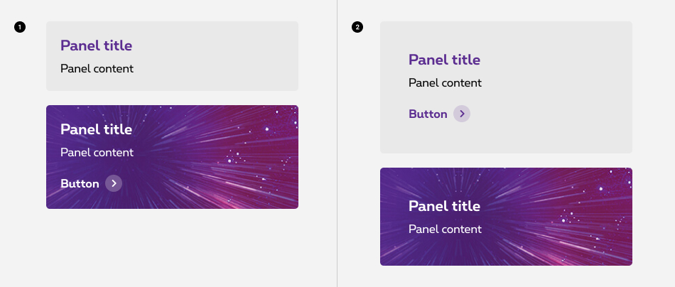
- Default panel
- Big panel
With bigger gutters
Functionalities
Panel can be extended with several functionalities:
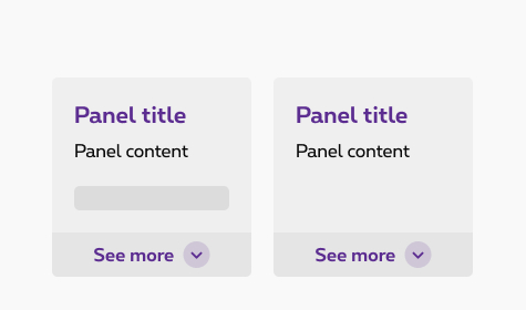
- Non-clickable
A simple default panel to enclose your content. - Clickable
This option allows your panels to be fully clickable, working as navigational element to drive user to another page. - Expandable
Expandable panel is used to hide/show larger amount of content. - Selectable
Selectable panel are called selectable boxes and allow the user to select unique or multiple options. More info about selectable boxes
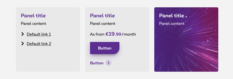
These variations of panels are flexible enough to support a variety of different use cases.
Non-clickable
A panel can contain many different components, but the most common are headings, texts, prices, lists,... A panel can also include one or more links. If the panel contains several links, then you can interact with each link separately and the panel stay non-clickable, but if the panel contains only one link then the whole panel is clickable to that destination, see the clickable panel.
Clickable
Clickable panel allows your panels to be fully clickable, working as navigational element to drive user to another page. Clickable panel cannot contain multiple navigation elements inside. Behaviour is limited to one destination.
The single link can be visible by using a clickable element as a button or a default link, but you have also the possibility to add a link to your panel without a clickable element.
States
The hover effect is applied following this rule:
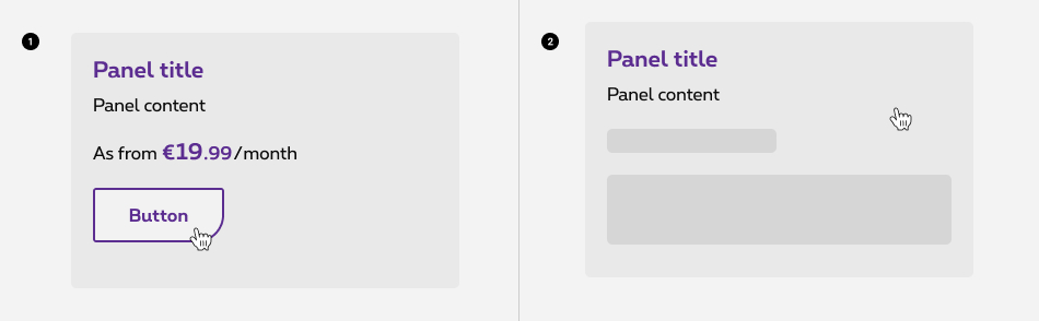
- Containing a clickable element
The full panel is clickable, and the hover effect is applied on the clickable element (button, link,...) only. - Without a clickable element
The full panel is clickable, and an hover effect is applied on the panel itself: the panel move to the top of 10px
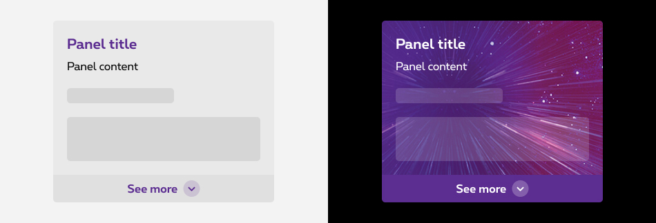
Expandable
Expandable panels are useful when hiding/showing larger amount of content is needed. When expanded, another panel appears underneath the panel with an arrow pointing to it. This new panel can also be customized.
- Don't use to present critical information or request required input needed to complete a workflow.
- Content inside expandable panel should be informative content with image, text, headings, list items.
- Don't put expand/collapse behavior inside of a panel expand item. That's not a best UX practice.
States
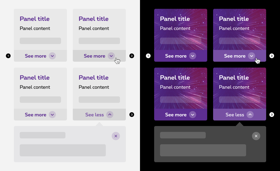
- Default state
- Hover
- Opened
State visible when clicked. The panel expand opens, allowing the content inside to be displayed. Only one panel can be expand at a time. If a new expand is opened, the previous one is closed.
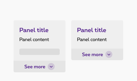
Anatomy
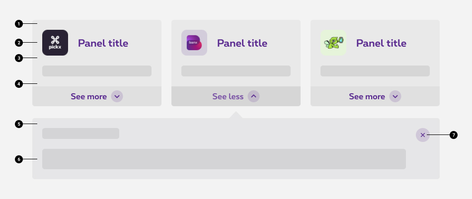
- Panel container
Container background can be customized whether by choosing a color, a gradient or an image. - Panel title
Title give some context about the panel itself, depending on the use of the panel, the title is an optional content. It can be combined with an image or an icon. Though its size and place is always the same. - Panel content
- Expand action panel
Toggle a panel underneath it when clicked on. A single accordion is used within the expand action panel to show the expandable function to the user. - Expand panel container
This container appears when the expand action is triggered, similar to the panel, this one has a pointing arrow towerds the panel it expands. - Expanded panel content
- Close button
Closes the expanded panel when clicked on. Refer to close action link for more info.
Composition
Composition of panels is set to the grid. We can have maximum 4 columns per row in desktop and we recommend one panel per row on mobile.
The height of the boxes is based on the highest box of the row.
Do
The height of the boxes is based on the highest box of the row.
Don't
The height of the boxes is based on each box content.
Sizes and colors
Default panel
A panel is a block element taking full width of its container.
Default panel are using Zurb Foundation panel
class. Background color is by default white.
Default panel
Big panel
Panel can have a bigger padding by using rslib rs-panel-big
class instead of Zurb Foundation panel
class. It has no default color.
Big panel
Resizing panels with flexbox (boxes only, not contents inside)
To align panels height on a same row, the first easiest way is to use flexbox
as long as elements inside of the panels should not be aligned (otherwise a resizer withtout flexbox will be needed).
A <div class="rs-panel-flex-cell">
should be added inside of the <div class="rs-panel-flex">
.
Flexbox gridding is of course required to work properly.
To have a big flex panel, rs-panel-flex-cell-big
should be used instead of rs-panel-flex-cell
.
The background should be added on same div as rs-panel-flex-cell
Short Title
This is a flex panel with a small text
Long Title with a longer text than the other box
This is a flex panel with a longer text than the other box next to this one and going on more than one line.
Resizing panels and their contents
If you need to align panels height and their content a JavaScript solution exists. See Resizer documentation.
Short Title
This is a flex panel with a small text
Long Title with a longer text than the other box
This is a flex panel with a longer text than the other box next to this one and going on more than one line.
Panel with extended background parts (not available for flex panel)
- To have a different background color only on the header part containing the panel title,
rs-panel-headershould be added directly to the heading (h2,h3,...) with the wished background color. - To have a different background color on any other part than header part of the panel,
rs-panel-collapseshould be added to the <div> containing the wished background color.
Panel Title
This is a small text
This is another small text on a different background color
This is another small text
Panel Title
This is a small text
This is another small text on a different background color
This is another small text
Panel with extended image
To have an image on a part of the panel, rs-panel-collapse-img
should be added to a <div>
containing the <img>
.
alt attribute must be filled to the img which is not decorative.

Panel with top image
Lorem ipsum dolor sit amet, consectetur adipiscing elit.
Big panel with top image
Lorem ipsum dolor sit amet, consectetur adipiscing elit.
Flex panel with extended image
Same as regular panel except flex gridding is mandatory as well as the flex panel classes.

Panel with top image
Lorem ipsum dolor sit amet, consectetur adipiscing elit.
Big panel with top image
Lorem ipsum dolor sit amet, consectetur adipiscing elit.
Panel arrow
To have an arrow on the panel, add rs-pos-rel
to the <div>
with panel
Add a <span></span> with the next class inside the panel
- Top left:
rs-panel-arrow-tl - Top right:
rs-panel-arrow-tr - Right top:
rs-panel-arrow-rt - Right bottom:
rs-panel-arrow-rb - Bottom right:
rs-panel-arrow-br - Bottom left:
rs-panel-arrow-bl - Left bottom:
rs-panel-arrow-lb - Left top:
rs-panel-arrow-lt
urna. Nulla facilisi. Morbi arcu lorem consectetur at accumsan nec
urna. Nulla facilisi. Morbi arcu lorem consectetur at accumsan nec
urna. Nulla facilisi. Morbi arcu lorem consectetur at accumsan nec
urna. Nulla facilisi. Morbi arcu lorem consectetur at accumsan nec
urna. Nulla facilisi. Morbi arcu lorem consectetur at accumsan nec
urna. Nulla facilisi. Morbi arcu lorem consectetur at accumsan nec
urna. Nulla facilisi. Morbi arcu lorem consectetur at accumsan nec
urna. Nulla facilisi. Morbi arcu lorem consectetur at accumsan nec
Panel clickable
To have a panel full clickable, jsrs-clickable
and rs-panel-clickable
should be added to the <div>
containing the panel
.
Always put at least one <a>
in the panel
.
- Make sure <a></a> contains an explicit text and an href to make people understand what's the content of the link and where they go if they click on it.
Panel clickable with overlapping element
In addition of the code in Overlap article, you will have to add rs-panel-clickable
to the parent containing rs-has-overlap
.
Panel clickable with arrow
In order to highlight the "link" side of this element,
it is possible to add an arrow whose style is similar to the "entrypoint".
For that adapt your gridding and use a span
with the class rs-panel-clickable-arrow
.
Make sure <span>
has a aria-hidden
attribute set to true.
Panel clickable with target blank
If the link opens in a new tab, then this should be indicated to the user from a visual and screen reader point of view.
The arrow therefore becomes rs-panel-clickable-arrow-blank
or rs-panel-clickable-arrow-blank-neg
.
A <span>
with show-for-sr
needs to be added
inside your <a>
with the mention New window.
Panel clickable with button
Panel clickable with image zoom on hover
alt attribute must be filled to the img who is not decorative.
urna. Nulla facilisi. Morbi
urna. Nulla facilisi. Morbi arcu lorem consectetur at accumsan nec
Expandable panel (with big spacings inside)
- data-expand-panel on the button must call up the id of the content that will be displayed
- aria-expanded attribute must be applied to the button that controls the foldout panel.
- aria-controls attribute creates a cause and effect relationship. It identifies the element(s) that are controlled by the current element
- aria-labelledby artribute is used to indicate the IDs of the elements that label the object. It is used to establish a relationship between the components. You must therefore link the content with the button by adding its id.
Add class="hide"
and a background color class to the content to display.
As in this example below, rs-bg-grey2
is optionnal. Any background class could be added.
Use attribute data-extra-classes="..."
to add other classes to expanded panel.
Content here link.
Expand panel negatif
To switch Expand panel to a darker one, add rs-panel-expand-neg
to element with rs-panel-expand
and rs-panel-expand-btn-neg
to button
.
To have the negative version of the content to display, you have to add data-expand-panel-dark
to button
and a dark color like rs-bg-primary
to the content to display.
Content here
Expandable standard panel
Add rs-panel-expand-slim
to have an expandable panel with standard spacings.
Content here link.
Expand panel fully clickable
Add jsrs-clickable
to have all the panel clickable. Pay attention that if you have a link, it has the priority.
Content here link.
Branded Component
Pickx
Expand panel
To switch Expand panel to Pickx version, add rs-bg-pickx rs-panel-expand-neg rs-panel-expand-slim
to element with rs-panel-expand
and rs-panel-expand-btn-pickx rs-panel-expand-btn-neg
to button
.
The content to display is the negative version. Here we use rs-bg-pickx
class color on it. Don't forget to add data-expand-panel-dark
to button
.
Content here
JavaScript
Expandable panel:
EL refers to html element with jsrs-expand-panel
class or data-expand-panel-trigger
attribute, for example
enableAngularBindings is a boolean, false by default.