 Design System
Please don't forget to read Usage part of each element.
Status
expiry date: 30/04/2024
Allowing the user to have an information concerning a status.
Overview
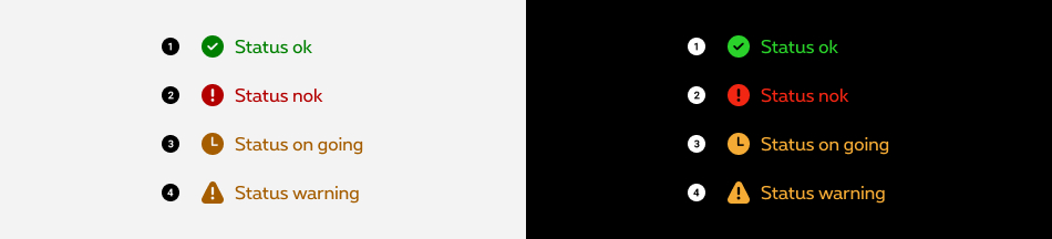
- Status OK
- Status NOK
- Status on going
- Status warning
Currently we do not allow using other status. If you ever need another status that the ones stated above, please contact us and we'll add it to the Design System.
Show / hide status label
The label is not a mandatory element in the status. If necessary, it can be hidden in one of the breakpoints and shown in others.
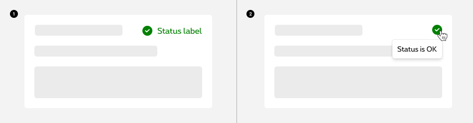
- Default with the label
- Without the label
If a status is used only with an icon, a tooltip should be added to explain the user what it means.
Anatomy
The notification dot comes with two sizes for desktop, and one on mobile.
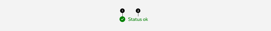
- Status icon
- Status label (not mandatory)
Sizes and colors
Icon with text
All
| Name | Type | Description | Default value |
|---|---|---|---|
| sStatusText | string | Status text |
|
| bIsIconOnly | boolean | Is the text hidden | false |
| bIsParagraph | boolean | Is <p> instead of <div> | false |
| bIsSpan | boolean | Is <span> instead of <div> | false |
| sXtraClass | string | Extra class to rs-status
container |
"" |
Icon only
If a status is used only with an icon, a tooltip should be added to explain the user what it means.
Negative
You just need to add rs-neg
class as parent of any rs-status
version to have it with negative colors.
Deprecated
The following classes have been simplified and changed to be consistent:
-
rs-status-okbecomesrs-success -
rs-status-nokbecomesrs-error -
rs-status-ongoingbecomesrs-ongoing -
rs-status-warningbecomesrs-warning -
rs-status-unlimitedbecomesrs-unlimited
Configuration metadata (DSStatusComponent)
Selector: ds-status
Class: DSStatusComponent
e2e testing Id: None
Use case example
Inputs
| Name | Type | Default | Required | Description |
|---|---|---|---|---|
| type | StatusTypeEnum | StatusTypeEnum.Ok | No | Define css styling, logo for status |
| negative | boolean | false | No | Determines negative style |
| label | string | 'Status' | No | Label or title of the status |
| tooltip | string | undefined | No | The tooltip on hover, is required if there is no label/title |
Outputs
None
Models
        export enum StatusTypeEnum {
            Ok = 'ok',
						Nok = 'nok',
						Ongoing = 'ongoing',
						Warning = 'warning',
						Unlimited = 'unlimited',
        }
Available from library version 14.80.5 and above