 Design System
Please don't forget to read Usage part of each element.
Timeline
Timeline displays upcoming, current, and past activities.
Types
Timeline displays upcoming, current, and past activities to the user. It can be both functional and informational:
Informational timeline
The informational timeline gives an overview to the user about the steps to achieve an action (e.g. activate a product).
Functional timeline
The functional timeline informs the user about an ongoing process by displaying upcoming, current and past activities (e.g. ticketing system).
The functional timeline component is not available in negative mode.
States
-
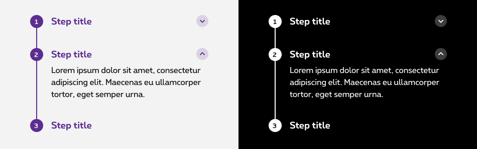
Default state
State visible before click. Content is hidden and the chevron is pointing downwards. -
Hover/Focused state
State visible when the cursor hovers the step and chevron and triggered by keyboard navigation or click. Cursor becomes a pointer. -
Opened state
State visible when clicked. The branch opens, allowing the full content inside to be revealed. The chevron is pointing upwards.
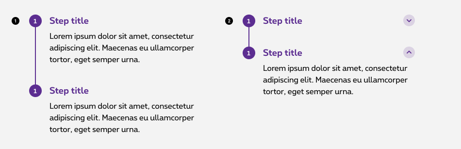
Anatomy
-
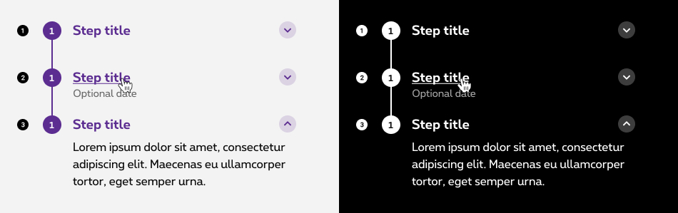
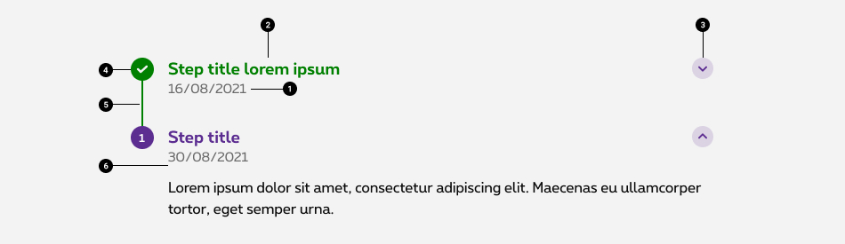
Step timestamp (optional)
Gives a precise indication about the time of the step. Allowing user to follow chronologically the timeline. -
Step title
Indicate the name of the step. Use clear and concise labels to facilitate user's understanding (e.g.: delivery method, document upload) -
Chevron (optional)
Informs the user about the state of the expandable step. Pointing down, the content is collapsed. Pointing up, the content is expanded. You have the possibility to open one by default. -
Step indicator
Displays the step information via the color and the icon/numbers. -
Timeline bar
Provides an additional hint about the progression, depending on its location. -
Step content (optional)
If needed, content provides a space to fit in additional content and/or component for the user to interact with.
Step with content
If needed, content provides a space to fit in additional content and/or component(s) for the user to interact with. This content can be directly displayed or hidden inside a accordion.
- Default displayed
-
Hidden inside a accordion
In case of accordion, you have 2 options available:- Parameter the accordion to have one step expanded by default.
- Parameter the accordion to allow the user to expand multiple steps at once.
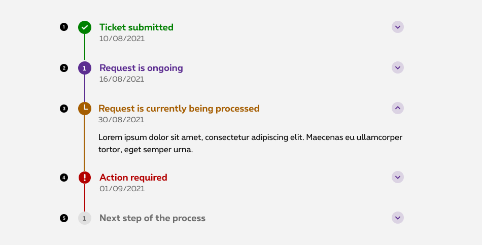
Functional timeline
Statuses
5 statuses are available for the functional timeline:
-
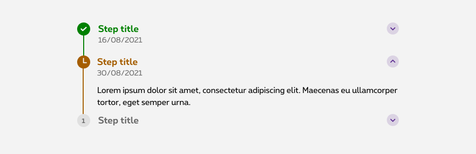
Success
The step is done. - On going
The step is ongoing. - Pending
The step is currently being process or in a waiting state. - Error
The step requires an input from the user. - Inactive
The step exists but hasn't started yet.
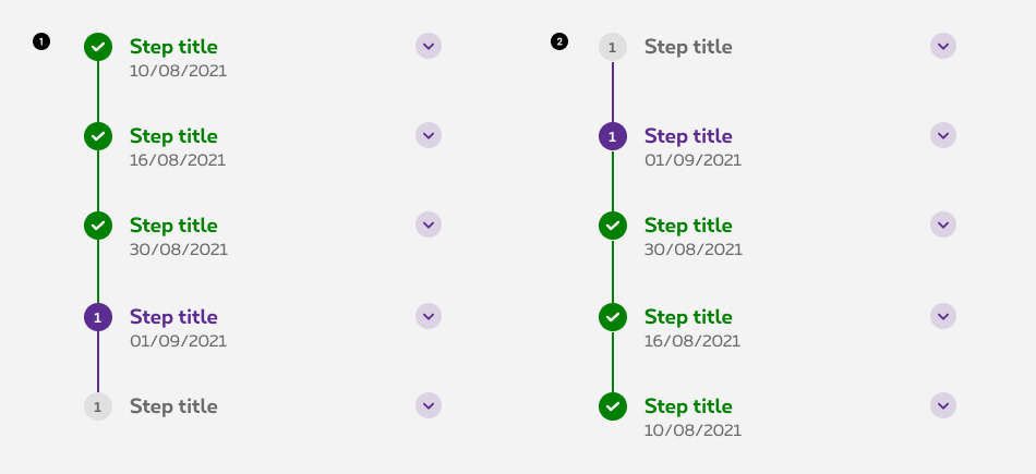
Reverted functional timeline
-
Chronological timeline
Displays chronological events to the user. -
Reverse chronological timeline
Displays reverse chronological events to the user.
Best practise
-
Make it start; make it end.
The user must know when the process starts and when it ends. Therefore, when using a timeline, the component will always begin with a discus and end with another one. -
Anchors, anchors, anchors!
Sometimes, the timeline will be bigger than the height of the screen. When accessing the page where the component is, try to use an anchor to allow the user to leapfrog to the latest step.
Related elements
Progress indicator vs. Timeline
Progress indicator offers an indicative information about the progression of the user within a multi step task. Whereas timeline is more adapted to offer the user an interactive set of elements to indicate a chronology of events. (e.g. tickets follow up, informative content about processes, etc.)
Sizes and colors
Structure
To build a timeline put a <div>
with rs-tmline
class.
Inside put an <ol>
with rs-tmline-list
class and inside this list a <li>
with rs-tmline-item
class.
Each rs-tmline-item
element must contain a <div>
with rs-tmline-indicator
class and a <div>
or a heading ( <h2>
to <h6>
) with rs-tmline-title
class. The indicator element must contain a <div>
with rs-tmline-indicator-el
class.
The rs-tmline-item
element can also contain a <div>
with rs-tmline-content
class for the content of the step and a <div>
with rs-tmline-date
class for the date of the step.
-
rs-tmlinediv must have aria-label='breadcrumb' attribute; - The current
rs-tmline-itemmust havers-selectedclass and aria-current='page' attribute; - The
rs-tmline-indicator-elelement must contain the step number or an icon if the step has a status. In this case, put a i tag with the appropriate icon class and a span withshow-for-srclass containing the explicite status for screen reader.
Default steps
-
DoneLorem Ipsum
-
2Lorem Ipsum
-
3Lorem Ipsum
Statuses steps
The steps of the timeline can be used with a status. To use a status, put the following classes with rs-tmline-item
class.
Take care that a status must have an appropriate icon instead of a number excepted for the ongoing status.
-
rs-done: done status -
rs-selected: ongoing status -
rs-warning: waiting status -
rs-error: status who requires an input from the user
Put a i
tag inside the rs-tmline-indicator-el
element.
Add a span
with class show-for-sr
containing the explicite status for screen reader.
-
DoneLorem Ipsum
-
WaitingLorem Ipsum
-
ErrorLorem Ipsum
-
4Lorem Ipsum
Reverted timeline
All timelines are available with reverted steps. Just add rs-tmline-inverted
class on the <div>
with the rs-tmline
class.
-
4Lorem Ipsum
-
3Lorem Ipsum
-
2Lorem Ipsum
-
DoneLorem Ipsum
Informative steps
If you have a timeline who is only informative for the user with no current steps, you must use the rs-selected
on all the steps.
-
1Lorem Ipsum
-
2Lorem Ipsum
-
3Lorem Ipsum
Clickable / Links
rs-tmline-title
must have a type="button"
attribute and must be a <button>
instead of a <div>
.
-
1
-
2
-
3
Steps with content
-
1Lorem Ipsum
et ultrices posuere cubilia Curae; Suspendisse id massa vel nunc vestibulum posuere et at dolor. Vestibulum ante ipsum primis in faucibus orci luctus et ultrices posuere cubilia Curae; Proin accumsan vulputate arcu et auctor nulla vestibulum id. Sed urna dolor euismod non aliquam sit amet sodales sed ante. Aliquam et nibh at felis tempus tempus. Nam ac risus id velit hendrerit venenatis. Nullam ut erat nisi at porta ligula. Vestibulum a urna vitae risus ultrices iaculis varius ut erat. Donec et
-
2Lorem Ipsum
et ultrices posuere cubilia Curae; Suspendisse id massa vel nunc vestibulum posuere et at dolor. Vestibulum ante ipsum primis in faucibus orci luctus et ultrices posuere cubilia Curae; Proin accumsan vulputate arcu et auctor nulla vestibulum id. Sed urna dolor euismod non aliquam sit amet sodales sed ante. Aliquam et nibh at felis tempus tempus. Nam ac risus id velit hendrerit venenatis. Nullam ut erat nisi at porta ligula. Vestibulum a urna vitae risus ultrices iaculis varius ut erat. Donec et
Steps with date
-
106 october 2021
-
206 october 2021Next step
sodales sed ante. Aliquam et nibh at felis tempus tempus.
Negative version
Simply add rs-tmline-neg
to rs-tmline
container.
Only these type of timeline are available:
- Informative timeline;
- Timeline with content;
- Timeline with date.
-
1Lorem Ipsum
-
206 october 2021Lorem Ipsum
-
3
Accordion
If you need an opened accordion by default, set aria-expanded on true in the button and aria-hidden on false in the accordion content.
Toggle accordion
Add jsrs-tmline jsrs-tmline-toggle
classes around Timeline component.
Add jsrs-tmline-step
on all step links <a>
.
Timeline accordion is a webcomponent which needs data-rslib-webcomponent-load="rslib.apps.timeline" attribute to work.
Changing visual
Follow same rules as for Toogle accordion.
Add data-step-image
attribute with the img source to every step link <a>
.
The <img>
must have jsrs-tmline-visual
class. JS will update it with the selected image step.
-
1
Choose and order the Bizz Online package that fits your needs: from €15/month (excluding activation fees)
I discover the Bizz Online solutionsStarter promoNeed advice?Your Bizz Expert will call you
-
2
-
3
-
4
-
5

JavaScript
Each time you add timeline element to the page, you have to use this JS function
As Timeline accordion toggle is a webcomponent, you will have to load
Next time you add Timeline accordion toggle to the page, you also have to call this JS:
CONTEXT refers to document or html element parent.