 Design System
Please don't forget to read Usage part of each element.
Time picker
Time picker allows the user to select a specfic time value.
Overview
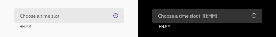
Time picker allows users to enter a specific time value.
Anatomy
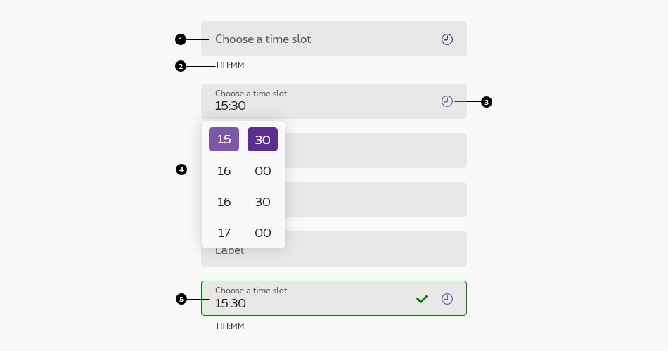
-
Text field
This is the default text field of the Design System. Anatomy details available in text field article. -
Helper text
The helper text is part of the text field. In this specific case, the helper text is mandatory to cleary indicate the requested format to the user. -
Action icon
The action icon is part of the text field. In this specific case, the action icon is mandatory to cleary indicate to the user the field type and also allows him to select the hour and minute value from the select popup. -
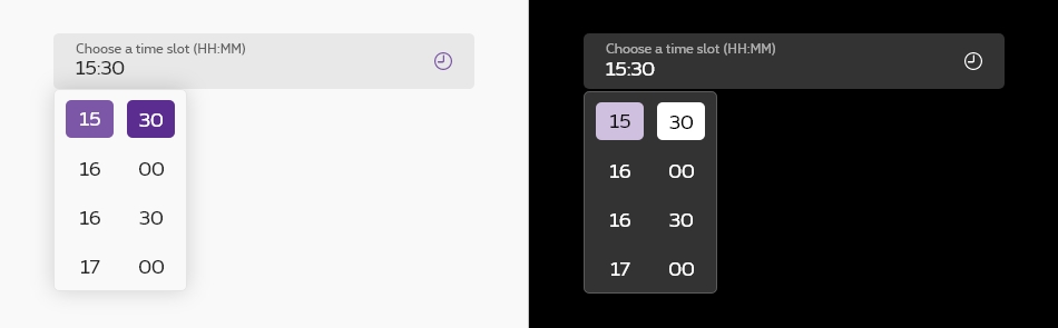
Select popup
Select popup allows the user to select the hour or minute value. It's triggered by clicking on the field or on the action icon. -
Valid state
Behaviour
Selecting time
There are two primary methods for selecting time:
- Type in a specific value in the text field.
- Select the hour or minute value from the select popup.
Optional vs. mandatory
All fields in a form are assumed required, if the time picker optional in yours, this field has to be tagged as so in the label.

Related elements
Date picker
Date picker allows the user to select a date or a range of dates.
The input must have a helper with an exemple of value and the available timetable. See text fields with helper text accessibility.
This timepicker is an input "time" all info can be found on developer mozilla.
This component is generated using the
By passing the paramaeter
You still need to add the correct helper / id / etc. by yourself.
It's also very important to add the "pattern" on the
Standard time picker
Disabled time picker
Error time picker
Success time picker
Negative version
rs-form-neg
class added on <form>
or a <div>
container (if <form>
is not needed in particular cases like with Angular) allows to switch all form fields to negative version.
Deprecated
The custom timepicker that needed js below is not accessible and should no longer be used.
This element will no longer be available from the expiry date meaning the related css will be removed and the element design will be broken if it's not adapted to the new html.
Class rs-timepicker
Configuration metadata
Selector: ds-time-picker
Class: DSTimePickerComponent
Use case example
NOT AVAILABLE LIVE PREVIEW
Inputs
| Name | Type | Default | Required | Description |
|---|---|---|---|---|
| iconAriaLabel | string | Open the popup to choose a time slot | No | Accessibility label for the icon |
| hoursAriaLabel | string | Hours list | No | Accessibility label for the list of hours |
| minutesAriaLabel | string | Minutes list | No | Accessibility label for the list of minutes |
Outputs
None
Models
None