 Design System
Please don't forget to read Usage part of each element.
Buttons
Buttons enable actions like navigation (e.g., call-to-action), item interactions (e.g., save), or app navigation (e.g., next/previous), with clear labels.
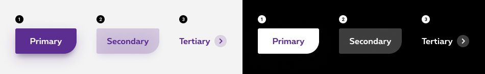
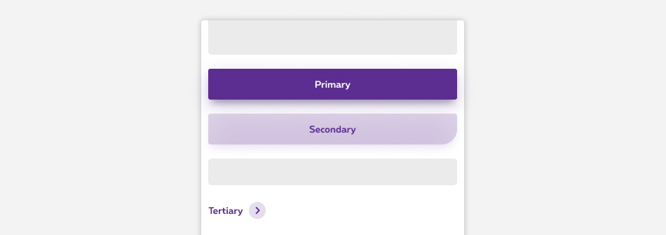
Types
Buttons are used to initialize action, either to go on another page (i.e. call to action on a banner), to act on an item (i.e. save, add or login) or to navigate inside an app (i.e. next or previous). Based on the action triggered, different types of buttons are available.
-
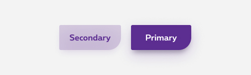
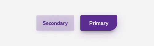
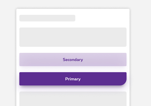
Primary button
Use this one as the main call to action on interfaces. -
Secondary button
For secondary actions. Great at keeping the eye focused on a page's primary imagery. With properly chosen background and well-outlined contrasting border secondary button attracts attention without giving a user overwhelming impression. -
Tertiary button
Use tertiary buttons in isolation, for less prominent actions, or paired with a Primary or Secondary button, or multiple CTAs around the same subject.
-
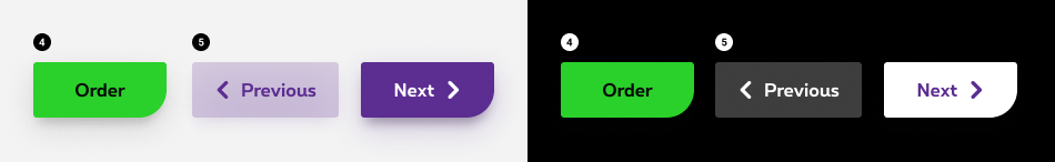
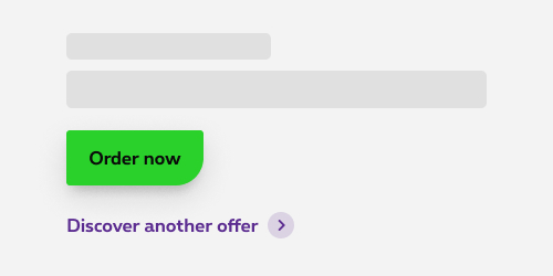
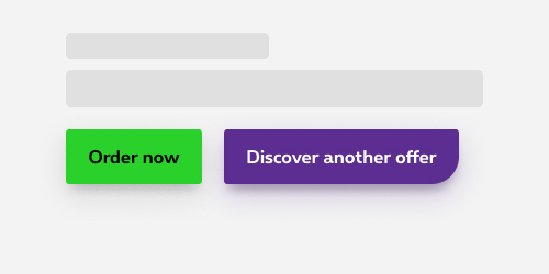
Order/Activate button
The order/activate call-to-action button allows you to go to the webshop/caddy. This green button is also used at the end of the order flow to validate the order. -
Previous/Next button
Use this one for navigation purpose (e.g. webshop flow or multi-pages forms). Always displayed on the bottom of the section/page/component, aligned at the left. Those button have the same look than a primary and seconday button. Arrow icons are mandatory for previous/next button.
Forms can be simple or complex, so we have prepared clear recommendations for you to use. These guidelines will help you build your forms and maintain consistency between all the forms of our digital platforms. Discover our recommandations to build a form.
States
-
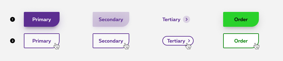
Default state
State visible before click. -
Hover/Focused state
State visible when the cursor hovers the button and triggered by keyboard navigation or click. Container & label are displayed in another colour depending of the type of button. Cursor becomes a pointer.
-
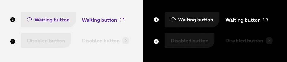
Waiting state
State visible after click. Waiting dots and a waiting message are displayed to inform the user why he is waiting. The waiting dots are displayed at the left of the label by default, except for next button and the tertiary button. -
Disabled state
State visible if the button is not clickable. All elements (container & label) are displayed but they are greyed out in order to signify the change of state.
Anatomy

-
Container
A container is displayed around the text label with a solid color. -
Button label
Button label is the most important element on a button, as it indicates the action that will be triggered when clicked. Try to be as concise as possible to avoid having big/long buttons.
Explicit labelThe label alone has to be sufficiently explicit for the users to understand the link purpose and target. Make sure to write a clear and concise label about the action the users are about to perform.
-
Contextual icon (optional)
Only available for primary and secondary button. There is no icon by default. When words are not enough, you can use icons to better communicate what the button does. The icon used must be directly related to the action that the users are taking, and displayed at the left of the label, except for next button. Arrow icons are only used for previous/next button. -
Action icon
Only available for tertiary button. The arrow icon is considered as action icon and mandatorily displayed at the right of the label and this is the only icon available for the tertiary button.
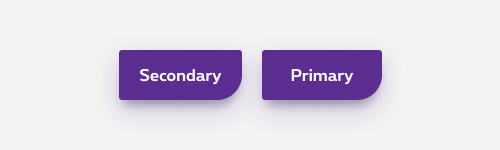
Primary & secondary buttons used together
When used next to each other, different button types should be used in order to make the primary action stand out from the rest.
Rounded corner
Combining two buttons happens a lot. In order to keep consistency throughout digital interface, use rounded corner only on the last displayed button.

Do
Secondary button has 4 straigth corners next to a primary button.
Don't
Secondary button with a rounded corner next to a primary button.
Button position
When using multiple buttons next to each other, button should appear in order of prominence from left to right, and top to bottom on mobile (most important one on the right, or top on mobile).
Even though, research has shown that there is no performance or usability issue when display first the primary or secondary action, consistency throughout products and interfaces is crucial.
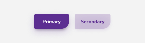
Therefore, on desktop, you should use buttons in the prescribed order (from left to right): secondary button(s) (without any rounded corners), then, the primary button (with the rounded corner) as last button.
Consequently, it is important to keep consistency in the button positioning. Depending on the situation, you'll position buttons as follow:
Do
Don't
On mobile, the button order changes: the primary button first (without rounded corner because this is not the last button) and the secondary will have a rounded corner as last button.
Do
Don't
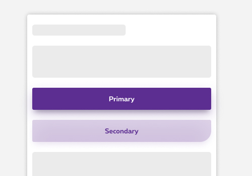
A single prominent button by section
Make sure each section contain a single prominent button which emphasizes its role as main action in comparison with other less important buttons.
An interface can show more than one button in a section at a time, so a primary button can be accompanied by secondary and tertiary buttons with less important actions. Please refer to the previous section to know more about Primary & secondary buttons used together

Do
Use a secondary button next to a primary.
Don't
Use multiple primary buttons next to each other.
Avoid using multiple primary action, as you better keep user focus on one main action. Though, some exception could happen. The rates tables case for instance allow to use multiple primary actions since each product displayed within the tables are at the same level.
Order button
The order button is considered as the primary action and therefore as a primary button. With an order button, we can only use a secondary or tertiary button in the same section.
Do
Don't
Button alignment
Button alignment depends on where they are displayed.
Left aligned
Within section on the commercial website
In forms & multi-steps configurators (webshop,...)
Cancel, previous and next used together
More examples available here
Right aligned
In dashboard, when using cards
In overlayers
Full width
For the primary, secondary and order buttons, the container width is set to the size of the text label with paddings on the left and right on desktop and set it relative to the width of the column on mobile.
On mobile
When displayed on mobile, buttons take the full width of their container by default. If multiple buttons, they stack one on top of each other. It's possible to manualy change it to align the button on the left, with the width based on paddings.
There is an exception for the tertiary button, which is aligned at the right and not take the full width. It's possible to manualy change its alignement too.
In comparative and rates tables.
When displayed on comparative tables, buttons take the full width of their container.
Open in new window
For accessibility reason, give users advanced warning when opening a new window. To provide a warning before automatically opening a new window or tab, we display a target blank icon.
Sizes and colors
In most cases, buttons are links implemented via <a>
.
In more specific cases, such as forms, buttons are implemented via <button>
(see the <button> section).
To override this behaviour, add class rs-btn-not-wide-so
to any button and it will be displayed in auto-width on mobile too, just like it does for desktop/tablet.
Default button
To create a default button, add rs-btn
class to the <a>
tag.
Add the corresponding classes to create different buttons: rs-btn-order
, rs-btn-second
,...
All
| Name | Type | Description | Default value |
|---|---|---|---|
| txtLabel | string | Label | "Button" |
| sUrl | string | URL | "javascript:void(0)" |
| XtraClass | string | Extra class to rs-btn
container |
"" |
| IconName | string | Icon class name | "" |
| bIsLeft | boolean | Icon is on the left | false |
| bNoIcon | boolean | Button has no icon | true |
| btn | boolean | Is it <button> instead of <a> | false |
| XtraParameters | string | Extra parameters to rs-btn
container |
"" |
| bTargetBlank | boolean | Target = "_blank" | false |
| bDisabled | boolean | Is disabled | false |
| bWaiting | boolean | Is "waiting" type | false |
Default negative
Order button
There is no difference between the positive and negative versions of the order button.
One-click-buying button
There is no difference between the positive and negative versions of the one-click-buying button.
Secondary button
If placed next to another button and if it is not the last button displayed, the secondary button has 4 square corners.
If placed as the last in order or used alone, it always has a rounded bottom-right corner. See "Primary & secondary buttons used together" to understand the corner logic.
Secondary negative button
Primary & secondary buttons used together
When using two or more buttons together, the rule is to always have the rounded corner only on the last button, but that depends on the breakpoint:
- on desktop the secondary button will be first (then without the rounded corner) while the primary will come next and last (and therefore with a rounded corner)
- it's the opposite on mobile: the primary button is first (withoutthe rounded corner) and the secondary will be last (and therefore with a rounded corner)
This logic is implemented via the following classes, knowing that "nl" stands for "not last":
| Small up | Small only | Medium up | Medium only | Large up | Large only |
|---|---|---|---|---|---|
rs-btn-nl
|
rs-btn-nl-so
|
rs-btn-nl-m
|
rs-btn-nl-mo
|
rs-btn-nl-l
|
rs-btn-nl-lo
|
To switch the buttons order, we have to use a flex gridding and the code has to be done mobile first - we always work mobile first.
Tertiary button
Since the purpose of the icon is purely decorative, aria-hidden="true"
is added to <i>
so that screen readers can ignore it.
This is visually similar to, but not the same thing as Action Links. Learn more.
Tertiary negative
Tertiary with left icon
Add rs-btn-third-icon-left
class to the button to generate the correct behaviour upon hover:
Tertiary negative with left icon
Disabled button
Add the following attributes to help the screen reader:
-
aria-disabled = "true" tabindex = "-1"if you're using <a> -
disabledif you're using <button>
Disabled negative
Waiting button
On button with waiting state element, you have to set:
- role="alert" and aria-live="polite" attributes ; the screen reader will alert the user something is loading if he is not busy somewhere else on the page
- aria-busy="true"
- an explicite value for aria-label
attribute:
- FR: Merci de patienter... Votre contenu est en cours de chargement
- EN: Please wait... Your content is loading
- NL: Even geduld aub... Uw inhoud wordt geladen
- DE: Bitte warten... Ihr Inhalt wird geladen
Once the spinner is replaced by the loaded content, you have to:
- update aria-busy attribute to false
- remove aria-label attribute
- if the waiting button was replacing a button, add <span class="show-for-sr">
containing a sentence explaining the new status.
Ex: a waiting button appears after a click on an "Activate" button, once the activation is done, the waiting button is replaced by a "Deactivate" button:
<button class="rs-btn"><span class="show-for-sr">Your option is activated, click to Deactivate</span>Deactivate</button>
Waiting negative
Button with icon
Negative primary and secondary buttons with icon
Previous/Next buttons
Same logic for rounded corner is used as the primary & secondary buttons usage.
aria-hidden="true"
is added to icon <i>
for screen readers to ignore it because its purpose is simply decorative.
Negative Previous/Next buttons
Open in new window
- An icon is added to the button to inform that a new window will be opened.
-
title="New window"attribute is added to icon <i> to display browser tooltip indicating link New window. - <span class="show-for-sr">New window</span> is added inside the icon <i> for screen readers to read this text indicating link New window.
- The copy has to be translate by language: EN: New window FR: Nouvelle fenêtre NL: Nieuw venster
Negative button with target="_blank"
Button with link style
Sometimes you may need a button instead of an ancre, for exemple to open a dialog or whatever. If you need a button with a link appearance, put rs-btn-no-style
instead of rs-btn
with rs-link
to have the focus/hover effect of a link.
Button used with <button>
All above buttons can be used with <button>, by passing value
There are 3
Configuration metadata
Selector: ds-button
Class: DSButtonsComponent
Use case example
NOT AVAILABLE LIVE PREVIEW
Inputs
| Name | Type | Default | Required | Description |
|---|---|---|---|---|
| buttonConfig | ButtonConfig | undefined | Yes | Configuration for one button. |
| disabled | boolean | undefined | No | Disable the button. |
Outputs
| Name | Type | Description |
|---|---|---|
| clicked | EventEmitter<ButtonConfig> | The ButtonConfig of the button clicked will be given as event. |
Models
        export interface ButtonConfig {
					label: string;
					buttonType: ButtonTypeEnum | ButtonTypeEnum[];
					disabled?: boolean;
					id?: string; // optional identifier to determine which one was clicked
					roundedCorner?: boolean;
					iconPosition?: 'left' | 'right';
					icon?: IconEnum;
					iconMarginSize?: number;
					cypressTag?: string;
				}

        export enum ButtonTypeEnum {
					Cancel = 'rs-btn-no-style rs-link rs-margin-bottom2', // cancel button
					Neg = 'rs-btn-neg',
					Next = 'rs-btn-next',
					Default = '',
					NoStyle = 'rs-btn-no-style rs-link rs-margin-bottom2',
					OneClickOrder = 'rs-btn-oneclick',
					Order = 'rs-btn-order',
					Previous = 'rs-btn-prev',
					Second = 'rs-btn-second',
					Third = 'rs-btn-third',
					ThirdLeftIcon = 'rs-btn-third rs-btn-third-icon-left',
					ThirdRightIcon = 'rs-btn-third rs-btn-third-icon-right',
					Waiting = 'rs-btn-waiting',
				}