Please don't forget to read Usage part of each element.
Welcome to the Proximus Design System
Proximus' design system is a collection of reusable components, guided by clear standards, that can be assembled together to build any number of applications.

Dive in
-

News and updates
Latest news concerning the Design System and its libraries (UX/UI kits, HTML, CSS, javascript, Angular).
-

Get Started
Get to know how to use our documentation.
-

Guidelines
Rules and general guidelines.
-

Proximus theme
Proximus is the default theme of the Design System applying color, typography, and style that reflects Proximus' brand and style.
-

Pickx
Pickx is Proximus sub-brand providing exclusive TV content through a dedicated platform.
-

Scarlet
Scarlet is a customized theme of Proximus applying color, typography, and style that reflects Scarlet brand and style.
-

White label
White label is a customized theme of Proximus applying color, typography, and style that reflects neutral style and no brand.
-
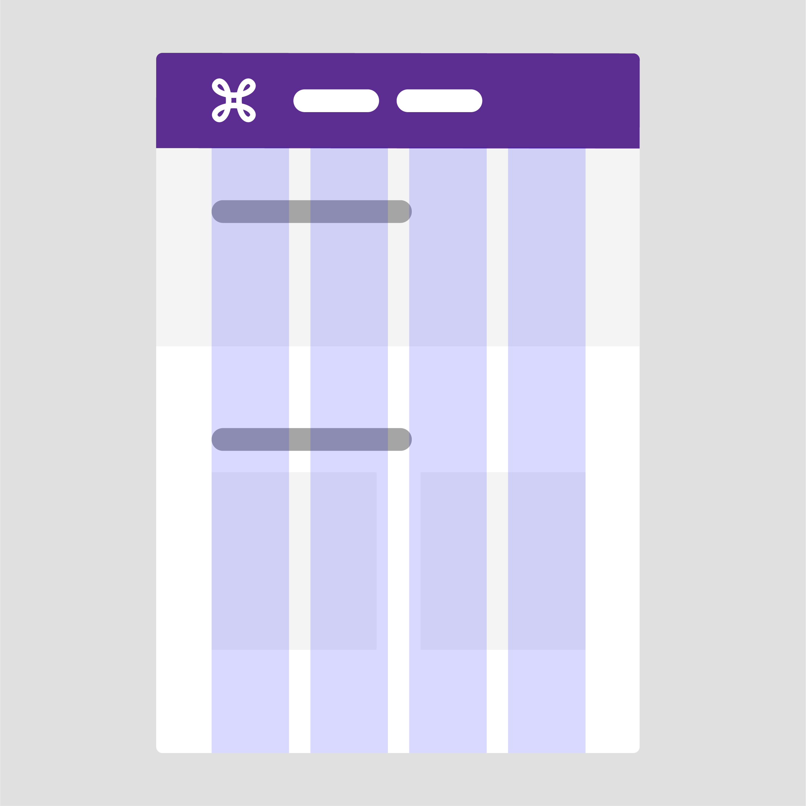
Basic Elements
Discover our ground principles to build digital products.
-

Components
Find all the available building blocks to compose your pages.
-
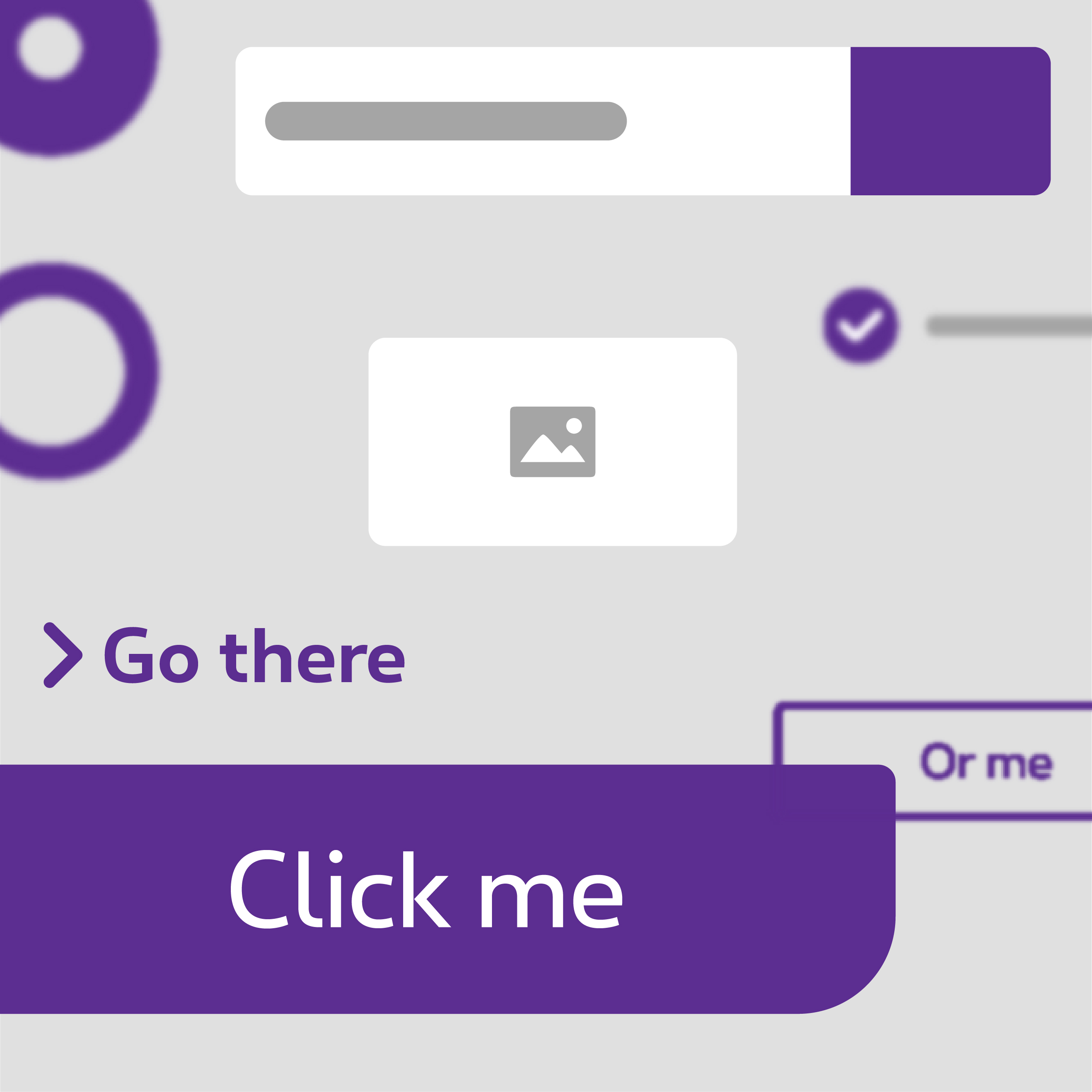
Forms
Find all the available form elements.
-

Templates
Reusable combinations of components that address common user objectives with sequences and flows.
-

Data Visualization
Graphical representation to present information/data and provide an accessible way to see and understand trends, outliers, and patterns in data.
-

Utilities
Elements, classes, helpers, ... useful for creating web interfaces.