 Design System
Please don't forget to read Usage part of each element.
Date picker
Date picker allows the user to select a date or a range of dates from a calendar interface.
Overview
A datepicker can be added as a popup to a text field or display an inline calendar on an interface. The popup shows when the field gains focus and is closed by clicking anywhere else on the page.
Forms can be simple or complex, so we have prepared clear recommendations for you to use. These guidelines will help you build your forms and maintain consistency between all the forms of our digital platforms. Discover our recommandations to build a form.
Anatomy and states
For more info about the field, check out the text field article.
Date picker popup
Those explanations and illustrations concern the desktop version of the date picker. On mobile, we recommend using the native date picker from the browser.
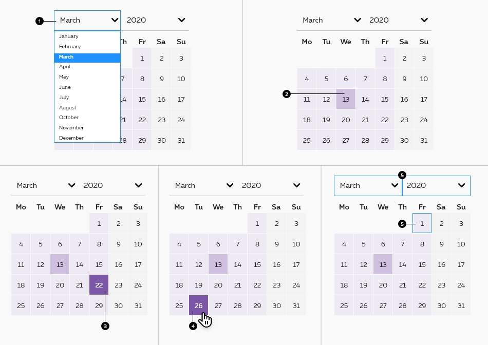
- Month and year dropdowns
By default, the date pickers is set on today's date. Month and year dropdowns let the user select the month and the year in a list.
- Current day-date
Highlighted by default with the current date. - Selected day
Selected day indicates to the user the day he picked. State visible when a date is selected, the date picked is displayed in another color. - Hover on date picker
State visible when the cursor hovers the calendar when a date is already picked. Elements are displayed in another color. - Focused state
State visible when users select the date picker via tab key. Focus on a day, month dropdown or year dropdown.
Weekdays and weekend days have a different background color and font color to help the user to understand the calendar working days.
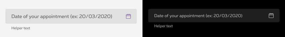
Date picker field
For more info about the field, check out the text field article.
Date picker popup
Please refer to the font sizes and colors default values.
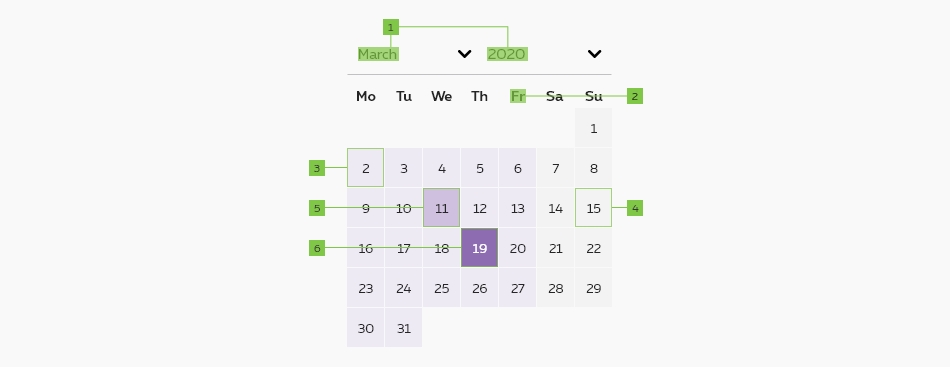
| Attribute | Desktop | |
|---|---|---|
| 1. Month and year labels | Font weight Font size Font color |
Bold Size 3 Black 9 |
| 2. Day label | Font weight Font size Font color |
Bold Size 3 Black 9 |
| 3. Weekday | Font weight Font size Font color Background color |
Regular Small Black 9 Purple1 |
| 4. Weekend day | Font weight Font size Font color Background color |
Regular Small Black 9 Grey2 |
| 5. Current day | Font weight Font size Font color Backgournd color |
Regular Small Black9 Purple3 |
| 6. Selected day | Font weight Font size Font color Backgournd color |
Regular Small White Purple8 |
Default datepicker
This datepicker is a jQuery Plugin.
Documentation can be found here: http://keith-wood.name/datepick.html
Input field must always be editable.
That means you have to add some javascript (regex) to check that the entered date corresponds to what you expect.
It's also possible to add pattern=" "
attribute on the input
. Here are some examples: HTML5 pattern Dates.
How to create a datepicker?
Add the class rs-datepicker
to an input with an id of your choice.
It must be embed in @section ipAssetsScripts{ } at the bottom of the page.
Negative datepicker
rs-form-neg
class added on <form>
or a <div>
container (if <form>
is not needed in particular cases like with Angular) allows to switch all form fields to negative version.
Disabled
Just add disabled
attribute to the <input>
.
Negative disabled datepicker
rs-form-neg
class added on <form>
or a <div>
container (if <form>
is not needed in particular cases like with Angular) allows to switch all form fields to negative version.
Inline datepicker
You can also create an inline calendar by adding the class rs-datepicker-inline
on a simple div
and add an id of your choice and add the following script to the bottom of the page:
Error datepicker
Error status is available by adding error
on rs-form-item
and on rs-form-label
.
The error message <span>
should have an id
(prefixed with "ac-" as accessibility abbreviation to know this is added for accessibility matter) which should be referenced in the <input aria-describedby="error_id">
for screen readers when the error is displayed.
Negative version
rs-form-neg
class added on <form>
or a <div>
container (if <form>
is not needed in particular cases like with Angular) allows to switch all form fields to negative version.
JavaScript
This datepicker is a jQuery Plugin.
Documentation can be found here: http://keith-wood.name/datepick.html
Put the following script to the bottom of the page:
Configuration metadata
Selector: ds-date-picker
Class: DSDatePickerComponent
Use case example
NOT AVAILABLE LIVE PREVIEW
Inputs
| Name | Type | Default | Required | Description |
|---|---|---|---|---|
| id | string | undefined | No | Unique id of the component |
| currentStep | number | undefined | Yes | Defines the active number |
| numberOfSteps | number | undefined | Yes | Defines the number of steps |
| stepTranslations | String[] | undefined | Yes | Translations of the component |
Outputs
None
Models
		export interface IDatePickerOptions {
			showTrigger?: string; // 'Some html'
			showOnFocus?: boolean; // input field gains focus
			rangeSelect?: boolean; // date range within the one picker
			multiSelect?: number; // allow the selection of multiple individual dates
			defaultDate?: string | number | Date; // set the default date to display when no other is set in the datepicker.
			minDate?: string | Date; // set minimum and/or maximum dates within which a date may be chosen
			maxDate?: string | Date; // set minimum and/or maximum dates within which a date may be chosen
			monthsToShow?: number; // Modify the display of each month in single view of Date picker
			multiSeparator?: string; // + or - for adding in multiple date selection
			changeMonth?: boolean; // set change month allowed in datepicker
			yearRange?: string; // 'c-5:c+5'  yearRange setting only applies to the year drop-down
			monthsToStep?: number; // months to step after next next
			monthsOffset?: number; // Show three months with current iné the middle
			autoSize?: boolean; // auto size for datepicker
			selectDefaultDate?: boolean; // select default date
			firstDay?: number; // the number of the first day in the calendar 0-6
			firstDayOfMonth?: boolean; // set only the first day of each month within the range selectable
			lastDayOfMonth?: boolean; // set only the last day of each month within the range selectable
			isAnyDayWithFirstOfMonth?: boolean; // set only if selectable within min and max range or 1st day of consecutive month till max date
		}