 Design System
Please don't forget to read Usage part of each element.
Dropdown
expiry date: 30/04/2021
Allows the user to select multiple options from a list and filter.
Overview
Use the dropdown component to select several options in forms or to filter or sort contents on a page.
Forms can be simple or complex, so we have prepared clear recommendations for you to use. These guidelines will help you build your forms and maintain consistency between all the forms of our digital platforms. Discover our recommandations to build a form.
Anatomy
-
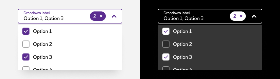
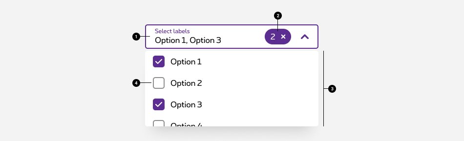
Field
Allows users to open the options panel. For more info about the field, check out the text field article. - Tag
Contains the total number of selected options. - Options panel
Contains a list of options to select from and is opened when the field is active/focused. - Options
A list of multiple options to select from within the options panel.
Making a selection
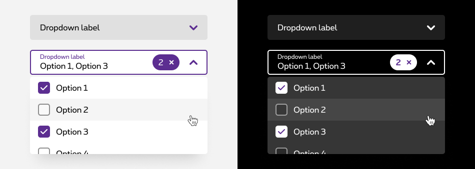
- By default, the dropdown displays label text in the field when closed.
- Clicking on the field opens a options panel. Each option contains a checkbox input to the left of the option text.
- The panel stays open while options are being selected. The menu closes by clicking the field or outside of the dropdown.
- Once options have been selected from the panel, a tag appears at the right inside the field containing the total number of selected options. The placeholder text changes to text that better reflects what is selected.
- Selected options keep their place inside the options panel.
Options label
- Describe the dropdown option succinctly in one line of text.
- Never use decorative images or icons within a dropdown.
- We recommend presenting the options in alphabetical order.
Clear all
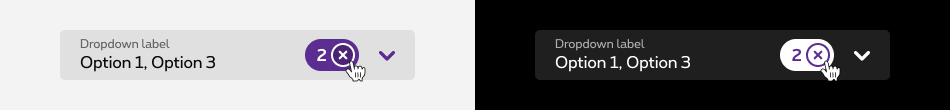
To clear all selected options from a list, hover over the filterable tag and click the “x” (or close) icon next to the value. If you want to unselect individual options, you can do so by unselecting the checkbox of each option.
Scrolling
Scroll bars may not always be enabled so we recommend showing 50% of the last option’s container height to indicate there is more to see within the menu. We recommend starting a scroll at the sixth option in the menu list, but this may vary based on your specific use case.

Optional vs. mandatory
All fields in a form are assumed required, if the dropdown is optional in yours, this field has to be tagged as so in the label.

Best practises
- Do not use a dropdown if there are two options to choose from. In this case, use a radio button group instead.
- Do not nest dropdown or use them to display overly complex information. Keep option selections as straight forward as possible.
Related elements
Dropdown vs select
Dropdown and select components have functionality and style differences.
- On mobile, the underlying code of a dropdown component is styled to match the design system, while the select component’s appearance is determined by the browser being used.
- Use a dropdown component in forms, to select multiple options at a time and to filter or sort content on a page. The select does not have filtering or dropdown functionality.
- Use a select component if most of your experience is form based. Custom dropdowns can be used in these situations, but the native select works more easily with a native form when submitting data.
- Use a select component if your experience will be frequently used on mobile. The native select uses the native control for the platform which makes it easier to use.
Sizes and colors
Multi dropdown
- <select>
tag must have an
aria-hidden="true"attribute; - <button>
rs-multiselect-btnmust haveautocomplete="off"andaria-expanded="false"attributes. They are updated automatically in JavaScript; - <button>
rs-multiselect-btnmust havearia-haspopup="true"attribute; - <button>
rs-multiselect-btnmust havearia-labels="Select labels"attribute translated into the 4 languages; - <button>
rs-multiselect-btnmust havearia-describedby="ac-selectbox-txt"attribute refered to the id of the <span> inside it; - For the tag who removes filters, check the accessibility in the Tags article.
The dropdown and dropdown neg can be generated with the helper called
Here is the list of all the parameters for this helper.
| Name | Type | Description | Default value |
|---|---|---|---|
| sID | string | Id |
|
| dOptions | dynamic | Pass the list of options (string[] or string[,]) | new [] {"Apple", "Banana", "Orange", "Strawberry"} |
| sLabel | string | Input's label | "Select label(s)" |
| bIsNeg | boolean | Is negative | false |
The parameter
If
If
To show the dropdown with selected element you need to pass it with the
Dropdown who allows multiple selection. Don't forget the multiple
attribute on the <select>
.
The list of option is generated by the number of <option> inside the select. The height of the list is automatic and blocked to 200px.
At the top of the rs-multiselect-list
generated by js, two buttons are available ( Select all
and Deselect all
).
All the styling and positioning of those actions cannot be change.
The tags inside the positive version are the negatives one.
Negative version
rs-form-neg
class added on <form>
or a <div>
container (if <form>
is not needed in particular cases like with Angular) allows to switch all form fields to negative version.
The tags inside the negative version are the positives one.
With option value different from label
This example shows you how to write razor for this case.
With selected options
This example shows you how to write razor for this case.
JavaScript
Each time you add Multi dropdown to the page, you have to use this JS function
CONTEXT refers to document or html element parent.
Deprecated
The dropdown below is not accessible and should no longer be used.
This element will no longer be available from the expiry date meaning the related css will be removed and the element design will be broken if it's not adapted to the new html.
Class rs-pdd
Negative version
Configuration metadata
Selector: ds-dropdown
Class: DSDropdownComponent
Use case example
NOT AVAILABLE LIVE PREVIEW
Inputs
None
Outputs
| Name | Type | Description |
|---|---|---|
| dropped | EventEmitter | Emits when drop |
Models
None