 Design System
Please don't forget to read Usage part of each element.
Entrypoints
expiry date: 16/06/2023
A handy list of links to quickly guide user in your interface.
Overview
Entrypoints allow the user to navigate through different screens in the interface, such as a dashboard.
An entrypoint is not a simple call to action, so it cannot be used on its own. Entrypoints are a list of links typically used in a dashboard to guide the user through different screens. If you need a unique link, please choose a button or a link.
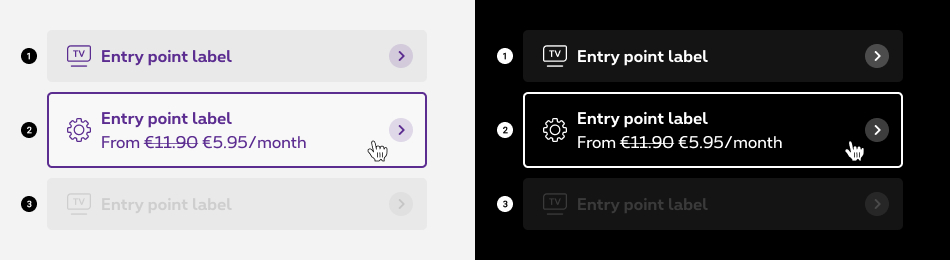
States
-
Default state
State visible before click. -
Hover/Focused state
State visible when the cursor hovers the anchor and triggered by keyboard navigation or click. -
Disabled state
State visible when no interraction is possible with the box. A tooltip can be added to inform the reason of deactivation.
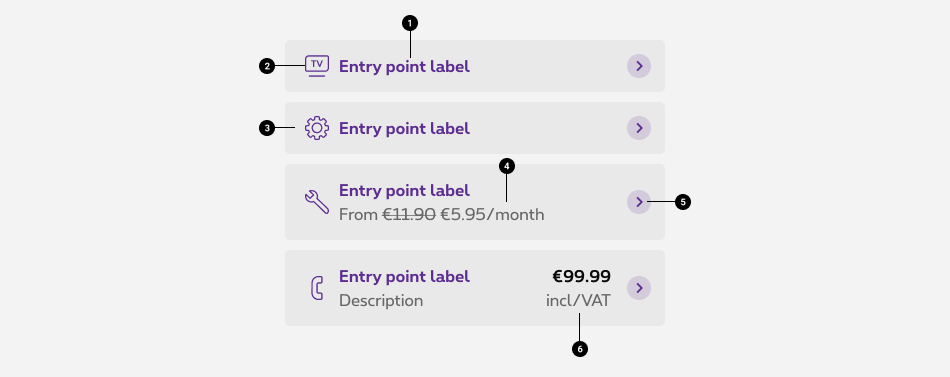
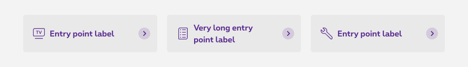
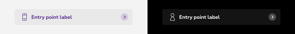
Anatomy
-
Label
Label should be consistent with the title of the intended destination. -
Icon (optional)
There is no icon by default. When words are not enough, you can use icons to better communicate what the entrypoint does. The icon used must be directly related to the action that the users are taking, and displayed at the left of the label. -
Container
A container is displayed around the text label with a solid color. -
Small detail (optional)
Provides complementary informations about the label. It can be an explanatory phrase, a price, ... -
Action icon
The arrow icon is considered as action icon and mandatorily displayed at the right of the container. -
Extra zone(optional)
Provides complementary informations displayed at the right of the container.
With notification dot
A notification dot can be added on the icon in the entrpoint to notify the user that something is new or updated. This option is only available for the positive entrypoint.
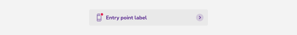
More info about notification dot
Composition options
We can have from 1 to 4 entrypoints per row in desktop and from 1 to 2 per row in mobile.The height of the boxes is based on the highest box of the row.
The composition options are based on our default grid. Please refer to the gridding article for more information.
Open in new window
For accessibility reason, give users advanced warning when opening a new window. To provide a warning before automatically opening a new window or tab, we display a target blank icon.
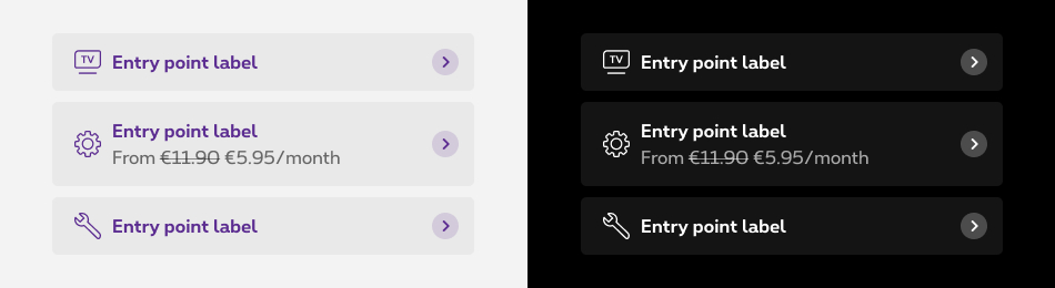
Sizes and colors
The entrypoints can be generated with the helper called rs-entrypoint-container
class.
Here is the list of all the parameters for this helper:
| Name | Type | Description | Default value |
|---|---|---|---|
| bIcon | boolean | Show icon | false |
| bIconNotif | boolean | Show notification on icon | false |
| bImg | boolean | Show image | false |
| bTxt | boolean | Show detail text below label | false |
| bExtra | boolean | Show extra text on the right of the label | false |
| bTargetBlank | boolean | Is target="_blank" link | false |
| bDisabled | boolean | Is disabled | false |
| bBtn | boolean | Is it <button> instead of <a> | false |
| sLink | string | url of the link | "#" |
| sIcon | string | Icon class | "icon-Innovation" |
| sImg | string | Image path | "http://placehold.it/44x44" |
| sLabel | string | Label text | "Label" |
| sTxt | string | Detail text below the label | "€5.95/month" |
| sExtra | string | Description text on the right of the label | "<strong>€19.99</strong><br /><span class=\"rs-txt-details\">/month</span>" |
Depending on the case, a button can be use with a simple link <a> or a <button> .
All the entrypoints must be wrapped by one single <div class="rs-entrypoint-container"> container. This container add an extra spacing of 10px at the bottom of the container to follow the guidelines.
Default entrypoint
Negative default entrypoint
Add rs-neg
around <div class="rs-entrypoint-container">
allows to switch all entrypoints to negative version.
Entrypoint with icon
With notification
Please, check accessibility and usage on Notification dot article.
Entrypoint with image
Entrypoint with details
Entrypoint with extra text
Entrypoint target blank
Please, check accessibility and usage on Link with target="_blank" article.
Entrypoint disabled
A tooltip is provided in order to notify the reason why. It's only visible via keyboard navigation. Please, check accessibility and usage on Tooltips article.
For Screen Reader add:
-
aria-disabled="true"andtabindex="-1"to <a> -
disabledto <button>
Multiple entrypoints
All the entrypoints must be wrapped by one single <div class="rs-entrypoint-container"> container. This container add an extra spacing of 10px at the bottom of the container to follow the guidelines.
The entrypoints have to be used with flex gridding to align all boxes to same height without any javascript.
Entrypoint as a button
Replace the <a> with <button> to have the button functionnality.
Deprecated
The entrypoint below should no longer be used.
This element will no longer be available from the expiry date meaning the related css will be removed and the element design will be broken if it's not adapted to the new html.
Class:
-
rs-entrypoint-disabled-info -
rs-entrypoint-disabled
The entrypoint below should no longer be used.
This element will no longer be available from the expiry date meaning the related css will be removed and the element design will be broken if it's not adapted to the new html.
Class:
-
rs-entrypoint-container-negmust be replace byrs-negadded around the element (section, div, panel...)