 Design System
Please don't forget to read Usage part of each element.
Tooltips
expiry date: 30/04/2021
Tooltips display small additional information upon click, hover, or focus.
Overview
Tooltips are floating labels that briefly explain the function of a user interface element. Default tooltip can be triggered when user hovers, clicks or navigates to it via keyboard.
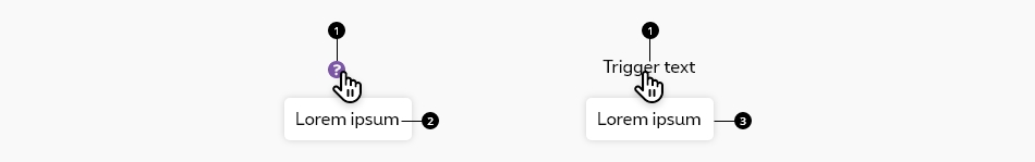
Anatomy
-
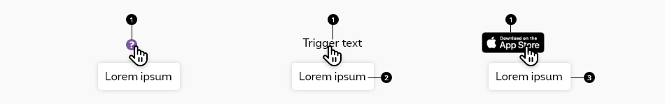
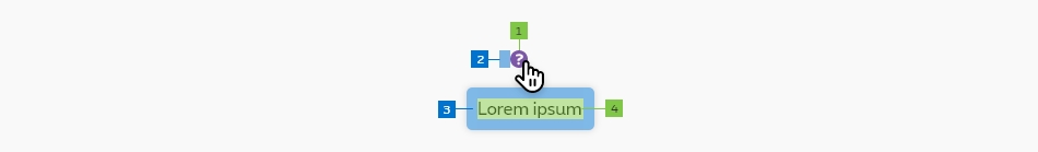
Trigger
The tooltip can be triggered on a icon, a text or an image. Cursor becomes a pointer.Tooltip icon2 icons are allowed to be used as tooltip icon:
-
Text content
Use a verb phrase to describe the action on an icon, for example (e.g. Edit settings). Use only plain text and be concise. Tooltips can be a sentence fragment. If more detailed information is required, use another form of help such as a message box or an overlayer. -
Container
A container is displayed around the text content with a solid color. Set container width to the size of the text label with the padding on the left and right on desktop and set it relative to the width of the screen on mobile.
Best practise
- Tooltips appear on hover, focus, or click, and disappear after a short duration.
- Continuously display the tooltip as long as the user long-presses or hovers over the element.
- Tooltips are always paired nearby the element with which they are associated.
- Use tooltips when you need to provide an explanation for an element.
- Use tooltips to add a floating label that briefly explains the function of a user interface element.
Do
- For communicating critical information, like errors.
- When you need to include links or actions.
- When you have a long explanation.
Don't
Use a message box or an overlayer instead.
Please refer to the font sizes and colors default values.
Sizes
| Attribute | Mobile | Tablet | Desktop | |
|---|---|---|---|---|
| 1. Trigger | Icon/Font size | Min. 1.6 rem | ||
| 2. Trigger padding | Left | 1 rem | 0.5 rem | |
| 3. Container | Padding Rounded corner |
1 rem 0.5 rem |
||
| 4. Content | Font size | Size 4 | ||
| Attribute | Mobile | Tablet | Desktop | ||
|---|---|---|---|---|---|
| Margin | Left & right | 2 rem | 4 rem | ||
Colors
| Attribute | Value | |
|---|---|---|
| 1. Trigger | Icon color Text color |
Purple Depending of the context |
| 2. Text content | Text color | Body text color |
| 3. Container | Background color Shadow |
White 0 0 3px 0 rgba(0, 0, 0, 0.25) |
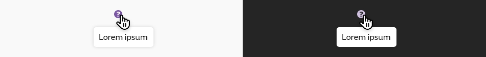
There is no specific tooltip for the dark theme. The container and the text content of the tooltip are the same. Only the trigger will then take the color of the body text of the dark theme.
To add a tooltip to an element you should:
- add the class
has-tip - add the attribute
data-tooltip="" - add content of your tooltip insie a
titleattribute - If the element is not clickable also add the
tabindex="0"attribute
Default position of tooltip is at the bottom, but a different position can be added to the tooltip by putting following class:
tip-top
tip-right
tip-left
Default tooltip
All
| Name | Type | Description | Default value |
|---|---|---|---|
| hoverText | string | The text containing the tooltip | "Hover on desktop or touch me on mobile!" |
| tooltipText | string | Text of the tooltip | "A fabulous tooltip" |
| position | string | The position of the tooltip: "tip-bottom"|"tip-top"|"tip-right"|"tip-left" |
"tip-bottom" |
| htmlTag | string | Html tag containing the text | "span" |
| isClickable | boolean |
The tooltip is a clickable element If yes, it will change the tabindex |
false |
| XtraClass | string | Extra class to tooltip container | "" |
| XtraParameters | string | Extra parameters/attributes to tooltip container | "" |
| isDisabledOnMobile | boolean | The tooltip is disabled on mobile meaning it will only be visible on medium up | false |
| iconXtraClass | string | Extra class on icon's <i>
(only for |
"" |
Different positions
Tooltip on the right
Tooltip on the left
Different html tag
This is a p
With a clickable element
Disabled on mobile tooltip
data-options="show_on:medium"
attribute is added to the element who has a tooltip.
Icon tooltip
- icon-Information-box:
- icon-Help:
With an info icon
With an help icon
Negative version
With an info icon
With an help icon
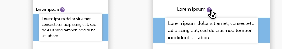
Icon tooltip opening an overlayer
You can open an overlayer with a tooltip icon , you can see example in overlayer page.Javascript
Each time you add tooltip element to the page, a refresh of foundation is needed:
Deprecated
The popover below is not accessible and should no longer be used.
This element will no longer be available from the expiry date meaning the related css will be removed and the element design will be broken if it's not adapted to the new html.
Class rs-popover
This is the content of the fabulous popover!
ButtonConfiguration metadata
Selector: ds-tabs-button
Class: DSTabsComponent
Use case example
NOT AVAILABLE LIVE PREVIEW
Inputs
| Name | Type | Default | Required | Description |
|---|---|---|---|---|
| id | string | undefined | Yes | Unique id of the component |
| tooltipText | string | undefined | Yes | The text shown by the tooltip |
| tooltipConfig | ITooltipConfig | undefined | Yes | Applies the configuration of the component |
| tooltipPosition | TooltipPositionEnum | undefined | Yes | Sets the position of the tooltip component |
Outputs
None
Models
        export interface ITooltipConfig {
          disabledOnMobile?: boolean;
        }

        export enum TooltipPositionEnum {
            Top = 'top',
            Bottom = 'bottom',
            Right = 'right',
            Left = 'left',
        }