 Design System
Please don't forget to read Usage part of each element.
Counter
Counter is used for entering numeric values and includes controls to increase or decrease an incremental value.
Overview
Counter contains a text field and 2 controls used to increase or decrease an incremental value.

Forms can be simple or complex, so we have prepared clear recommendations for you to use. These guidelines will help you build your forms and maintain consistency between all the forms of our digital platforms. Discover our recommandations to build a form.
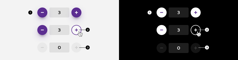
States
-
Default state
State visible before click. -
Hover/Focused state
State visible when the cursor hovers the control and triggered by keyboard navigation or click. -
Disabled state
State visible when the minimum or maximum value is reach. The controls is than not clickable anymore.
-
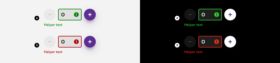
Valid state
When given input is correct or validated. Field and user input are visible, a green mark is displayed. An optional confirmation text can be displayed underneath the input (helper text). -
Error message
When given input is not correct. Field and user input are visible, a red mark and an error message are displayed to give context to the user. The helper text is mandatory. This error message should contain informations about the nature of the error, helping the user to fill the correct content.
To have more informations avout the text field, please refer to the text field article.
Anatomy

-
Text field
Allows users to manually enter the number value. For more info about the field, check out the text field article. -
Controls
Allow users to increase or decrease value incrementally.
Set a minimum or maximum value

A minimum and maximum value must be defined. When users reach this value, disable one of the control buttons accordingly. Once the maximum value is reached, disable the + button. If the minimum value is reached, disable the - button.
Best practises
- Do not use number inputs when large value changes are expected. They work best for making small, incremental changes that require only a few clicks.
- Enable the user to also choose to type a number in the field.
- Ensure that a default value is shown within the field.
Sizes and colors
Counter input requires some attributes:
-
value: the default value on load. -
min: the minimum value. -
max: the maximum value. -
step: the increment/decrement value.
It also requires a <label>
which can be hidden with an accessibility class
like show-for-sr
.
This label must repeat minimum and maximum values like in the examples below.
Counter buttons requires tabindex='-1'
attribute.
All
| Name | Type | Description | Default value |
|---|---|---|---|
| sCounterLabel | string | Label | "Counter label (between 0 and 10)" |
| sCounterName | string | Input's name | "counter" |
| iCounterValue | string | Input's default value | 0 |
| iCounterMin | integer | Input's minimum value | 0 |
| iCounterMax | integer | Input's maximum value | 10 |
| iCounterStep | integer | Input's step value | 1 |
| sXtraClass | string | Extra class to rs-counter
container |
"" |
| sState | string | Input's state: "success", "error" | "" |
Progress bar is a webcomponent which needs data-rslib-webcomponent-load="rslib.apps.counter" attribute to work.
Default counter
Negative counter
Add rs-counter-neg
class to rs-counter
container.
Add rs-form-neg
class to rs-counter-form
.
Error state
Success state
Disabled
Just add rs-disabled
class around.
JavaScript
As Counter is a webcomponent, you will have to load
Next time you add Counter to the page, you have to call this JS:
CONTEXT refers to document or html element parent to data-counter.
Configuration metadata
Selector: ds-counter
Class: DSCounterComponent
Use case example
Inputs
| Name | Type | Default | Required | Description |
|---|---|---|---|---|
| id | string | undefined | Yes | Unique id of the component |
| step | number | 1 | No | The step of the counter |
| round | 'UP' | 'DOWN' | 'NONE' | 'NONE' | No | The rounding of the user's input |
| value | number | 0 | No | The starting value |
| min | number | -Infinity | No | The minimum value of the counter |
| max | number | Infinity | No | The maximum value of the counter |
Outputs
| Name | Type | Description |
|---|---|---|
| onChange | EventEmitter<number> | The number after value change |
Models
None