 Design System
Please don't forget to read Usage part of each element.
Tabs
Tabs organize and allow navigation between groups of content that are related and at the same level of hierarchy.
Types
Horizontally stacked, each tab should contain content that is distinct from other tabs in a set. For example, tabs can present different sections of news, different genres of music, or different themes of documents.
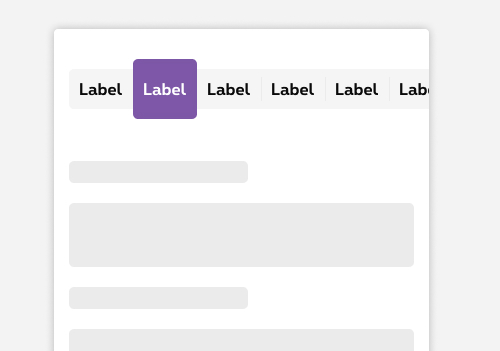
- Default Tabs content is boxed inside a panel.
- Minimal Use this type of tabs when the content is rather complex and the layout underneath the tab act as structure (rates table, data tables, multiples boxes,... or when the section is already boxed, it is visually more appealing to avoid nesting boxes.
States
-
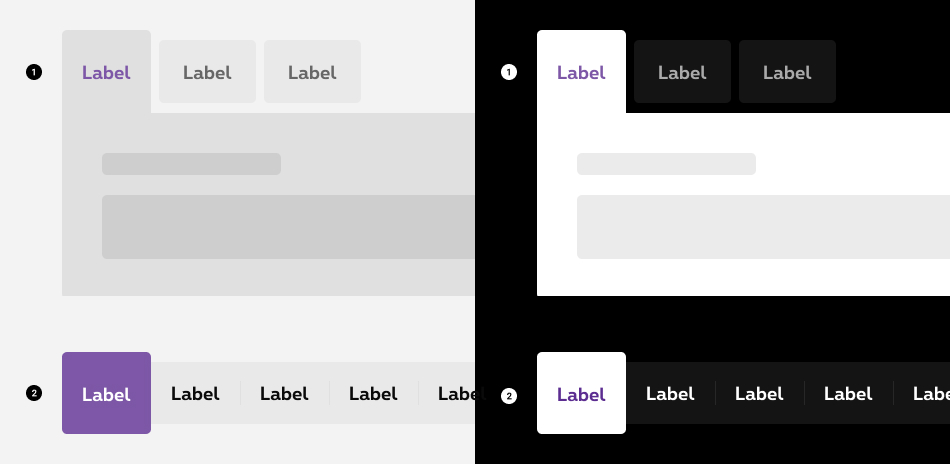
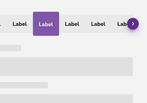
Active state
State visible when the tab is "opened" and reveals its content. By increasing the size of the tabs, sticking it to its content and matching their colors, it is easy for the user to identify which tabs is opened.
There is always one tab active. -
Inactive state
State visible before click. Only one tabs can be opened at the time, so the rest of the tablist are in an inactive state waiting to be opened. This state is a greyed out version with a clear space between the tab and the content underneath. -
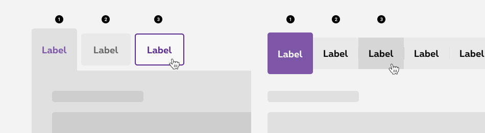
Hover and focused state
State visible when the cursor hovers a tab and when users tab on the tabs to indicate the user where he is in the tablist.
Disabled state
A disabled state is available for the tabs. This state is visible when the tabs are not yet accessible due to pre-requisite actions. This state is only available for the whole component and not for an item.
Anatomy
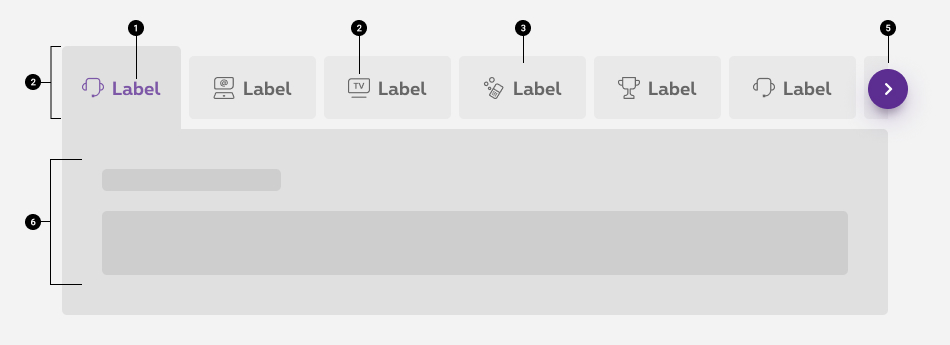
Label
Text labels should clearly and succinctly describe the content of the tab they represent. Tab content should contain a cohesive set of items that share a common characteristic.Max recommended characters
- Without icon: maximum 25 characters /tab included spaces
- With icon: maximum 20 characters /tab included spaces
Icon (optional)
In context, an icon can help supporting the label and make it clearer for the user.
If an icon usage is required, all tabs must contain one. It's not allowed to use an icon only on one tab item and not on others.
Icon color should be similar to the text color of the label. Only the default tab colors indicated here are allowed both for icons and labels.-
Tab item container
Whether it is active or inactive each tab element is enclosed within a container. -
Tabs list
A tabs item cannot be displayed alone. They need to be at least 2 elements in order to make the use of the component relevant. A group of tabs is the tabs list. -
Navigation arrows
If the tabs list is bigger than the screen size, the exceeding elements will be hidden and an arrow will be displayed. This arrow allows to comfortably navigate through all the tabs. It is avaiblable both on the right and the left side depending where the user is within the list.
Arrows are only displayed as from medium breakpoint. On mobile, tabs are swipeable. -
Content of the active tab
The active tab reveals its content. On the default version, the content is enclosed within a container.- Different types of content can be displayed such as heading, paragraphe, image, button,...
- The content of the active tab is displayed in a standard grid of 12 columns
- The first text/title of active tab content can't be bigger than a H4
Navigation between tabs
If the tabs is bigger than the gridding size, the exceeding tab item will be hidden. Users can navigate through all the tabs differently depending of the breakpoint:
Desktop
Tabs are hidden by a clean cut and the user can use the navigation arrows to see the other tab items.
Mobile
Tabs are hidden by a clean cut and the user can navigate through the tab items by swiping the tabs.
Best practices
Don't
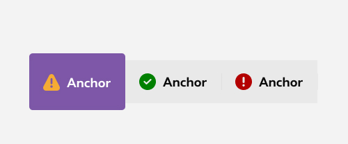
Putting color status icons inside tabs item is not allowed.
Sizes and colors
Default tabs
Tabs are included in a div with attribute data-tabs that contains slider and tabpanel.
For accessibility, it's imperative to use the aria-label attribute to describe the content of the tabs.
aria-controls
is used to associate a control with the fields it controls. The fields are identified with an ID
aria-selected
is used to allow the reader which tab is selected.
role='button'
is used to simulate this anchor like a button.
The anchor link must redirect to the id corresponding to its content href='#tab'
.
Add hide
class to all non-visible tabpanels.
Use role='tablist'
attribute to <ul>
.
Add role='tabpanel'
class to all tabpanels.
If you have more elements than the width of your page, there is nothing more to add, a slider is automatically added by JS
The "tabs" being a quite complexe component we don't have a
With the
| Name | Type | Description | Default value |
|---|---|---|---|
| sTabsLabel | string | Label describing the set of tabs | "Label describing the purpose of the set of tabs" |
| lTabsNames | string [] | Name of each tabs | new [] {"tab 1", "tab 2", "tab 3"} |
| iTabSelected | integer | Selected tab number | 1 |
| sTabID | string | ID of tabs set | "tabMini" |
| sXtraClass | string | Extra class to rs-sliding-tabs-wrapper
container |
"" |
Title tab 1 here
ipsum primis in faucibus orci luctus et ultrices posuere cubilia Curae; Proin accumsan vulputate arcu et auctor nulla vestibulum id.
Title tab 2 here
ipsum primis in faucibus orci luctus et ultrices posuere cubilia Curae; Proin accumsan vulputate arcu et auctor nulla vestibulum id.
Title tab 3 here
ipsum primis in faucibus orci luctus et ultrices posuere cubilia Curae; Proin accumsan vulputate arcu et auctor nulla vestibulum id.
Title tab 4 here
ipsum primis in faucibus orci luctus et ultrices posuere cubilia Curae; Proin accumsan vulputate arcu et auctor nulla vestibulum id.
Title tab 5 here
ipsum primis in faucibus orci luctus et ultrices posuere cubilia Curae; Proin accumsan vulputate arcu et auctor nulla vestibulum id.
Title tab 6 here
ipsum primis in faucibus orci luctus et ultrices posuere cubilia Curae; Proin accumsan vulputate arcu et auctor nulla vestibulum id.
Title tab 7 here
ipsum primis in faucibus orci luctus et ultrices posuere cubilia Curae; Proin accumsan vulputate arcu et auctor nulla vestibulum id.
Negative default tabs
To switch to a Negative default tab just add class a rs-sliding-tabs-wrapper-neg
to div
that contains slider and tabpanel.
Title tab 1 here
ipsum primis in faucibus orci luctus et ultrices posuere cubilia Curae; Proin accumsan vulputate arcu et auctor nulla vestibulum id.
Title tab 2 here
ipsum primis in faucibus orci luctus et ultrices posuere cubilia Curae; Proin accumsan vulputate arcu et auctor nulla vestibulum id.
Title tab 3 here
ipsum primis in faucibus orci luctus et ultrices posuere cubilia Curae; Proin accumsan vulputate arcu et auctor nulla vestibulum id.
Title tab 4 here
ipsum primis in faucibus orci luctus et ultrices posuere cubilia Curae; Proin accumsan vulputate arcu et auctor nulla vestibulum id.
Title tab 5 here
ipsum primis in faucibus orci luctus et ultrices posuere cubilia Curae; Proin accumsan vulputate arcu et auctor nulla vestibulum id.
Title tab 6 here
ipsum primis in faucibus orci luctus et ultrices posuere cubilia Curae; Proin accumsan vulputate arcu et auctor nulla vestibulum id.
Title tab 7 here
ipsum primis in faucibus orci luctus et ultrices posuere cubilia Curae; Proin accumsan vulputate arcu et auctor nulla vestibulum id.
Tabs with icons
To add icons to a default tab create a <i> into <a> with attribute aria-hidden='true' and add the corresponding class to show the icon.
Title tab 1 here
ipsum primis in faucibus orci luctus et ultrices posuere cubilia Curae; Proin accumsan vulputate arcu et auctor nulla vestibulum id.
Title tab 2 here
ipsum primis in faucibus orci luctus et ultrices posuere cubilia Curae; Proin accumsan vulputate arcu et auctor nulla vestibulum id.
Title tab 3 here
ipsum primis in faucibus orci luctus et ultrices posuere cubilia Curae; Proin accumsan vulputate arcu et auctor nulla vestibulum id.
Title tab 4 here
ipsum primis in faucibus orci luctus et ultrices posuere cubilia Curae; Proin accumsan vulputate arcu et auctor nulla vestibulum id.
Title tab 5 here
ipsum primis in faucibus orci luctus et ultrices posuere cubilia Curae; Proin accumsan vulputate arcu et auctor nulla vestibulum id.
Title tab 6 here
ipsum primis in faucibus orci luctus et ultrices posuere cubilia Curae; Proin accumsan vulputate arcu et auctor nulla vestibulum id.
Title tab 7 here
ipsum primis in faucibus orci luctus et ultrices posuere cubilia Curae; Proin accumsan vulputate arcu et auctor nulla vestibulum id.
Minimal tabs
To switch every tabs component to a minimal one, for that just add rs-sliding-tabs-minimal
to div
with attribute data-tabs
that contains slider and tabpanel.
Title tab 1 here
ipsum primis in faucibus orci luctus et ultrices posuere cubilia Curae; Proin accumsan vulputate arcu et auctor nulla vestibulum id.
Title tab 2 here
ipsum primis in faucibus orci luctus et ultrices posuere cubilia Curae; Proin accumsan vulputate arcu et auctor nulla vestibulum id.
Title tab 3 here
ipsum primis in faucibus orci luctus et ultrices posuere cubilia Curae; Proin accumsan vulputate arcu et auctor nulla vestibulum id.
Negative Minimal tabs
Like default, to switch to a Negative minimal tab just add class a rs-sliding-tabs-wrapper-neg
to div
that contains slider and tabpanel.
Title tab 1 here
ipsum primis in faucibus orci luctus et ultrices posuere cubilia Curae; Proin accumsan vulputate arcu et auctor nulla vestibulum id.
Title tab 2 here
ipsum primis in faucibus orci luctus et ultrices posuere cubilia Curae; Proin accumsan vulputate arcu et auctor nulla vestibulum id.
Title tab 3 here
ipsum primis in faucibus orci luctus et ultrices posuere cubilia Curae; Proin accumsan vulputate arcu et auctor nulla vestibulum id.
Minimal tabs with icons
Like default, to add icons to a default tab create a <i> into <a> with attribute aria-hidden='true' and add the corresponding class to show the icon.
Disabled tabs
Just add rs-disabled
around (or on the section). That does the job for positive and negative and also for minimal tabs.
Content of tabs need to be disabled too. Method depend of the content. Please read carefully the DS for each component.
Also add aria-hidden="true" aria-disabled="true"
to completely hide the component for screen reader.
To avoid focus and the posibility to use it with keyboard, you also need to add tabindex="-1"
on all <a>
.
JavaScript
If you add Tabs html to the page after page loaded or modify it, you have to use this JS function:
CONTEXT refers to document or html element parent.
Configuration metadata
Selector: ds-tabs-button
Class: DSTabsComponent
Use case example
NOT AVAILABLE LIVE PREVIEW
Inputs
| Name | Type | Default | Required | Description |
|---|---|---|---|---|
| generalTabsDescription | string | undefined | Yes | Represents the description of the tab |
| options | ITabsOptions | undefined | Yes | Sets the options of the component |
| inputTabsContents | ITabsContent[] | null | Yes | Sets the content of the component |
Outputs
| Name | Type | Description |
|---|---|---|
| tabsClicked | EventEmitter<string> | Emits the selected choice of the user when a tab is clicked |
Models
        export interface ITabsOptions {
            negativeStyle?: boolean;
            isMinimal?: boolean;
            panel?: boolean;
        }

        export interface ITabsContents {
            contents: Array<ITabsContent>;
        }

        export interface ITabsContent {
            title: string;
            id: string;
            isSelected?: boolean;
            iconClass?: string;
            href?: string;
        }