 Design System
Please don't forget to read Usage part of each element.
Text fields
expiry date: 30/04/2021
Text fields allow users to enter any combination of letters, numbers, or symbols.
Types
There are instances, sometimes in the same form, where you need users to enter both short and long form content. Allow the size of the text input box to reflect the length of the content you expect the user to enter.
-
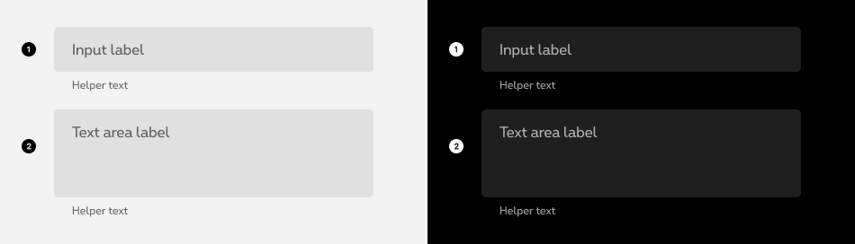
Text field
When the expected user input is a single line of text, as opposed to a paragraph. -
Text area
When the expected user input is more than one sentence.
Forms can be simple or complex, so we have prepared clear recommendations for you to use. These guidelines will help you build your forms and maintain consistency between all the forms of our digital platforms. Discover our recommandations to build a form.
States
-
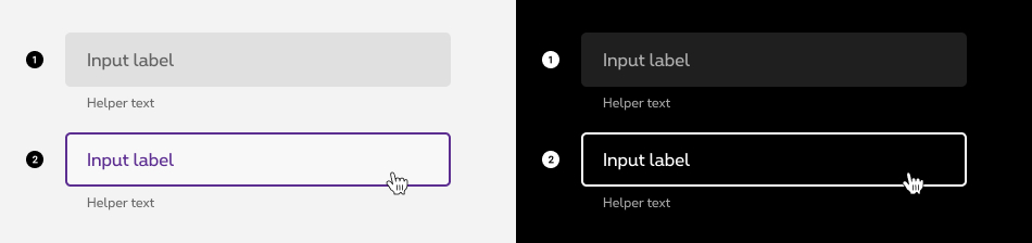
Default state
State visible before click. Field and label are displayed. No user input yet. -
Hover/Focused state
State visible when the cursor hovers the field and triggered by keyboard navigation or click.

-
Active state
State visible when the field is focused and unfilled. -
Active + Filled state
State visible when the field is focused and filled. -
Filled state
State visible when the field is filled and unfocused.
-
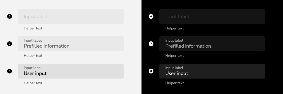
Disabled state
State visible if no interactions are allowed for this field. -
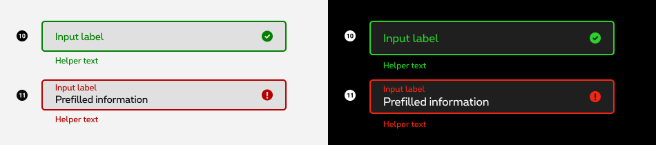
Read Only / Disabled pre-filled state
State visible when the input is pre-filled and can't be change. Container is visible with a disabled label and the user input is displayed like in the filled state. -
Prefilled state
State visible when the field is prefilled.
-
Loading state
Between an active state and a valid/error state. Field and user input are visible, animated dots and a waiting message are displayed to inform the user why he is waiting. This state should be used when the field needs to live check the content but the check takes more time than an immediate response.
-
Valid state
When given input is correct or validated. Field and user input are visible, a green mark is displayed. An optional confirmation text can be displayed underneath the input (helper text). -
Error message
When given input is not correct. Field and user input are visible, a red mark and an error message are displayed to give context to the user. The helper text is mandatory. This error message should contain informations about the nature of the error, helping the user to fill the correct content.
Anatomy
-
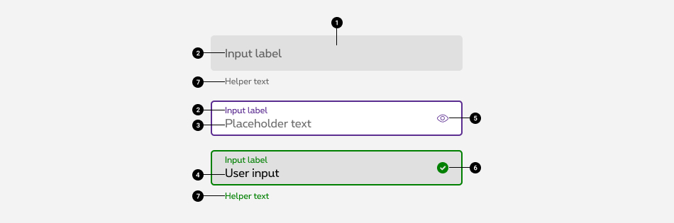
Container
Container improves legibility and discoverability of the text field in the interface environment by creating contrast in the surrounding content -
Label
Label text is used to inform user to what information is requested. -
Placeholder
Text dislayed after click in order to help the user fill in the right content. -
User input
Input text lives inside the container takes over the place of the placeholder as soon as the users type in some text. -
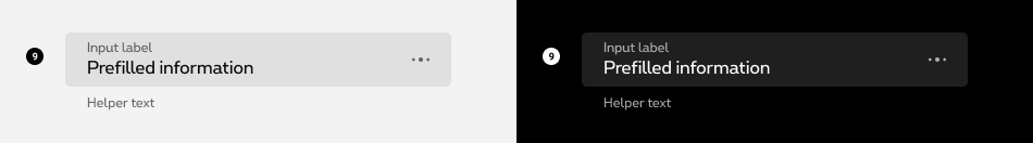
Action icon (optional)
Icon displayed to interact with the content of the field (e.g. delete, search, access dropdown or filters, etc.). Action icons are always in purple and clickable. -
Indicator icon (optional)
Activation icons inform the user on the status of the input. Icons can be used to message alerts as well. Pair them with error messages to provide redundant alerts, which are useful when you need to design for colorblind users. -
Helper text (optional)
Helper text conveys additional guidance about the input field, such as how it will be used. It should only take up a single line, being persistently visible or visible only on focus.
Label text
Label text content
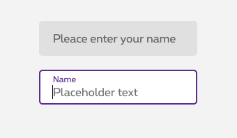
Label text is used to inform user to what information is requested. Every text field should have a label. Label text should always be visible.
The label alone has to be sufficiently explicit for the users to understand the purpose. Make sure to write a clear and concise label about the text field the users are about to complete.
Do

Don't
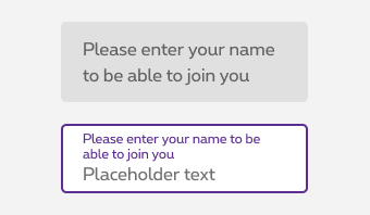
Don't
Label text interaction
When inactive the label should stay inside the input to spare as much as possible some visual space.
As soon as it becomes active, the label should slide up on top of the field. The label is aligned to the left of the field to keep the user informed, also to leave some room for the placeholder and for the content of the input.
Password
A password field answers to all the rules mentionned before and requires two specificities:
- Every single character provided by the user should be hidden
- The password itself can be unmasked by clicking on the "eye" action icon
Input field with a button
Depending of your needs, you can combine a input field with a button. In this case, you have to add a standard button next to the field, at the right with 2px of spacing. This composition is based on the gridding of the page.
Only the primary and order types of button can be used
Preformatted text fields
When having a long chain of digits (e.g. national security number, card number, phone number). Make use of a text field with preformatted content. It improve readability of the field.
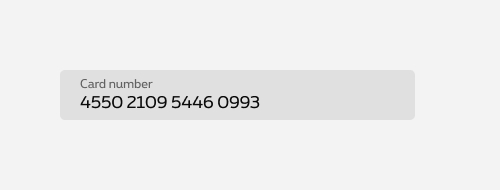
Do
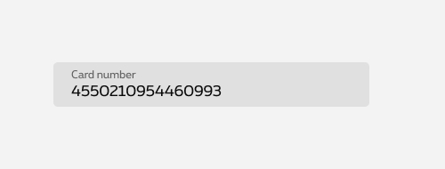
Don't
Sizes and colors
All form fields have a 100% width so they need to be included in a gridding to have the wished size.
Each <input>
must be wrapped within <div class="rs-form-item">
container.
This container must contain the <input>
and the <label>
linked to the input thanks to for
attribute refering to the id
of the <input>
.
We put ac-
prefix (abbreviation for "accessibility") to know that this id
has been added for accessibility matter.
By default, all form fields are mandatory, except those mentionned with (optional) in the label.
All <input> types are covered here except search, radio and checkbox which are all special cases.
An <input>
should have an id
that should always be linked to its <input>
with for
attribute containing the id
of the <input>
.
Never put important information (like requested format) helping the user to fill in the <input>
in the placeholder
. This kind of information can be put in parentheses within the label or as helper text under the <input>
to always be available when filling a form.
Group of form elements must be wrapped in a <fieldset>
containing a <legend>
for the title.
If the title is not visually needed, <legend>
can be hidden and showed only for screen reader with show-for-sr
class.
Single form element must make sense from its label. Single form element can't have <fieldset>
as the fieldset is only use to group elements. A group with a single element doesn't make sense.
We put ac-
prefix (abbreviation for "accessibility") to know that this id
has been added for accessibility matter.
All text fields can be created with the global include named
Here is the list of all the parameters for this include and the default settings in case of a textfield. Some default parameters will changes if you set a text area, a text field with button, etc.
| Name | Purpose | Default value |
|---|---|---|
| iteration | To pass an iteration in case of a loop (integral) | 0 |
| type | Declaring type of your input (text / tel / number / etc.)(string) | text |
| id | Declaring the id of your input (string) | ac-input0 |
| name | Declare the name of your input (string) | input0 |
| placeholder | Declare the placeholder of your input (string) | This is a placeholder |
| value | Declare the value of your input (string) | |
| label | Label of the input (string) | default label |
| isError | Show the "error" state (boolean) | false |
| errorText | Error message (string) | This is an error message |
| successText | Passing a string will set the field on valid state and show your message at the same time(string) | |
| helperText | Helper message (string) | |
| isLoading | Show loading state (boolean) | false |
| isDisabled | Show disabled state (boolean) | false |
| isReadonly | Show readonly state (boolean) | false |
| helperList | Pass a list of helper (string[]) | |
| button | Passing a string will add a button next to your input. (string) You can also have order button by passing "order_" at the start of your string. Or a negative primary with "btnNeg_". | |
| isUpload | Make a upload field (boolean) | false |
| isPrefix | Make a prefix (boolean) | false |
| isPostfix | Make a postfix (boolean) | false |
| isOptional | Make switch between optional and required (boolean) | false |
| helperId | Set an id for you helpers for complex cases (string) | id + "-helper" + iteration |
| inputXtraParameters | Extra parameters on the input | "" |
Default optional text field
Negative version
rs-form-neg
class added on <form>
or a <div>
container (if <form>
is not needed in particular cases like with Angular) allows to switch all form fields to negative version.
Textarea
All
| Name | Type | Description | Default value |
|---|---|---|---|
| sLabel | string | Label text | "What are your suggestions?" |
| sPlaceholder | string | Placeholder text | "Enter your text here" |
| sContent | string | Content text | "" |
| sID | string | ID | "ac-defaultTextarea" |
| sName | string | Name | "defaultTextarea" (=sID without "ac-") |
| bIsOptional | boolean | Is optional | false |
| sXtraClass | string | Extra class to <textarea> container | "" |
| sXtraParameters | string | Extra parameters to <textarea> container | "rows=5" |
| bIsError | boolean | Is in error status | false |
| sErrorMsg | string | Error message | "This is an error message" |
| bIsSuccess | boolean | Is in success status | false |
| sSuccessMsg | string | Success message | "This is an success message" |
| bHasHelper | boolean | Has a helper text | false |
| sHelperMsg | string | Helper text | "Helper text" |
| bIsDisabled | boolean | Is disabled | false |
| bIsReadOnly | boolean | Is readonly | false |
Negative version
rs-form-neg
class added on <form>
or a <div>
container (if <form>
is not needed in particular cases like with Angular) allows to switch all form fields to negative version.
Prefilled text field
When an Input field
is prefilled, rs-filled
class should be added to <input>
.
This avoids label moving above the input content after page load.
Error text field
To use Zurb Foundation form check javascript, data-abide="ajax"
attribute should be
added to <form>
so error
class will be added/removed dynamically
when needed, for example if <input>
is required.
The error message <span>
should have an id
(prefixed with "ac-" as accessibility abbreviation to know this is added for accessibility matter) which should be referenced in the <input aria-describedby="error_id">
for screen readers when the error is displayed. This is automatically added by the javascript.
Negative version
rs-form-neg
class added on <form>
or a <div>
container (if <form>
is not needed in particular cases like with Angular) allows to switch all form fields to negative version.
Valid text field
To create a success field, add rs-form-success
to <div class="rs-form-item">
and put your success message in a <span class="rs-form-helper">
with rs-form-success
class in addition.
The success message <span>
should have an id
(prefixed with "ac-" as accessibility abbreviation to know this is added for accessibility matter) which should be referenced in the <input aria-describedby="success_id">
for screen readers when the success message is displayed.
Negative version
rs-form-neg
class added on <form>
or a <div>
container (if <form>
is not needed in particular cases like with Angular) allows to switch all form fields to negative version.
Text field with helper text
The helper text <span>
should have an id
(prefixed with "ac-" as accessibility abbreviation to know this is added for accessibility matter)
which should be referenced in the <input aria-describedby="helper_id">
for screen readers.
Text field optional with helper text
Negative version
rs-form-neg
class added on <form>
or a <div>
container (if <form>
is not needed in particular cases like with Angular) allows to switch all form fields to negative version.
Loading text field
On the container of spinner element, you have to set:
- role="alert" and aria-live="polite" attributes ; the screen reader will alert the user something is loading if the user is not busy somewhere else on the page
- aria-busy="true"
- an explicite value for aria-label
attribute:
- FR: Merci de patienter... Votre contenu est en cours de chargement
- EN: Please wait... Your content is loading
- NL: Even geduld aub... Uw inhoud wordt geladen
- DE: Bitte warten... Ihr Inhalt wird geladen
Once the spinner is replaced by the loaded content, you have to:
- update aria-busy attribute to false
- remove aria-label attribute
Add rs-form-item-waiting
class to <div class="rs-form-item">
element. And add <span class="rs-form-waiting-dots"></span>
after input
.
Negative version
rs-form-neg
class added on <form>
or a <div>
container (if <form>
is not needed in particular cases like with Angular) allows to switch all form fields to negative version.
Disabled text field
Just add disabled
attribute to the <input>
.
Negative version
rs-form-neg
class added on <form>
or a <div>
container (if <form>
is not needed in particular cases like with Angular) allows to switch all form fields to negative version.
Readonly text field
Just add rs-filled
class and readonly
attribute
to the <input>
.
Negative version
rs-form-neg
class added on <form>
or a <div>
container (if <form>
is not needed in particular cases like with Angular) allows to switch all form fields to negative version.
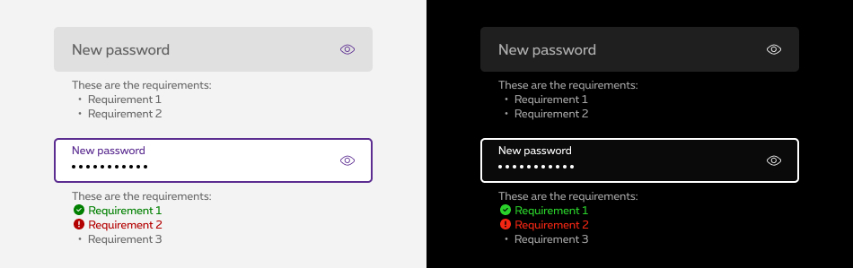
Password field
Password field has a toggle icon allowing to see/hide typed password.
The toggle icon <span>
should have an aria-label
attribute with a description which should be translated to the page language for screen readers.
Password field with Success/error/helper texts
When filling in a Password field , it may have dynamic helper texts (to be dynamized by each team according to its needs) displayed as a list.
The helper texts should have an id
(prefixed with "ac-" as accessibility abbreviation to know this is added for accessibility matter)
which should be referenced in the <input aria-describedby="helper_id">
for screen readers.
Negative version
rs-form-neg
class added on <form>
or a <div>
container (if <form>
is not needed in particular cases like with Angular) allows to switch all form fields to negative version.
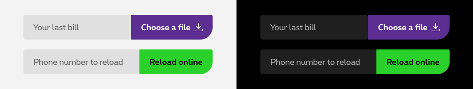
Text fields with a button
Form fields can be combined with a button as a standalone form like for instance "Reload" form field.
They have to be wrapped within a rs-form-items-group rs-form-items-group-collapse
.
rs-form-items-group-collapse
meaning there is no space between them and are displayed
like on single element.The error message and/or the help text are placed with the field.
Negative version
rs-form-neg
class added on <form>
or a <div>
container (if <form>
is not needed in particular cases like with Angular) allows to switch all form fields to negative version.
Upload field
Upload fields are combined with a "fake" button allowing to choose a file to upload.
All
| Name | Type | Purpose | Default value |
|---|---|---|---|
| sLabel | string | Label |
|
| sID | string | ID |
|
| sName | string | Name |
|
| sValue | string | Value | null |
| sPlaceholder | string | Placeholder | example.pdf |
| bIsOptional | boolean | Optional | false |
| sXtraClass | string | Extra classes | "" |
| bIsError | boolean | Is error | false |
| sErrorMsg | string | Error message | "This is an error message" |
| bIsSuccess | boolean | Is success | false |
| sSuccessMsg | string | Success message | "This is an success message" |
| bHasHelper | boolean | With helper text |
|
| sHelperMsg | string | Helper message |
|
| bIsDisabled | boolean | Is disabled | false |
| bIsReadOnly | boolean | Is readonly | false |
Negative version
rs-form-neg
class added on <form>
or a <div>
container (if <form>
is not needed in particular cases like with Angular) allows to switch all form fields to negative version.
Multiple files
Text fields with pre/postfix
A form field can be combined with another form field before ( rs-form-item-prefix
)
or after ( rs-form-item-postfix
).
You must use collapse rows (see "Gridding")
to manage inputs width
and then simply add rs-form-item-prefix
to the first rs-form-item
if it is before the main rs-form-item
and rs-form-item-postfix
to the last rs-form-item
if it is after the main rs-form-item
.
The error and the help texts are always placed with the related field.
Prefix
Postfix
JavaScript
Each time you add Text field to the page, you have to use this JS function
CONTEXT refers to document or html element parent.
Deprecated
The input below is not accessible and should no longer be used.
This element will no longer be available from the expiry date meaning the related css will be removed and the element design will be broken if it's not adapted to the new html.
Class rs-label
The input below is deprecated and should no longer be used.
This element will no longer be available from the expiry date meaning the related css and JS will be removed and the element design will be broken if it's not adapted to the new html.
Class:
-
rs-form-label rs-form-label-file -
rs-form-file-input -
rs-form-file-btn
Configuration metadata
Selector: ds-text-fields
Class: DSTextFieldsComponent
Use case example
NOT AVAILABLE LIVE PREVIEW
Inputs
| Name | Type | Default | Required | Description |
|---|---|---|---|---|
| textFieldsId | string | undefined | Yes | Unique id of the component |
| config | ITextFieldsConfig | {} | Yes | Component configuration |
| type | TextFieldsTypesEnum | undefined | Yes | Defines the type of input, if it a text or a search etc |
| loading | boolean | undefined | Yes | Defines if the component is in loading status or not |
| error | boolean | undefined | Yes | Defines if the component is invalid and has a validation error |
| valid | boolean | undefined | Yes | Defines if the component is valid |
| helper | boolean | undefined | No | Defines if the text field should have a helper text or not |
| helperPassword | boolean | undefined | No | Defines if the text field should have a helper text for a password text field or not |
| button | boolean | undefined | No | Defines if there should be a button |
| buttonId | string | undefined | Yes | Defines unique id of the button |
| buttonDisabled | boolean | undefined | No | Defines if the existing button should be enabled/disabled |
| showGreenButtonColor | boolean | true | No | Defines if the rs-btn-order CSS class should be applied |
| readonly | boolean | false | No | Set the readonly attribute |
Outputs
| Name | Type | Description |
|---|---|---|
| buttonClicked | EventEmitter<boolean> | Emits when the button is clicked |
| focused | EventEmitter | Emits on focus |
| blurred | EventEmitter | Emits on blur |
Models
        export interface ITextFieldsConfig {
            typeInputText?: string;
            rows?: number;
            label?: string;
            placeholder?: string;
            disabled?: boolean;
            disableAutoComplete?: boolean;
            prefilled?: string;
            errorMessage?: string;
            validMessage?: string;
            helperMessage?: string;
            pattern?: string;
            helperPasswordMessage?: string;
            helperPasswordSuccess?: string;
            helperPasswordError?: string;
            helperPasswordOk?: string;
            buttonMessage?: string;
            uploadMessage?: string;
            prefixPlaceHolder?: string;
            prefixLabel?: string;
            maskExp?: string;
            maskSuffix?: string;
            acceptedFileExtension?: string;
        }

        export enum TextFieldsTypesEnum {
            InputText = 'inputText',
            TextArea = 'textArea',
            Password = 'password',
            File = 'file',
            Prefix = 'prefix',
        }