 Design System
Please don't forget to read Usage part of each element.
Drag and Drop
Drag and drop is a user interaction method where users click, hold, and move objects to new positions, simplifying interaction.
Overview
Users can move elements on the screen by dragging and dropping them, using a mouse, keyboard, or other input device.
States
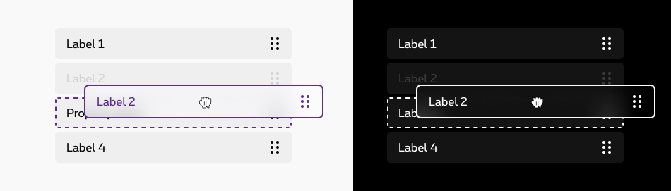
Elements of the list can be shifted in terms of their positioning relative to each other. When an entry is moved, possible destinations are shown graphically.
-
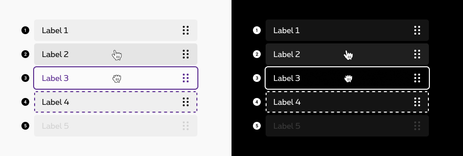
Default state
State visible before click. -
Hover/focused state
State visible when the cursor hovers the box. Cursor becomes a hand. -
Dragging state
State indicates that the object is “grabbed”. -
Drop state
State indicates the user where the box will go when he "drops" it. -
Disabled state
State visible when no interraction is possible with the box. background and label are displayed but they are greyed out. A tooltip can be added to inform the reason of deactivation.
Anatomy
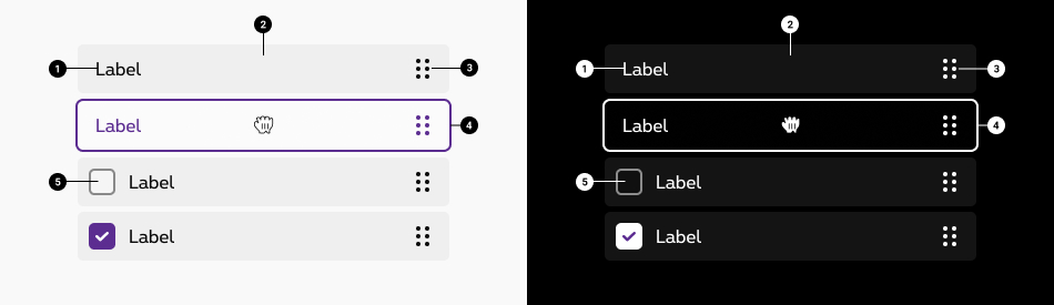
Label
-
Container
-
Grab-handle icons The grab-handle icon communicates that drag–and–drop is available and provide a safe target to click and drag without activating other nearby controls. The user doesn't have to click exactly on the grab handle icon, but its purpose remains the same. In the default version, without checkbox, the user can click on the whole box to initiave the drag and drop.
-
Outline The outline makes it clear what the status of the box is.
-
Checkbox A box can also contain a checkbox. In this case, it's only the action icon that is clickable to initiate the drag and drop.More info about the checkboxes available here.
Behavior
How it works?
- To initiate the interaction, users acquire an object using a mouse or touch gesture (such as a mouse click or, respectively, a long press).
- While keeping the object selected (e.g., by continuous pressure on the mouse button), the user then moves the pointing device (mouse, finger, etc.) to some desired target. This is the “drag” part of the operation.
- Finally, the user deselects the object — for example, by letting go of the mouse button. This is the “drop” area.
The outcome of all these steps may simply be that the object has been relocated.
System cursors.
System cursors indicate when an element is draggable. The system cursors will significantly improve discoverability of draggable elements.
- The cursor appears on hover and indicates that drag–and–drop is available.
- While clicking and holding, the drag–and–drop cursor changes to a closed glove to indicate that the item is grabbed.
Sizes and colors
Default drag and drop
- Add
aria-grabbed='false'andaria-haspopup='true'attributes to each list item. - Add
tabindex='0'attribute to each list item to make them selectable with the keyboard. - Don't forget to translate
aria-label='Draggable'attribute into your website language.
To disable dragging on a list item,
- Add
rs-disabledclass to thisrs-draggable-itemlist item. - Set
draggableattribute tofalse. - Remove
tabindex,aria-grabbedandaria-haspopupattributes. -
Change
aria-labelattribute of child icon from'Draggable'to'Not draggable'. Don't forget to translate it into your website language.
- Name
- Role
- Actions
Negative
Add rs-draggable-neg
class to rs-draggable
container.
- Name
- Role
- Actions
Drag and drop with checkbox
Don't forget to add disabled
attribute to disabled checkbox.
Replace rs-draggable-label
by rs-draggable-form
and put a checkbox inside.
Negative
Add rs-draggable-neg
class to rs-draggable
container.
Add rs-form-neg
class to rs-draggable-form
.
JavaScript
Each time you add Drag and Drop to the page, you have to call this JS:
CONTEXT refers to document or html element parent to data-draggable.
Informations about how to use drag and drop
Informations about how to use drag and drop
Configuration metadata (DSDragAndDropDirective)
Selector: [dsDragAndDrop]
Class: DSDragAndDropDirective
Use case example
NOT AVAILABLE LIVE PREVIEW
Inputs
None
Outputs
| Name | Type | Description |
|---|---|---|
| dropped | EventEmitter | Emits when drop |
Models
None
Configuration metadata (DSDraggableItemDirective)
Selector: [dsDraggableItem]
Class: DSDraggableItemDirective
Use case example
NOT AVAILABLE LIVE PREVIEW
Inputs
| Name | Type | Default | Required | Description |
|---|---|---|---|---|
| dragId | string | undefined | Yes | Unique id of the component |
| itemDisabled | boolean | false | No | Enables/Disables the component |
Outputs
None
Models
None