 Proximus design system
Please don't forget to read Usage part of each element.
Lists
A list is an ordered or unordered collection of items, providing structured organization and facilitating easy access to information within interfaces.
Types
Based on the list usage, different types of lists are available:
- Unordered list
To present content of equal status or value. This list can be displayed with an icon. - Ordered list
To present sequence and ordered items, and are commonly used when giving a set of instructions. - Advantages list
To present the benefits of a product/service. This list can be used to show what is and is not included in a product/service. - Links list
To present a list of links.
If a part of the list is a link, please used a default link refer to the links article.
Unordered list
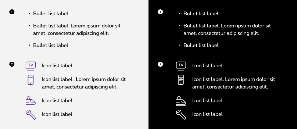
To present content of equal status or value. This list can be displayed with an icon.
-
Bullet list
To list items of equal importance. Two list levels are available. -
Icons list
To list items of equal importance and illustrate the information listed with an icon of its own. All icons can be used.
Ordered list
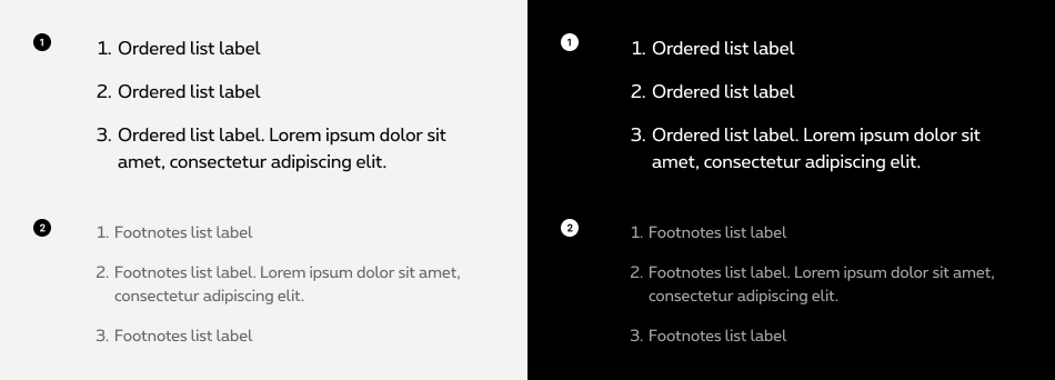
To present sequence and ordered items, and are commonly used when giving a set of instructions.
-
Default
Ordered list offers a simple and visual way to display elements that are linked by a certain order. -
Footnote
Like the classic, this option offers a smaller and lighter display of a list. Preferably used in situation where the text needs to be smaller (e.g. footnotes)
Advantages list
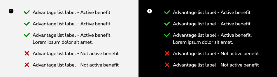
To present the benefits of a product/service. This list can be used to show what is and is not included in a product/service.
- Advantages list
To list the advantages or what a product contains or not, in this case the advantage is active or non active. Only the check and cross icons can be used.
Icon colors in the advantages list are not accessible on purple background, so this type of list can't be used on this background color..
Links list
To present a list of links.
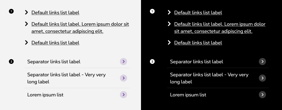
- Default links list
- Separators links list
It's not allowed to use a single link in a list of links from an accessibility point of view. So the minimum of links is 2. If you need only one single link, please use a button or a default link.
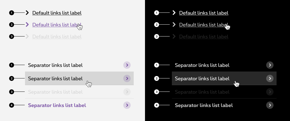
States
-
Default state
State visible before click. -
Hover state
State visible when the cursor hovers the link. Cursor becomes a pointer. -
Disabled state
State visible if the link is not clickable. All elements are displayed but they are greyed out in order to signify the change of state. -
Selected state (only for the separators links list)
State visible when the link is clicked/selected.
Sizes and colors
Depending on the case, lists can be use with as <ul> or <ol> . The entire list will be placed in these tags in the form of <li> .
Link in a list: Part or all of a list can be a link. If the link opens a new window or downloads a file, accessibility rules must then be taken into account.
Please refer to the link article to have the necessary information to be accessible.
List title: it's recommended to link a title to a list because people with disabilities can navigate through list in a page so it's clearer for them to have a title connected to a list.
In order to do that, add an id
to the desired title and aria-labelledby
with this id to the <ul>
. There is no specific html for this title
Bullet list
To get a default list with bullets, simply create an unordered list <ul> and add elements of the list in the <li> .
Optional but recommended title
- Lorem ipsum dolor
- Lorem ipsum dolor sit amet
- Lorem ipsum
- Dolor sit amet
- Lorem ispum
Negative bullet list
rs-list-neg
class added on <ul>
allows to switch the list to negative version.
- Lorem ipsum dolor
- Lorem ipsum dolor sit amet
- Lorem ipsum
- Dolor sit amet
- Lorem ispum
Ordered list
To get a default list with numbers, create an ordered list <ol> and add elements of the list in the <li> .
- Lorem ipsum dolor sit amet, consectetuer adipiscing elit. Lorem ipsum dolor sit amet, consectetuer adipiscing elit. Lorem ipsum dolor sit amet, consectetuer adipiscing elit. Lorem ipsum dolor sit amet, consectetuer adipiscing elit.
- ol list
- ol list
- ol list
Negative ordered list
rs-list-neg
class added on <ol>
allows to switch the list to negative version.
- Lorem ipsum dolor sit amet, consectetuer adipiscing elit. Lorem ipsum dolor sit amet, consectetuer adipiscing elit. Lorem ipsum dolor sit amet, consectetuer adipiscing elit. Lorem ipsum dolor sit amet, consectetuer adipiscing elit.
- ol list
- ol list
- ol list
Footnotes list
To get a footnotes list, add the class 'rs-footnote' on <ol> .
- Lorem ipsum dolor sit amet, consectetuer adipiscing elit. Lorem ipsum dolor sit amet, consectetuer adipiscing elit. Lorem ipsum dolor sit amet, consectetuer adipiscing elit. Lorem ipsum dolor sit amet, consectetuer adipiscing elit. Lorem ipsum dolor sit amet, consectetuer adipiscing elit.
- ol list
- ol list
- ol list
Negative footnotes list
rs-list-neg
class added on <ol>
allows to switch the list to negative version.
- Lorem ipsum dolor sit amet, consectetuer adipiscing elit. Lorem ipsum dolor sit amet, consectetuer adipiscing elit. Lorem ipsum dolor sit amet, consectetuer adipiscing elit. Lorem ipsum dolor sit amet, consectetuer adipiscing elit.
- ol list
- ol list
- ol list
Advantages list
To get a advantages list, add the class icons-ul
and rs-ul-advantages
on <ul>
.
It is important to give context to a list of advantages:
- Either all items on the list are active advantages and a title precedes the list to provide context, for example "Here are our advantages" or "Here is what is included". Then the icon is purely decorative.
aria-hidden="true"is added to the <i> of the icon for screen readers to ignore it because its purpose is simply decorative. - Either the list includes active and non-active items, then it is important to specify the meaning of the icon. The label must then be defined according to the context and translated in the 3 languages, for example: "included" "not included".
aria-label="xxx"is added to the <i> of the icon for screen readers to provide a text alternative.
All active advantages list
- Advantages 1, lorem ipsum dolor sit amet, consectetuer adipiscing elit Advantages 1, lorem ipsum dolor sit amet, consectetuer adipiscing elit
- Lorem ipsum
- Lorem ipsum
Mix of active & inactive advantages list
- Advantages 1, lorem ipsum dolor sit amet, consectetuer adipiscing elit Advantages 1, lorem ipsum dolor sit amet, consectetuer adipiscing elit
- Lorem ipsum
- Lorem ipsum
- Lorem ipsum
- Lorem ipsum
Negative advantages list
rs-list-neg
class added on <ul>
allows to switch the list to negative version.
- Advantages 1, lorem ipsum dolor sit amet, consectetuer adipiscing elit Advantages 1, lorem ipsum dolor sit amet, consectetuer adipiscing elit
- Lorem ipsum
- Lorem ipsum
- Lorem ipsum
- Lorem ipsum
Icon list
To get a icon list, add icons-ul
and big-icons-ul
on <ul>
. The icon class should be add in <i>
.
Note that here icons can only be used with icon-2x
size to have correct foreseen spacings. All icons available
Decorative Icons
If your icons are purely decorative, you will need to manually add an aria-hidden='true'
attribute to each of your icons so they are accessible. The code will look like <i class='icon-Arrow icon-lh' aria-hidden='true'></i>
Informative icon
If your icons have semantic meaning, you'll need to manually add an aria-label='xxx'
attribute to provide an alternative text. The code will look like <i class='icon-Login2 icon-2x icon-lh' aria-label='login'></i>
The aria-label='xxx'
has to be translated for all languages.
Negative icon list
icons-ul-neg
class added on <ul>
allows to switch the list to negative version.
Links list
To get a links list, add icons-ul
on <ul>
and arrow icon with a <i>
.
aria-hidden="true"
is added to the <i>
for screen readers to ignore it beacuse its purpose is simply decorative.
It's not allowed to use a single link in a list of links from an accessibility point of view. So the minimum of links is 2. If you need only one signle link, please use a button or a default link.
Negative links list
icons-ul-neg
class added on <ul>
allows to switch the list to negative version.
Separators links list
To get a separator links list no-bullet
and icons-separator-ul-right
on <ul>
.
A selected state can be added on a link with the addition of rs-selected
class on <li>
.
aria-hidden="true"
is added to the <i>
for screen readers to ignore it beacuse its purpose is simply decorative.
Negative separators links list
Use icons-separator-ul-right-neg
class on <ul>
instead of icons-separator-ul-right
allows to switch the list to negative version.