 Design System
Please don't forget to read Usage part of each element.
Spacings
Spacings create visual balance, improve readability, organization, and enhance overall aesthetics.
Default bottom spacing
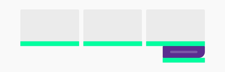
All the components have a default bottom spacing, it's the space between the component itself and the next one.
By default, all components of the Proximus Design System have a bottom spacing of 2rem, i.e. 20px in all breakpoints (except special cases).
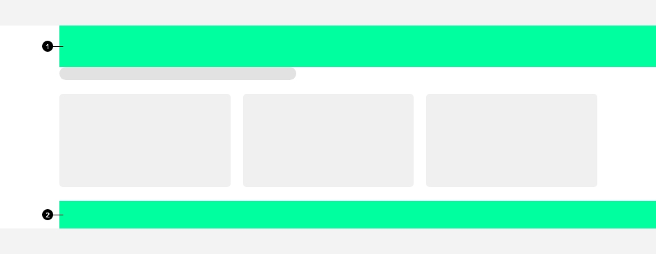
Spacings on section
A combination of class is defined to have enough spacings whithin sections of yours pages.
-
Top spacing
It's the first element of a section, corresponding tors-fe3class -
Bottom spacing
It's the last element of a section, corresponding tors-le2class
Increase spacings inside the content
You can space your content by using the content spacers. Use them to visually group related set of content together by adding spacing between those groups.
There are 3 possible content spacers:
Spacings on section
Top
| Sizes | Mobile | Tablet | Desktop |
|---|---|---|---|
| rs-fe | 1.5rem | 2rem | 2.5rem |
| rs-fe2 | 2rem | 3rem | 4rem |
| rs-fe3 | 4rem | 5rem | 6rem |
Bottom
| Sizes | Mobile | Tablet | Desktop |
|---|---|---|---|
| rs-le | 0rem | 1rem | 2rem |
| rs-le2 | 2rem | 3rem | 4rem |
| rs-le3 | 2.5rem | 4rem | 5.5rem |
Paddings & margins
It is possible to add different paddings and margins to your elements by adding for example rs-padding1
or rs-margin1
class. The number (from 1 to 4) corresponds to the number of rem knowing in our library, 1 rem is equal to 10 pixels.
A mini padding of 0.2rem (2px) also exists with rs-padding-mini
class but is allowed only for special limited purposes and cannot be used without checking and validating with Design System Team.
Paddings & margins per side
You can also add paddings and margins per side (top, right, bottom, left) with same logic of numbers. Ex: rs-padding-top1
rs-margin-top1
.
Remove paddings & margins
You can remove all paddings with rs-no-padding
and all margins with rs-no-margin
.
Per side
Or you can remove them per side (top, right, bottom, left) or opposite sides (top & bottom, left & right) with following classes :
- Paddings:
rs-no-padding-top,rs-no-padding-bottom,rs-no-padding-right,rs-no-padding-left,rs-no-padding-v("v" for vertical: top & bottom),rs-no-padding-h("h" for horizontal: left & right) - Margins:
rs-no-margin-top,rs-no-margin-bottom,rs-no-margin-right,rs-no-margin-left,rs-no-margin-v(top & bottom),rs-no-margin-h(left & right),
Per breakpoint
You can also add or remove paddings and margins per breakpoint just by adding at the end of all above classes " -m
" for medium up and " -l
" for large up.
Negative margins
You can add negative margins just by adding " -neg
" at the end of the margin classes for example : rs-margin-top1-neg
knowing the number can be from 1 to 4 (1rem to 4rem).
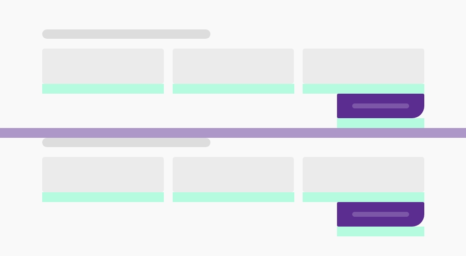
Spacings on sections
You will need to space your content to align with the (validated) design. To do this, use the divs with their specific classes specially designed for this purpose.
Be careful that these elements must be placed in the right place:
- rs-fe: first element of a section
- rs-me: middle elements in a section
- rs-le: last element of a section
Increase spacings
Their height sizes can be increased with a 2 or 3 added at the end. Ex: rs-fe2, rs-me3, rs-le2,...
Always use rs-fe3
as first element and rs-le2
as last element of a section.