 Proximus design system
Please don't forget to read Usage part of each element.
Radius
Border radius adds rounded corners to elements, softening their appearance and creating a more visually appealing and friendly interface, enhancing aesthetics and user experience.
Types
The shape system currently supports three types of radius that can be applied to component corners to suit your brand and app:
-
Default radius
The default radius is applied to virtually all components such as cards, menus, dialogs,... -
Baseline radius of 50% of the height
The radius of 50% of the element height is applied on 2 elements: primary & secondary buttons and tags. -
Circle shape
The circle shape is reserved for the profile picture on the services interfaces.
Default radius
Components such as cards, menus and dialogs all use 0.5rem rounded corners.
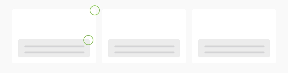
If one component contains another, or a colored block, then that other component or block will also have rounded corners.
Baseline radius of 50% of the height
The roundest components have a baseline radius of 50%, such as tags or on the the button corner.

The button is a special case because it has 3 rounded corners smaller than the default value (0.3 rem) and a round corner with a baseline radius of 50% of the height.
Circle shape
Single usage for the profile picture on the services interfaces.

Composition
If 2 components (cards,...) are sticked together, the corners where they are sticked are at 0.

Be aware that composition can change depending of the breakpoint, so some corners can be rounded in mobile and square in desktop, and vice versa.
Multimedia
Images and videos do not have rounded corners, their corners are straight.
Default radius
All <div>
element with a panel
class have 0.5 border radius defined by CSS.
Radius depending on the composition
To follow the usage rules when two panels are sticked together, add those class on <div>
element with a panel
to remove rounded corners:
All breakpoints:
rs-no-radius
Per side and breakpoint:
Lorem ipsum
Lorem ipsum dolor sit amet consectetur adipiscing elit
Small up:
Top:rs-no-radius-top
Right:
rs-no-radius-right
Bottom:
rs-no-radius-bottom
Left:
rs-no-radius-left
All:
rs-no-radius
Small only:
Top:rs-no-radius-top-so
Right:
rs-no-radius-right-so
Bottom:
rs-no-radius-bottom-so
Left:
rs-no-radius-left-so
Medium up:
Top:rs-no-radius-top-m
Right:
rs-no-radius-right-m
Bottom:
rs-no-radius-bottom-m
Left:
rs-no-radius-left-m
Medium only:
Top:rs-no-radius-top-mo
Right:
rs-no-radius-right-mo
Bottom:
rs-no-radius-bottom-mo
Left:
rs-no-radius-left-mo
Large up:
Top:rs-no-radius-top-l
Right:
rs-no-radius-right-l
Bottom:
rs-no-radius-bottom-l
Left:
rs-no-radius-left-l
Radius on another element than a panel
If you use another element than a <div>
with a panel
class and it has to have rounded corners, add rs-radius
class on the element.
Circle shape
You could set the width. See Width documentation to learn more.
