 Design System
Please don't forget to read Usage part of each element.
Gradients
The gradients are our main colour application and one of the most recognizable assets of our identity.
Gradients by Business Units
To follow our brand identity guidelines, available gradient varie based on the respective Business Unit.
Residential
Default gradients
These gradients are composed of 80% of purple and 20% of a secondary color.
Light gradients
Light gradients are considered as a secondary type of gradient. These gradients are composed of 60% of purple and 40% of a secondary color.
Gradients here above are the only ones allowed. All others gradients are forbidden:
- A gradient between two secondary colors or two primary colors is not allowed.
- Secondary colors are used at 100% in gradients, lighter variations (blue2, turquoise4,...) of these colors should never be used instead.
Business
Enterprise
Directions
Gradient can follow four possible directions with the goal to create depth in communication and give brand recognition depending on the color chosen and the scenario in question.
A direction is chosen by considering how it complements the pictures, text, sub-headlines, composition and overall communication in question.
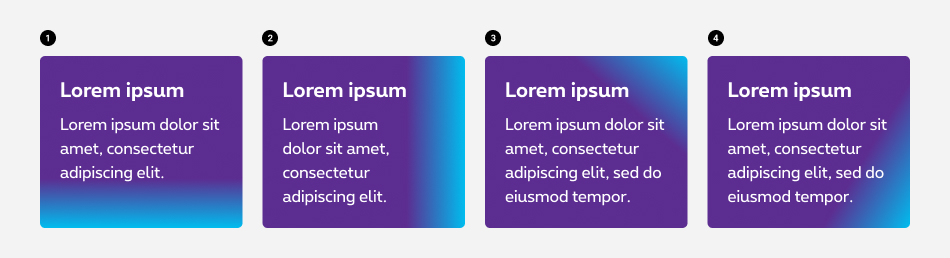
- Vertically From top to bottom
- Horizontally From left to right
- Diagonally From bottom left to top right
- Diagonally From top left to bottom right
Text on gradient
Always use the default gradient if you have text written on it. The text should always be on the purple part of the gradient to ensure readibility and accessibility.
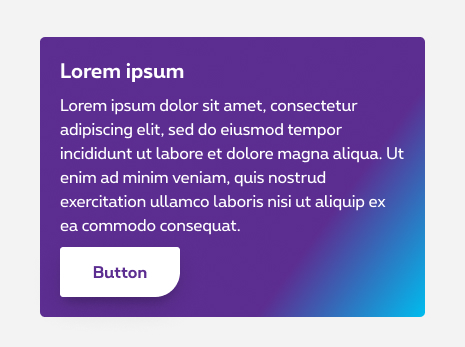
Do
Text on the purple color of the default gradient.
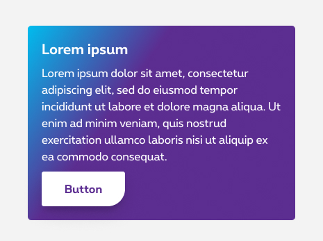
Don't
Direction bottom right to top left is forbidden due to the text on the non accessible secondary color.
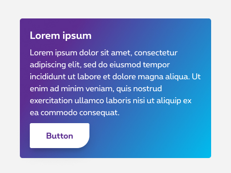
Don't
Text on the secondary color of the light gradient.
Don't
Text on the secondary color of the light gradient.
From primary color
To create a gradient background, use this image to decide from which side your gradient will come.
*Those gradients are deprecated and should no longer be used.
There's two different gradient backgrounds:
Default gradient
- Use
rs-bgt-# - Followed by number of the side you want to the color come.
Ex: rs-bgt-1
(default gradient from top to bottom)
Light gradient
- Use
rs-bgtl-# - Followed by number of the side you want to the color come.
Ex: rs-bgtl-8
(light gradient from top left to bottom right)
In addition with a flat background color, the gradient is placed above it and allows you to obtain all kinds of combinations.
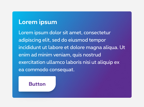
Example of gradient
Lorem ipsum ...
From black color
Lorem ipsum ...
SE
Lorem ipsum ...
Lorem ipsum ...