 Proximus design system
Please don't forget to read Usage part of each element.
Sysnav
Sysnav offer a handy way to navigate with anchors within a page.
Overview
Sysnav allows the user to navigate within a page by using anchors. Anchors help your visitors quickly find answers to their questions, without needing to scroll endlessly. A single click on an anchor will take them exactly where they want to go: down to the content.
Use the sysnav if the content of your page is very longue and the important informations are not on top of the page.
-
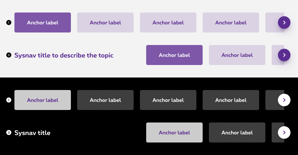
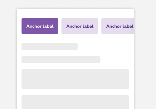
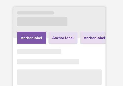
Default sysnav
Default sysnav takes the full width of the gridding. -
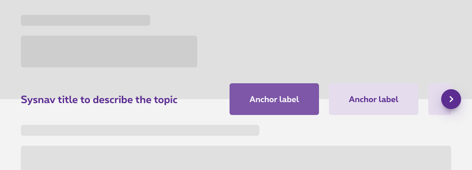
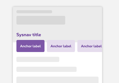
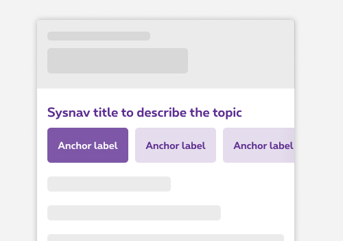
Sysnav with title
The title is used to describe the topic of the sysnav.
States
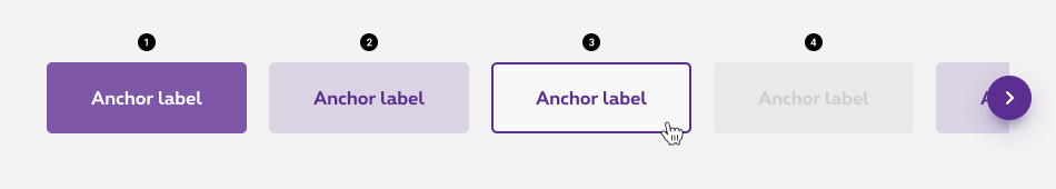
-
Active state
State visible when the section in your viewport match with an item in the sysnav. -
Default state
State visible before click. -
Hover/Focused state
State visible when the cursor hovers the anchor and triggered by keyboard navigation or click. -
Disabled state
State visible if the anchor is not available.
Anatomy
-
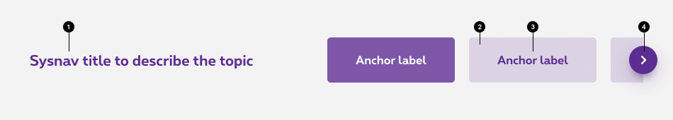
Title (optional)
The title is used to describe the topic of the sysnav. -
Item container
Whether its state, each item is enclosed within a container. -
Anchor label
Anchor labels should clearly and succinctly describe the content of the section they represent. To optimize the mobile experience, your labels can't exceed 25 characters, including spaces. -
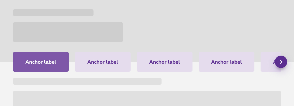
Navigation arrows (desktop only)
If the synav is bigger than the gridding size, the exceeding elements will be hidden and an arrow will be displayed on desktop only. This arrow allows to comfortably navigate through all the items. It is avaiblable both on the right and the left side depending where the user is within the list.
Navigation between anchors
If the synav is bigger than the gridding size, the exceeding anchors will be hidden. Users can navigate through all the anchors differently depending of the breakpoint:
Desktop
Anchors are hidden by a clean cut and the user can use the navigation arrows to see the other anchors.
Mobile
Anchors are hidden by a clean cut and the user can navigate through the anchors by swiping the sysnav.
Overlapping
The sysnav can overlap on another element. It's then placed astride and positioned at half its height.
Make sure there is enough space in the area for the sysnav to overlap.
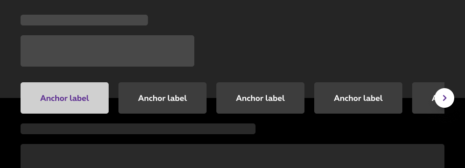
Negative sysnav
In the negative version, the overlap option is only available for black interface.
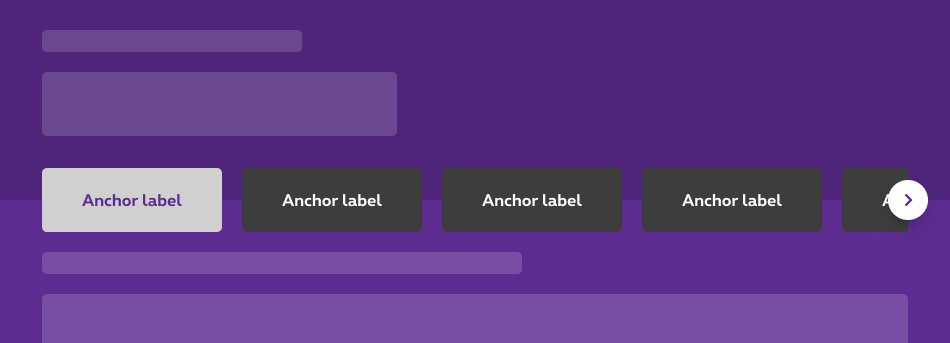
Don't
It's forbidden to use the negative sysnav on overlap on others colors like purple.
Sysnav with title
The overlap option is only available for the default sysnav. .
Don't
On desktop, it's forbidden to use the sysnav with title on overlap
Don't
On mobile, it's forbidden to use the sysnav with title on overlap too.
Responsiveness
Sysnav with title on mobile
In the case of the sysnav with title, this one is displayed before the sysnav on mobile.
Overlapping on mobile
When you choose to apply the overlap option, it will be also overlap the sysnav on mobile.
Sizes and colors
aria-label='Page navigation' role='navigation'
has to be added to rs-sysnav-list
.
The aria-label='Page navigation'
is added for screen readers to provide a text alternative, so it has to be translated for all languages.
When an anchor link is disabled, replace its anchor with javascript:void(0)
and add tabindex='-1'
on it.
Add the class rs-selected
to rs-sysnav-item
when its anchor link is selected.
Add the class rs-disabled
to rs-sysnav-item
when its anchor link is disabled.
Sysnav is a webcomponent which needs data-rslib-webcomponent-load="rslib.apps.sysnav" attribute to work.
Sysnav standard
Negative version
Add the class rs-sysnav-neg
to rs-sysnav
.
Sysnav with title
There is a dedicated class for sysnav title ( rs-sysnav-title
), please use it and don't create yours.
You can use gridding for alignment, like in the example below.
Negative version
Be carefull to add rs-txt-c2
to rs-sysnav-title
to change the text color.
Sysnav overlapping
To have a sysnav overlapping the section above it, add rs-sysnav-overlapping
to the <section>
of the sysnav.
The section next to the overlapped sysnav must have a rs-fe3
spacing. Please refers to Spacing article.
Negative version
Javascript
As Sysnav is a webcomponent, you will have to load
Next time you add Sysnav to the page, you have to call this JS:
CONTEXT refers to document or html element parent to data-sysnav.
Configuration metadata
Selector: ds-sysnav
Class: DSSysNavComponent
Use case example
NOT AVAILABLE LIVE PREVIEW
Inputs
| Name | Type | Default | Required | Description |
|---|---|---|---|---|
| id | string | sysnav | Yes | Defines unique id of the component |
| title | string | undefined | No | Sets the sysnav title |
| config$ | Observable<ISysNavConfig> | undefined | Yes | Sets component configuration |
| inputSysNavContents | ISysNavContents | { contents:[] } | Yes | Sets component content |
Outputs
| Name | Type | Description |
|---|---|---|
| sysNavClicked | EventEmitter<string> | Emits the selected choice of the user when a sysnav element is clicked |
Models
        export interface ISysNavContent {
            id: string;
            label: string;
            isSelected?: boolean;
            isDisabled?: boolean;
            reference: string;
        }

        export interface ISysNavConfig {
            hasNegativeStyle?: boolean;
            hasTitle?: boolean;
            isOverlapping?: boolean;
        }

        export interface ISysNavContents {
          contents: Array<ISysNavContent>;
        }