 Proximus design system
Please don't forget to read Usage part of each element.
Notification dot
A notification dot is a small colored indicator placed on an icon or UI element, signaling unseen alerts or updates to the user. A notification dot is a small colored indicator placed on an icon or UI element, signaling unseen alerts or updates, prompting user engagement and attention to new information.
Overview
A notification dot notifies the user that something is new or updated without showing a count, such as an "unread report", or activity notification. It may be useful as a less prominent notification, even when the count is known.
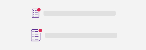
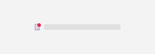
A notification dot will appear on an icon or close to the relevant item, often a label.

- On an icon
- Close to the relevant item
Size matters
The notification dot comes with two sizes for desktop, and one on mobile.

-
Small notification dot
For icon from 24px to 30px. -
Big notification dot (desktop only)
For icon bigger than 30px.
Best practices
Bold text
Use bold text to indicate that a notification hasn't been read.
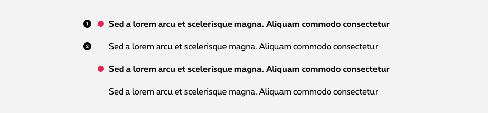
- Unread Notification dot visible + text label in bold.
- Read No notification dot + text label in regular.
Icon minimum size
The minimum size of an icon is 2rem in mobile and 2.4rem in desktop.
Do
Don't
Related elements
Patches
If you need a text label, use a patch instead. Patches provide a way to highlight two types of content: informational and promotional messages.
Sizes and colors
Add role="status"
or role="alert"
depend of your needs on the notification dot:
- status: A container whose content is advisory information for the user but is not important enough to justify an alert, often but not necessarily presented as a status bar.
- alert: A message with important, and usually time-sensitive, information.
Don't forget the screenreader message ( show-for-sr
) inside the notification dot and on the title
.
Unread notification with icon
Mobile and less then 30px icon
Add rs-has-notif-unread
and icon-lh
to the icon with notification.
More than 30px icon
Add rs-has-notif-large
to the icon.
Unread notification with copy
Copy must be in bold.
lacinia sit amet. Curabitur sed hendrerit quam. Vestibulum ante ipsum