 Proximus design system
Please don't forget to read Usage part of each element.
Images
expiry date: TBD
Images help tell a story, clarify complex messages that are difficult to express with words, and simply express a brand's visual language.
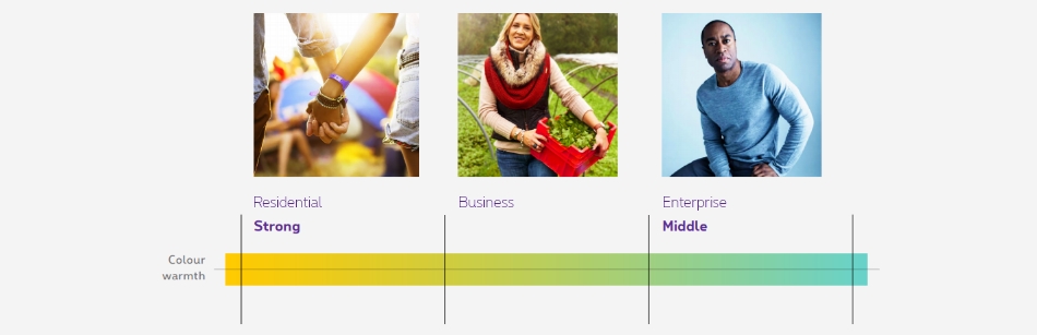
Overview
The colour intensity decreases as follows along the Business Units.
Key principles
Always prioritize full bleed pictures.
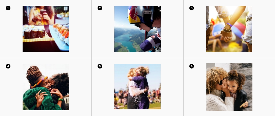
We also need to find at least two of the following elements in each photo.
-
Blur
What stands out = Think Possible. This increases a feeling of “being close” (depth of field). -
Authenticity
The people’s attitude is natural, even when photographed in an “extra-ordinary” context. -
Lighting
Show a diverse range of people connecting to each other. The user must be able to relate to the image. -
Delight
Displaying original and authentic moments gives our users confidence that we are delivering on our promises. -
Close ups
Close ups are essential. They convey stories and allow the viewer to relate to them by bringing the captured emotions forward. For online purpose, select wide images first and get your close up by cropping the original image.
Segmentation
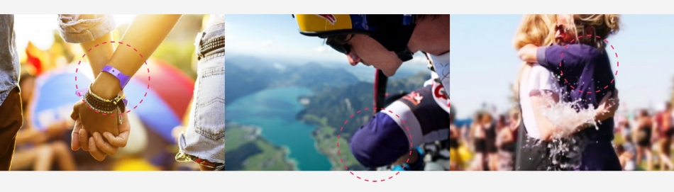
Residential photographic style
Add subtle touches of purple to help the viewer attribute the photo to the Proximus brand. Use this technique over the use of shapes, as these should only be used in 30% of cases.
Play with hues and simple masks, but always aim for a realistic end result. The picture should not feel tampered with.
Never have more than 30% of purple in the picture.
Business photographic style

Pride
The person is the hero of his or her own story.

Work environment
The person is photographed in his or her work environment.

Extra
Picture taken in front of a coloured wall referencing a Proximus brand colour, but without feeling flat and unnatural.
Enterprise photographic style

Storytelling metaphore
Bring together isolated elements to support a concept or narrative.

Charismatic individuals
Charismatic appearance without a hint of smugness
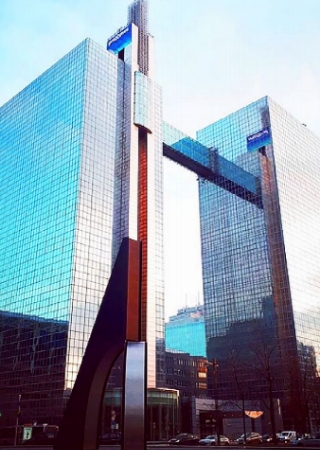
Architecture
Sleek and modern buildings or interiors.
For more detailed info on photography please enjoy this extra doc:
Photography Specs Document (.pdf - 202MB)
Content on image
If you want to write text on a visual, you have to ensure the accessibility of it. To do this, your content have to be write in the HTML ( not on the image ).
There is two strategies to ensure the readibility of you text on the image :
-
Edit your image
Edit your image with Photoshop or another software to ensure a good contrast between your text and your visual. Use Accessibility tools to check the result. -
Apply a css gradient
Add a gradient directly in the HTML. To do this, specify the direction (left 1, right2, bottom3, top4). The value of the gradient is black 85% - black 70% - black 20%. Please double check the result with an Accessibility tools.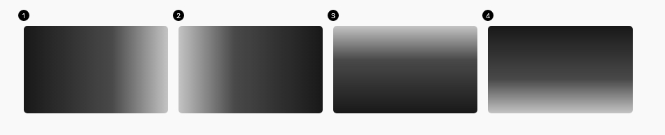
Here is some examples of gradients apply on divers components
Lazy load should be added on all images, background images and videos except on the first section of the page as they should be directly loaded and visible.
jsrs-resizerContainer/jsrs-resizerPart cannot be used togetherNot inside, nor around the image.
Because equalizer is not triggered after image is loaded.
<img>
It is mandatory to have an alt
attribute wether the image is decorative or informative.
When the image is informative, the alt
has to be filled with a meaningful description of the image, otherwise leave it empty.
Content images use native HTML. Add loading="lazy"
attribute to images below the fold. They will be loaded before you can see them. It has been tested also with injected HTML via JavaScript. It's magic!

If you need different images per breakpoint, use show class as below:


Animated gif
As a general rule, we never put animated GIFs. If an animation is needed, use a video instead.
Animated gifs can be accessible if :
- they are set to stop after 5 seconds or if users are presented with a way to pause it
- they have
alttext - they do not contain blinking/flashing.
Background image
When background image is dark, always use a dark background colour class as well as a placeholder in case the image is not loading for some reason (images blocked by the user, bad connection,...) to ensure the text remains readable.
Add data-lazy="IMG_SRC"
to element with background.
If same image for all breakpoint, just put image source.
Dark background
If different breakpoints, follow this pattern:
Breakpoints could be: default or small, medium, large, xlarge and xxlarge.
Responsive background
Background Image Cover
Following classes allow to scale the image as large as possible without stretching the image. If the proportions of the image differ from the element, it is cropped either vertically or horizontally so that no empty space remains.
| Left | Center | Right | |
|---|---|---|---|
| Top | rs-bgi-cover-lt
|
rs-bgi-cover-ct
|
rs-bgi-cover-rt
|
| Center | rs-bgi-cover-cc
|
||
| Bottom | rs-bgi-cover-lb
|
rs-bgi-cover-cb
|
rs-bgi-cover-rb
|
With breakpoint:
| medium-up | Left | Center | Right |
|---|---|---|---|
| Center | rs-bgi-cover-cc-m
|
||
| Bottom | rs-bgi-cover-rb-m
|
rs-bgi-cover-cc = cover center center
Background Image Contain
Following classes allow to scale the image as large as possible without cropping or stretching the image.
| Left | Center | Right | |
|---|---|---|---|
| Top | rs-bgi-contain-lt
|
rs-bgi-contain-ct
|
rs-bgi-contain-rt
|
| Center | rs-bgi-contain-cc
|
||
| Bottom | rs-bgi-contain-lb
|
rs-bgi-contain-cb
|
rs-bgi-contain-rb
|
With breakpoint:
| medium-up | Left | Center | Right |
|---|---|---|---|
| Center | rs-bgi-contain-cc-m
|
||
| Bottom | rs-bgi-contain-rb-m
|
rs-bgi-contain-cc = contain center center
Background Image Auto
Following classes allow to retain the original image size by cropping it but not stretching it.
| Left | Center | Right | |
|---|---|---|---|
| Top | rs-bgi-lt
|
rs-bgi-ct
|
rs-bgi-rt
|
| Center | rs-bgi-cc
|
||
| Bottom | rs-bgi-lb
|
rs-bgi-rb
|
rs-bgi-cc = center center
Background Image with gradient for Accessibility
To improve readability of text on images, add rs-bgt1-top/bottom/left
on the element who has the background image.
Background gradient top
Background gradient left
Background gradient bottom
Medium up breakpoint classes
All gradient for accessibility exist with the breakpoint medium up. Just add -m
at the end of the class.
Background gradient top mobile / left desktop
Background gradient top mobile / bottom desktop
Background gradient left mobile / top desktop
Remove Background Image per breakpoint
To remove background image on small only, you must add rs-no-bgi-s
to the element containing the background image.
rs-no-bgi-s = no background-image on small only
Or, you could put nothing for small breakpoint.
Background set for medium-up
To remove background-image on medium only, you must add rs-no-bgi-m
to the element containing the background image.
rs-no-bgi-m = no background-image on medium only
JavaScript
Each time you add HTML element with background image or video
tag, you have to use this JS function
If you add only one element with data-lazy
attribute, you have to use this JS function
CONTEXT refers to document
or html element parent.
EL refers to html element with data-lazy
attribute on.
Deprecated
The lazy load methods below are deprecated and should no longer be used.
This element will no longer be available from the expiry date meaning the related js will be removed and the element design will be broken if it's not adapted to the new html.
Attribute to replace by data-lazy
:
-
data-src -
data-interchange
All img tags must be replace by native HTML.