 Proximus design system
Please don't forget to read Usage part of each element.
Background colors
Allowed background colors according to Proximus branding guidelines including primary, secondary, opacity, promo, status, states,...
Default Proximus theme
Use primary colors as flat background color of full sections or panels. The colors below are the ones allowed to be used as background color of full sections in the default theme.
Positive mode
Negative mode
Secondary colors
Secondary colors can further enrich our communications. They play a supporting role and can help where additional colors are required.
The usage of secondary colors is defined by segment to follow brand identity. The color values below are the ones allowed to be used as background color of a panel.
Residential
Colors usage should be carefully considered, with legibility and accessibility as paramount concerns.
The visual presentation of text and images of text has a contrast ratio of at least 4.5:1.
Success criterion 1.4.3 - Contrast (Minimum)
Business & Enterprise
As the Business and Enterprise segments are more professional environments, the use of colors is limited and does not allow for secondary colors from the palette.
Default opacities
Color opacities can be used as background through all the segments. These are the primary background shades for informative frames without emphasis.
Positive mode
Negative mode
Opacities on background image
These background colors are intended to be used on images. It's an opacity color associated with a a glassmorphism effect, frosted-glass effect using a background blur.
Positive mode

White 80% + blur rgba(255, 255, 255, 0.8) + blur(30px)
Negative mode
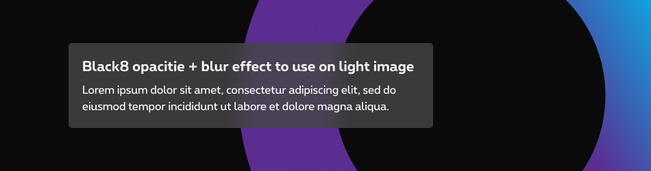
Black8 80% + blur #464646 80% + blur(30px)
Less is more
These options should be used sparingly and carefully in order to create a hierarchy between several boxes.
Do
The effect is used to highlight one content in relation to another. Use maximum one box with opacity + blur per viewport/page.
Don't
The effect doesn't add value and doesn't allow to highlight a content.
- The use of blur has an impact on performance when displaying web pages. It's therefore important to use it only where it's really necessary.
- CSS blur filter isn't working in Firefox, so there is only the colour opacity in this browser without the glassmorphism effect.
Clickable frames
These are the background colors used for clickable frames with emphasis. These colors are used in secondary buttons and some others clickable components.
Positive mode
Negative mode
Promo colors
Promo colors can be used as background color of a small zone of content to ensure the message will be read. It is not allowed to use it as background color of a section.
Positive mode
Negative mode
Status colors
Status colors can be used as background color of a small zone of content to ensure the message will be read, depending of the theme of your page. It is not allowed to use it as background color of a section.
Success status
Positive mode
Negative mode
Warning status
Positive mode
Negative mode
Error status
Positive mode
Negative mode
States colors
Please refer to states article for more info.
More infoBranded component
Please refer to the Themes category for more informations about each others themes.
More info
All branded-colors used by Proximus used some CSS classes.
Thoses always begin with rs-bg-
For Pickx theme, please refer to Pickx article.
Create a flat Background
- Select the color of your choice like
rs-bg-primary. - Add class to your HTML element.
Lorem ipsum ...
Create a flat background with color variations
- Select the color of your choice like
rs-bg-red. - Followed by nuance property can take a value from 1 - 9.
The lower value is the lightest. It is possible that the nuance you are trying to create is not defined, we have only integrated in the css those currently used in our online communication. You can check in Primary & secondary colors - all occurences bellow
Lorem ipsum ...
Primary & secondary colors - all occurences
Purple colors
rs-bg-purple1
rs-bg-purple2
rs-bg-purple3
rs-bg-purple5
rs-bg-purple7
rs-bg-purple8
rs-bg-purple9
rs-bg-purple
Blue colors
rs-bg-blue1
rs-bg-blue2
rs-bg-blue4
rs-bg-blue
Turquoise colors
rs-bg-turquoise2
rs-bg-turquoise4
rs-bg-turquoise8
rs-bg-turquoise
Green colors
rs-bg-green2
rs-bg-green4
rs-bg-green
Yellow colors
rs-bg-yellow2
rs-bg-yellow4
rs-bg-yellow
Orange colors
rs-bg-orange2
rs-bg-orange4
rs-bg-orange
Red colors
rs-bg-red2
rs-bg-red4
rs-bg-red
Magenta colors
rs-bg-magenta2
rs-bg-magenta4
rs-bg-magenta
Grey colors
rs-bg-grey1
rs-bg-grey2
rs-bg-grey4
rs-bg-grey5
rs-bg-grey8
rs-bg-grey9
rs-bg-grey
Almond colors
rs-bg-almond2
rs-bg-almond
Black colors
rs-bg-black7
rs-bg-black8
rs-bg-black9
rs-bg-black
Specific colors
rs-bg-c2
rs-bg-dark-purple
Promo colors
rs-bg-promo
Status colors
rs-bg-error
State colors
Please refer to States article.
Opacities
rs-bg-tr-b1
rs-bg-tr-b2
rs-bg-tr-b3
Negative opacities
rs-bg-tr-w1
rs-bg-tr-w2
rs-bg-tr-w3
Opacities on background image
On an image, specific backgrounds with opacities should be use to assure the lisibility of the content.
Two classes are now available rs-bg-ac
and rs-bg-ac-neg
, "ac" standing for accessibility.
This transparent background is strong enough to be accessible even if the blur effect isn't working correctly.
rs-bg-ac
Negative opacities on background image
rs-bg-ac-neg
rs-bg-ac with rs-neg parent
To remove a background color
Thoses classes can allow you to remove backgrounds and also using conditions with breakpoints. That allows you to adapt components depending on the screen size
rs-no-bg
rs-no-bg-s
rs-no-bg-m
rs-no-bg-l
Extended background
You can find the details on background outgrid page.